FabCon is coming to Atlanta
Join us at FabCon Atlanta from March 16 - 20, 2026, for the ultimate Fabric, Power BI, AI and SQL community-led event. Save $200 with code FABCOMM.
Register now!- Power BI forums
- Get Help with Power BI
- Desktop
- Service
- Report Server
- Power Query
- Mobile Apps
- Developer
- DAX Commands and Tips
- Custom Visuals Development Discussion
- Health and Life Sciences
- Power BI Spanish forums
- Translated Spanish Desktop
- Training and Consulting
- Instructor Led Training
- Dashboard in a Day for Women, by Women
- Galleries
- Data Stories Gallery
- Themes Gallery
- Contests Gallery
- QuickViz Gallery
- Quick Measures Gallery
- Visual Calculations Gallery
- Notebook Gallery
- Translytical Task Flow Gallery
- TMDL Gallery
- R Script Showcase
- Webinars and Video Gallery
- Ideas
- Custom Visuals Ideas (read-only)
- Issues
- Issues
- Events
- Upcoming Events
The Power BI Data Visualization World Championships is back! Get ahead of the game and start preparing now! Learn more
- Power BI forums
- Forums
- Get Help with Power BI
- Desktop
- How to create % restricted to a certain group?
- Subscribe to RSS Feed
- Mark Topic as New
- Mark Topic as Read
- Float this Topic for Current User
- Bookmark
- Subscribe
- Printer Friendly Page
- Mark as New
- Bookmark
- Subscribe
- Mute
- Subscribe to RSS Feed
- Permalink
- Report Inappropriate Content
How to create % restricted to a certain group?
Hello all,
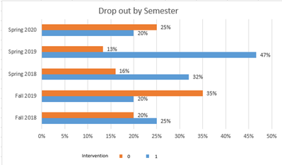
I am trying to tap into the community of experts in Power BI to see if I can get some help create a bar chart comparing the percentages of drop-out between the intervention and control groups across 5 semesters. It doesn't seem very straightforward to me though it can be quicly done in Excel. Could I use your expertise for some guidance as to how to create the chart? Below the first table shows dropout rate for each semester by intervention. The second table shows the corresponding percentages only. The chart shown below is what I intend to create in Power BI but can't get it work. The following two links give access the test data and pbix file:
Excel:
https://drive.google.com/file/d/11nVwTr1vdXFtfyJvN6F2J3CVV6-A03vg/view?usp=sharing
Pbix:
https://drive.google.com/file/d/1uJEaxVITndYhDtt8_37YwWuKAH6yLvLc/view?usp=sharing
Thank you very much!
Laurel
Solved! Go to Solution.
- Mark as New
- Bookmark
- Subscribe
- Mute
- Subscribe to RSS Feed
- Permalink
- Report Inappropriate Content
Hi, @laurelning
It’s my pleasure to answer for you.
According to your description,I think you can create some measures to display the cluster bar chart.
Like this:
Measure0 =
VAR a =
    COUNTROWS ( ALL ( 'Raw Data' ) )
VAR b =
    COUNTROWS (
        FILTER (
            ALL ( 'Raw Data' ),
            [Semester] = SELECTEDVALUE ( 'Raw Data'[Semester] )
        )
    )
VAR c =
    DIVIDE ( b, a )
VAR d =
    COUNTROWS (
        FILTER (
            ALL ( 'Raw Data' ),
            [Semester] = SELECTEDVALUE ( 'Raw Data'[Semester] )
                && [Dropout] = 0
                && [Intervention] = 0
        )
    )
RETURN
    DIVIDE ( d, c ) / 100
Here is my sample .pbix file.Hope it helps.
If it doesn’t solve your problem, please feel free to ask me.
Best Regards
Janey Guo
If this post helps, then please consider Accept it as the solution to help the other members find it more quickly.
Helpful resources

Power BI Monthly Update - November 2025
Check out the November 2025 Power BI update to learn about new features.

Fabric Data Days
Advance your Data & AI career with 50 days of live learning, contests, hands-on challenges, study groups & certifications and more!


