Fabric Data Days starts November 4th!
Advance your Data & AI career with 50 days of live learning, dataviz contests, hands-on challenges, study groups & certifications and more!
Get registered- Power BI forums
- Get Help with Power BI
- Desktop
- Service
- Report Server
- Power Query
- Mobile Apps
- Developer
- DAX Commands and Tips
- Custom Visuals Development Discussion
- Health and Life Sciences
- Power BI Spanish forums
- Translated Spanish Desktop
- Training and Consulting
- Instructor Led Training
- Dashboard in a Day for Women, by Women
- Galleries
- Data Stories Gallery
- Themes Gallery
- Contests Gallery
- Quick Measures Gallery
- Visual Calculations Gallery
- Notebook Gallery
- Translytical Task Flow Gallery
- TMDL Gallery
- R Script Showcase
- Webinars and Video Gallery
- Ideas
- Custom Visuals Ideas (read-only)
- Issues
- Issues
- Events
- Upcoming Events
Join us at FabCon Atlanta from March 16 - 20, 2026, for the ultimate Fabric, Power BI, AI and SQL community-led event. Save $200 with code FABCOMM. Register now.
- Power BI forums
- Forums
- Get Help with Power BI
- Desktop
- How to create line value for each column series in...
- Subscribe to RSS Feed
- Mark Topic as New
- Mark Topic as Read
- Float this Topic for Current User
- Bookmark
- Subscribe
- Printer Friendly Page
- Mark as New
- Bookmark
- Subscribe
- Mute
- Subscribe to RSS Feed
- Permalink
- Report Inappropriate Content
How to create line value for each column series in line and clustered column chart
Hi,
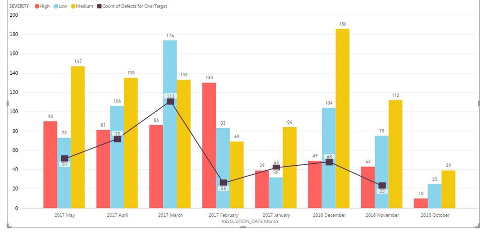
I am using Power BI desktop and would like to show the line value for each column series ( severity ). I created a Quick measure for totals and used that for creating line values.
My table has column to calculate whether each defect is over target or under target depending on the cycletime.
Solved! Go to Solution.
- Mark as New
- Bookmark
- Subscribe
- Mute
- Subscribe to RSS Feed
- Permalink
- Report Inappropriate Content
Hi @belurrashmi,
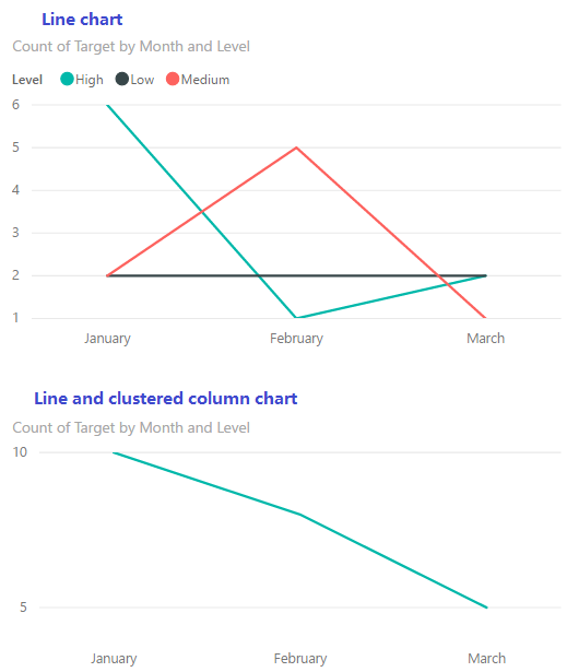
From below image, we can see the legend in a line chart can divide a line into several series based on legend items. However, the legend in a combination chart seems doesn't work, because it only applies to column bars in a combination chart.
To work around that, you should create multiple measures to generate multiple lines based on different legend items.
Count over High =
CALCULATE (
    COUNT ( 'Line chart'[Target] ),
    FILTER (
        'Line chart',
        'Line chart'[Level] = "High"
            && 'Line chart'[Target] = "Over Target"
    )
)

Count over Low =
CALCULATE (
    COUNT ( 'Line chart'[Target] ),
    FILTER (
        'Line chart',
        'Line chart'[Level] = "Low"
            && 'Line chart'[Target] = "Over Target"
    )
)

Count over Medium =
CALCULATE (
    COUNT ( 'Line chart'[Target] ),
    FILTER (
        'Line chart',
        'Line chart'[Level] = "Medium"
            && 'Line chart'[Target] = "Over Target"
    )
)
Besides, you can submit a feature request on idea.
Best regards,
Yuliana Gu
If this post helps, then please consider Accept it as the solution to help the other members find it more quickly.
- Mark as New
- Bookmark
- Subscribe
- Mute
- Subscribe to RSS Feed
- Permalink
- Report Inappropriate Content
Would you be able to start the line values according to the lenger. For example show the line values Count of HIGH from the column Level HIGH and similarly the line Count of Medium originate from the column Medium. At the moment it seem to be originating from the middle of the column
Helpful resources

FabCon Global Hackathon
Join the Fabric FabCon Global Hackathon—running virtually through Nov 3. Open to all skill levels. $10,000 in prizes!

Power BI Monthly Update - October 2025
Check out the October 2025 Power BI update to learn about new features.

| User | Count |
|---|---|
| 79 | |
| 38 | |
| 31 | |
| 27 | |
| 27 |


