This time we’re going bigger than ever. Fabric, Power BI, SQL, AI and more. We're covering it all. You won't want to miss it.
Learn moreLevel up your Power BI skills this month - build one visual each week and tell better stories with data! Get started
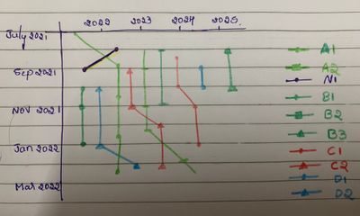
I dint get any custom charts where I can take date columns in both X and Y axis. So I have written R (used ggplot2 and lubridate libraries) codes to create that chart. But it's running in R studio and throwing error in power BI.
I tried using python too, but that's throwing error in power BI.
If possible how can I create these Icicle charts in power Bi??
Solved! Go to Solution.
Hi there is a way to reverse the Y-Axis.
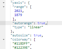
In the JSON section, under Y-Axis, change, "autorange" : "reversed", then ensure you hit save/load.
Proud to be a Super User!
@KerKol Thanks!!
I tried plotly.js but there is no option to reverse y axis. If we take a look at that above chart, the data is flowing from top to bottom. In plotly.js by default it's taking y axis in descending order.
I will try this Deneb, hope that works.
Hi there is a way to reverse the Y-Axis.
In the JSON section, under Y-Axis, change, "autorange" : "reversed", then ensure you hit save/load.
Proud to be a Super User!
You can give Deneb a try (available in AppSource) Declarative Visualization in Power BI | Deneb (deneb-viz.github.io)
(Uses Vega and Vega-Lite -- no external packages required)
or Plotly.JS (Available in AppSource) Find the right app | Microsoft AppSource
(Uses Plotly.JS -- no external packages required)
Proud to be a Super User!
Check out the April 2026 Power BI update to learn about new features.
Sign up to receive a private message when registration opens and key events begin.
If you have recently started exploring Fabric, we'd love to hear how it's going. Your feedback can help with product improvements.
| User | Count |
|---|---|
| 30 | |
| 24 | |
| 23 | |
| 17 | |
| 15 |
| User | Count |
|---|---|
| 61 | |
| 36 | |
| 29 | |
| 22 | |
| 22 |