Join us at FabCon Vienna from September 15-18, 2025
The ultimate Fabric, Power BI, SQL, and AI community-led learning event. Save €200 with code FABCOMM.
Get registered- Power BI forums
- Get Help with Power BI
- Desktop
- Service
- Report Server
- Power Query
- Mobile Apps
- Developer
- DAX Commands and Tips
- Custom Visuals Development Discussion
- Health and Life Sciences
- Power BI Spanish forums
- Translated Spanish Desktop
- Training and Consulting
- Instructor Led Training
- Dashboard in a Day for Women, by Women
- Galleries
- Data Stories Gallery
- Themes Gallery
- Contests Gallery
- Quick Measures Gallery
- Notebook Gallery
- Translytical Task Flow Gallery
- TMDL Gallery
- R Script Showcase
- Webinars and Video Gallery
- Ideas
- Custom Visuals Ideas (read-only)
- Issues
- Issues
- Events
- Upcoming Events
Compete to become Power BI Data Viz World Champion! First round ends August 18th. Get started.
- Power BI forums
- Forums
- Get Help with Power BI
- Desktop
- How to create filters in Power BI from Excel Pivot...
- Subscribe to RSS Feed
- Mark Topic as New
- Mark Topic as Read
- Float this Topic for Current User
- Bookmark
- Subscribe
- Printer Friendly Page
- Mark as New
- Bookmark
- Subscribe
- Mute
- Subscribe to RSS Feed
- Permalink
- Report Inappropriate Content
How to create filters in Power BI from Excel Pivot table data?
Hi Friends,
I have some data and figures from Excel pivot tables. They’ve already filtered in Excel pivot tables. Now, I’d like to plot them in Power BI with some slicers.
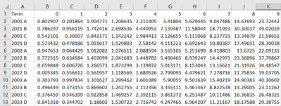
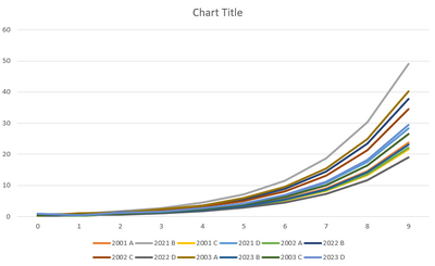
The data and figure in Excel are shown below:
data
figure
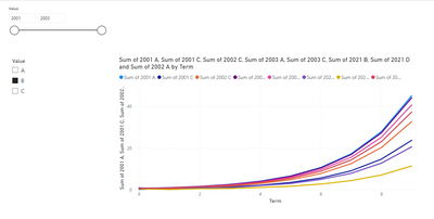
The demo figure in Power BI is something like this. It includes 2 filters, Year and class(A, B, C)
My question is how to create these filters in Power BI?
Thanks
- Mark as New
- Bookmark
- Subscribe
- Mute
- Subscribe to RSS Feed
- Permalink
- Report Inappropriate Content
I would like to express my sincere thanks for all the valuable information you share in this forum. It has been a great help in resolving my doubts and keeping me updated on topics related to [forum topic]. The community here is amazing and I really appreciate the time and effort you all put into helping each other.
Thank you!
- Mark as New
- Bookmark
- Subscribe
- Mute
- Subscribe to RSS Feed
- Permalink
- Report Inappropriate Content
@PowerBear just follow the instructions I provided and you don't need to do anything crazy in Power BI. you can easily unpivot it in Power BI.
Subscribe to the @PowerBIHowTo YT channel for an upcoming video on List and Record functions in Power Query!!
Learn Power BI and Fabric - subscribe to our YT channel - Click here: @PowerBIHowTo
If my solution proved useful, I'd be delighted to receive Kudos. When you put effort into asking a question, it's equally thoughtful to acknowledge and give Kudos to the individual who helped you solve the problem. It's a small gesture that shows appreciation and encouragement! ❤
Did I answer your question? Mark my post as a solution. Proud to be a Super User! Appreciate your Kudos 🙂
Feel free to email me with any of your BI needs.
- Mark as New
- Bookmark
- Subscribe
- Mute
- Subscribe to RSS Feed
- Permalink
- Report Inappropriate Content
@PowerBear first of all, as a best practice you should unpivot your data, and then everything will become super easy.
You can easily transform your data in Power Query in Power BI.
First split the Term column into two columns Year and Category. Remove the Term column, select new columns (Year and Category) -> right click -> Unpivot other columns. This will give you two new columns, Attribute and Value, rename those as you see fit. Close and Apply.
To visualize, you can use attribute columns on x-axis, value on y-axis, Year and Category columns as slicers and everything will flow nicely.
Subscribe to the @PowerBIHowTo YT channel for an upcoming video on List and Record functions in Power Query!!
Learn Power BI and Fabric - subscribe to our YT channel - Click here: @PowerBIHowTo
If my solution proved useful, I'd be delighted to receive Kudos. When you put effort into asking a question, it's equally thoughtful to acknowledge and give Kudos to the individual who helped you solve the problem. It's a small gesture that shows appreciation and encouragement! ❤
Did I answer your question? Mark my post as a solution. Proud to be a Super User! Appreciate your Kudos 🙂
Feel free to email me with any of your BI needs.
- Mark as New
- Bookmark
- Subscribe
- Mute
- Subscribe to RSS Feed
- Permalink
- Report Inappropriate Content
Hi @parry2k
Thanks for the reply.
I think my issue now is how to unpivot thoese pivot tables, because the data table I show here is calculated from those pivot tables. If I unpivot those Excel pivot tables, I need to do some calculations in PBI using DAX, probably.
Let me think how to solve this issue based on your advice. Thanks again!


