FabCon is coming to Atlanta
Join us at FabCon Atlanta from March 16 - 20, 2026, for the ultimate Fabric, Power BI, AI and SQL community-led event. Save $200 with code FABCOMM.
Register now!- Power BI forums
- Get Help with Power BI
- Desktop
- Service
- Report Server
- Power Query
- Mobile Apps
- Developer
- DAX Commands and Tips
- Custom Visuals Development Discussion
- Health and Life Sciences
- Power BI Spanish forums
- Translated Spanish Desktop
- Training and Consulting
- Instructor Led Training
- Dashboard in a Day for Women, by Women
- Galleries
- Data Stories Gallery
- Themes Gallery
- Contests Gallery
- QuickViz Gallery
- Quick Measures Gallery
- Visual Calculations Gallery
- Notebook Gallery
- Translytical Task Flow Gallery
- TMDL Gallery
- R Script Showcase
- Webinars and Video Gallery
- Ideas
- Custom Visuals Ideas (read-only)
- Issues
- Issues
- Events
- Upcoming Events
The Power BI Data Visualization World Championships is back! Get ahead of the game and start preparing now! Learn more
- Power BI forums
- Forums
- Get Help with Power BI
- Desktop
- How to create a progress donut chart with a value ...
- Subscribe to RSS Feed
- Mark Topic as New
- Mark Topic as Read
- Float this Topic for Current User
- Bookmark
- Subscribe
- Printer Friendly Page
- Mark as New
- Bookmark
- Subscribe
- Mute
- Subscribe to RSS Feed
- Permalink
- Report Inappropriate Content
How to create a progress donut chart with a value already in place
Hello All,
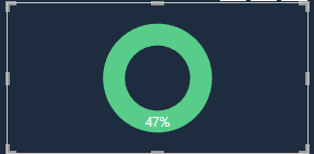
I am trying to create a tooltip that will show a progress donut chart as a percentage. The value of the percentage is provided in the dataset. However, when I drag the value into the "values" of the donut chart visual, the entire donut is filled. Is there a way to, for example, if the value is 50%, the donut filled 50% of the way? I tried messing with the formatting pane but it doesn't seem to have what I'm looking for.
- Mark as New
- Bookmark
- Subscribe
- Mute
- Subscribe to RSS Feed
- Permalink
- Report Inappropriate Content
Hi @Anonymous ,
Has your problem been solved, if so, please consider Accept a correct reply as the solution or share your own solution to help others find it.
Best Regards
Lucien
- Mark as New
- Bookmark
- Subscribe
- Mute
- Subscribe to RSS Feed
- Permalink
- Report Inappropriate Content
Hi @Anonymous
I'm afraid that's not how Donut Charts work. If you only give it one value to display, that value will take up the entire ring, as you've found.
You could add a 2nd value which would be 100% - the displayed percentage. So in this case that would give 100 - 47 = 53. If you then add 53% to your Donut you'll kinda get what you want but it's still not great looking and you'll have to fiddle with the postion and formatting.
I'd advise using a Gauge visual. You can then add a maximum value (100%) and a Target value if you wish. If you have no need for a Target value then just leave it out
regards
Phil
Did I answer your question? Then please mark my post as the solution.
If I helped you, click on the Thumbs Up to give Kudos.
Blog :: YouTube Channel :: Connect on Linkedin
Proud to be a Super User!
Helpful resources

Power BI Monthly Update - November 2025
Check out the November 2025 Power BI update to learn about new features.

Fabric Data Days
Advance your Data & AI career with 50 days of live learning, contests, hands-on challenges, study groups & certifications and more!

| User | Count |
|---|---|
| 57 | |
| 43 | |
| 40 | |
| 21 | |
| 17 |
| User | Count |
|---|---|
| 171 | |
| 104 | |
| 90 | |
| 44 | |
| 44 |


