Fabric Data Days starts November 4th!
Advance your Data & AI career with 50 days of live learning, dataviz contests, hands-on challenges, study groups & certifications and more!
Get registered- Power BI forums
- Get Help with Power BI
- Desktop
- Service
- Report Server
- Power Query
- Mobile Apps
- Developer
- DAX Commands and Tips
- Custom Visuals Development Discussion
- Health and Life Sciences
- Power BI Spanish forums
- Translated Spanish Desktop
- Training and Consulting
- Instructor Led Training
- Dashboard in a Day for Women, by Women
- Galleries
- Data Stories Gallery
- Themes Gallery
- Contests Gallery
- QuickViz Gallery
- Quick Measures Gallery
- Visual Calculations Gallery
- Notebook Gallery
- Translytical Task Flow Gallery
- TMDL Gallery
- R Script Showcase
- Webinars and Video Gallery
- Ideas
- Custom Visuals Ideas (read-only)
- Issues
- Issues
- Events
- Upcoming Events
Get Fabric Certified for FREE during Fabric Data Days. Don't miss your chance! Request now
- Power BI forums
- Forums
- Get Help with Power BI
- Desktop
- Re: How to create a line chart with range area in ...
- Subscribe to RSS Feed
- Mark Topic as New
- Mark Topic as Read
- Float this Topic for Current User
- Bookmark
- Subscribe
- Printer Friendly Page
- Mark as New
- Bookmark
- Subscribe
- Mute
- Subscribe to RSS Feed
- Permalink
- Report Inappropriate Content
How to create a line chart with range area in the background
Hello,
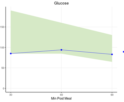
I am trying to create a Line chart with a range in the background (See pic below). The idea of the range is to show the normal range for the plot; anything outside of the range is considered abnormal. We want users to see whether the data point is within the range or outside the range. The screenshot shows how the graph looks like in R shiny, where the green area in the background represents the range, and the line represents the actual data points. Is there a way that I can recreate this in PowerBI? I really appreciate any advice. Thanks
Solved! Go to Solution.
- Mark as New
- Bookmark
- Subscribe
- Mute
- Subscribe to RSS Feed
- Permalink
- Report Inappropriate Content
Hi @Anonymous ,
After some research, I suggest that you can use R or Python visuals in Power BI Desktop. You can create the chart using the "Polygon()" function. Here is my test.
Result:
Hope that's what you were looking for.
Best Regards,
Yuna
If this post helps, then please consider Accept it as the solution to help the other members find it more quickly.
- Mark as New
- Bookmark
- Subscribe
- Mute
- Subscribe to RSS Feed
- Permalink
- Report Inappropriate Content
- Mark as New
- Bookmark
- Subscribe
- Mute
- Subscribe to RSS Feed
- Permalink
- Report Inappropriate Content
Hi @Anonymous,
If you can user custom visuals, you can try https://pbivizedit.com
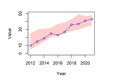
I am able to create following chart:
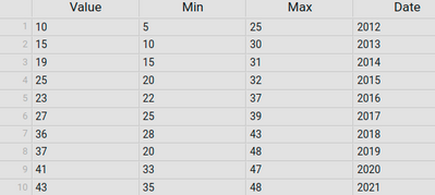
with the following data:
Please note that, these visuals do not support (yet):
1. Native tooltips of Power BI.
2. selection of data points for further filtering.
Thanks,
-R
- Mark as New
- Bookmark
- Subscribe
- Mute
- Subscribe to RSS Feed
- Permalink
- Report Inappropriate Content
Hi @Anonymous ,
After some research, I suggest that you can use R or Python visuals in Power BI Desktop. You can create the chart using the "Polygon()" function. Here is my test.
Result:
Hope that's what you were looking for.
Best Regards,
Yuna
If this post helps, then please consider Accept it as the solution to help the other members find it more quickly.
- Mark as New
- Bookmark
- Subscribe
- Mute
- Subscribe to RSS Feed
- Permalink
- Report Inappropriate Content
That looks like a great solution. I'll be grateful if you could post the R code that you used to produce that result. With no knowledge at all of R, I tried to figure it out myself from on-line documentation and didn't get very far.
Assuming it is R, of course.
- Mark as New
- Bookmark
- Subscribe
- Mute
- Subscribe to RSS Feed
- Permalink
- Report Inappropriate Content
@Anonymous thanks alot it worked.
- Mark as New
- Bookmark
- Subscribe
- Mute
- Subscribe to RSS Feed
- Permalink
- Report Inappropriate Content
Hi @Anonymous ,
Based on your description, it seems that there is no custom visual in Power BI that can fully meet your requirements. So I did a test to find something workaround. Is the following result what you want?
I just create a stacked chart visual and set the color of "minimum" as white.
If you set the maximum and value columns to the same color, this may better meet your needs.
Hope that's what you were looking for.
Best Regards,
Yuna
If this post helps, then please consider Accept it as the solution to help the other members find it more quickly.
- Mark as New
- Bookmark
- Subscribe
- Mute
- Subscribe to RSS Feed
- Permalink
- Report Inappropriate Content
@Anonymous , I doubt you can do that with standard visual.
check some custom visual
https://appsource.microsoft.com/en-us/marketplace/apps?product=power-bi-visuals
- Mark as New
- Bookmark
- Subscribe
- Mute
- Subscribe to RSS Feed
- Permalink
- Report Inappropriate Content
@amitchandak Thanks for replying. I have been checking some custom visuals but I have not found any good fit so far. If you have any recommendations then please let me know.
- Mark as New
- Bookmark
- Subscribe
- Mute
- Subscribe to RSS Feed
- Permalink
- Report Inappropriate Content
@Anonymous , check if this one can help
https://blog.pragmaticworks.com/power-bi-custom-visuals-chartaccent-linechart
Helpful resources

Power BI Monthly Update - November 2025
Check out the November 2025 Power BI update to learn about new features.

Fabric Data Days
Advance your Data & AI career with 50 days of live learning, contests, hands-on challenges, study groups & certifications and more!


