FabCon is coming to Atlanta
Join us at FabCon Atlanta from March 16 - 20, 2026, for the ultimate Fabric, Power BI, AI and SQL community-led event. Save $200 with code FABCOMM.
Register now!- Power BI forums
- Get Help with Power BI
- Desktop
- Service
- Report Server
- Power Query
- Mobile Apps
- Developer
- DAX Commands and Tips
- Custom Visuals Development Discussion
- Health and Life Sciences
- Power BI Spanish forums
- Translated Spanish Desktop
- Training and Consulting
- Instructor Led Training
- Dashboard in a Day for Women, by Women
- Galleries
- Data Stories Gallery
- Themes Gallery
- Contests Gallery
- Quick Measures Gallery
- Notebook Gallery
- Translytical Task Flow Gallery
- TMDL Gallery
- R Script Showcase
- Webinars and Video Gallery
- Ideas
- Custom Visuals Ideas (read-only)
- Issues
- Issues
- Events
- Upcoming Events
Join the Fabric FabCon Global Hackathon—running virtually through Nov 3. Open to all skill levels. $10,000 in prizes! Register now.
- Power BI forums
- Forums
- Get Help with Power BI
- Desktop
- Re: How to create a legend in a Deneb Vega-lite vi...
- Subscribe to RSS Feed
- Mark Topic as New
- Mark Topic as Read
- Float this Topic for Current User
- Bookmark
- Subscribe
- Printer Friendly Page
- Mark as New
- Bookmark
- Subscribe
- Mute
- Subscribe to RSS Feed
- Permalink
- Report Inappropriate Content
How to create a legend in a Deneb Vega-lite visual with multiple layers?
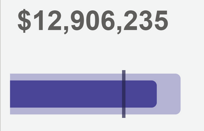
I have created a Deneb visual that concatenates a view with a text mark on top of a bullet chart/gauge.
I want to create a legend that explains what the 2 bars and the tick mark mean. But I'm not sure how/where to include it in the visual. I need the symbols on the legend to match the colors in the visual. If I can't make one "natively", I am fine getting creative and concatenating a "fake" one on the bottom. I'd rather it be inside the Deneb visual rather than layering another Power BI visual on top of it. But I'm struggling to figure out the best way to handle this. Vega-lite code is below.
{
"data": {"name": "dataset"},
"vconcat": [
{
"mark": {
"type": "text",
"fontSize": 40,
"align": "left",
"baseline": "top",
"dy": 20,
"fontWeight": "bold"
},
"encoding": {
"text": {
"field": "Actual",
"type": "quantitative",
"format": "$,.0f"
},
"color": {"expr": "pbicolor(3)"}
}
},
{ "width": "300",
"encoding": {
"x": {
"type": "quantitative",
"scale": {"nice": false},
"title": null,
"axis": null
},
"y": {"type": "nominal"},
"tooltip": [
{"field": "Actual"},
{"field": "Budget"},
{"field": "Projection"}
]
},
"layer": [
{
"mark": {
"type": "bar",
"cornerRadiusEnd": 8,
"color": {
"expr": "pbiColor(4, .6)"
},
"size": 60
},
"encoding": {
"x": {"field": "Budget"}
}
},
{
"mark": {
"type": "bar",
"cornerRadiusEnd": 8,
"color": {
"expr": "pbiColor(4)"
},
"size": 40
},
"encoding": {
"x": {"field": "Actual"}
}
},
{
"mark": {
"type": "tick",
"height": 70,
"thickness": 5,
"color": {
"expr": "pbiColor(4,-.5)"
}
},
"encoding": {
"x": {"field": "Projection"}
}
}
]
}
]
}
Solved! Go to Solution.
- Mark as New
- Bookmark
- Subscribe
- Mute
- Subscribe to RSS Feed
- Permalink
- Report Inappropriate Content
Ok, I got it working following this custom legend tutorial from Enterprise DNA: https://forum.enterprisedna.co/t/deneb-examples-legends/28900. I don't love that I had to make a fake chart, but it does work well. Basically add another view to the vconcat, make a fake chart using an arc marc with a radius of zero. Hard code the legend values in the data for that view.


