FabCon is coming to Atlanta
Join us at FabCon Atlanta from March 16 - 20, 2026, for the ultimate Fabric, Power BI, AI and SQL community-led event. Save $200 with code FABCOMM.
Register now!- Power BI forums
- Get Help with Power BI
- Desktop
- Service
- Report Server
- Power Query
- Mobile Apps
- Developer
- DAX Commands and Tips
- Custom Visuals Development Discussion
- Health and Life Sciences
- Power BI Spanish forums
- Translated Spanish Desktop
- Training and Consulting
- Instructor Led Training
- Dashboard in a Day for Women, by Women
- Galleries
- Data Stories Gallery
- Themes Gallery
- Contests Gallery
- QuickViz Gallery
- Quick Measures Gallery
- Visual Calculations Gallery
- Notebook Gallery
- Translytical Task Flow Gallery
- TMDL Gallery
- R Script Showcase
- Webinars and Video Gallery
- Ideas
- Custom Visuals Ideas (read-only)
- Issues
- Issues
- Events
- Upcoming Events
Get Fabric Certified for FREE during Fabric Data Days. Don't miss your chance! Request now
- Power BI forums
- Forums
- Get Help with Power BI
- Desktop
- How to create a Streamline in Power BI?
- Subscribe to RSS Feed
- Mark Topic as New
- Mark Topic as Read
- Float this Topic for Current User
- Bookmark
- Subscribe
- Printer Friendly Page
- Mark as New
- Bookmark
- Subscribe
- Mute
- Subscribe to RSS Feed
- Permalink
- Report Inappropriate Content
How to create a Streamline in Power BI?
Hi guys!
On a visualization level, how can I create a streamline in Power bi? Basically I have some dates that I want to show people to track the status of one delivery. So for example
| Delivery | Creation date | Picking Date | Packing date | PGI | Shipment |
| X | 13/02/2018 | 13/02/2018 | 14/02/2018 | 14/02/2018 | 15/02/2018 |
I have it actually exactly like this, as a table in my report but I want to make it visually better, Any recommendation?
Thanks!
Solved! Go to Solution.
- Mark as New
- Bookmark
- Subscribe
- Mute
- Subscribe to RSS Feed
- Permalink
- Report Inappropriate Content
Try the below:
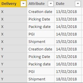
- Unpivot your dates such that you will end up with three columns: Delivery, Attribute (Creation Date, Picking Date...etc.) & Date
- Create a Line chart
- Add attribute as Legend
- Add Date as Axis
- Add Delivery Values

- Mark as New
- Bookmark
- Subscribe
- Mute
- Subscribe to RSS Feed
- Permalink
- Report Inappropriate Content
Hi @Anonymous
Based on my test, there are two custom visuals you may try.
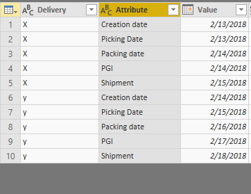
In Editor Queries, select columns from "Creation date" to "Shipment", then go to "Transform"->Unpivot columns
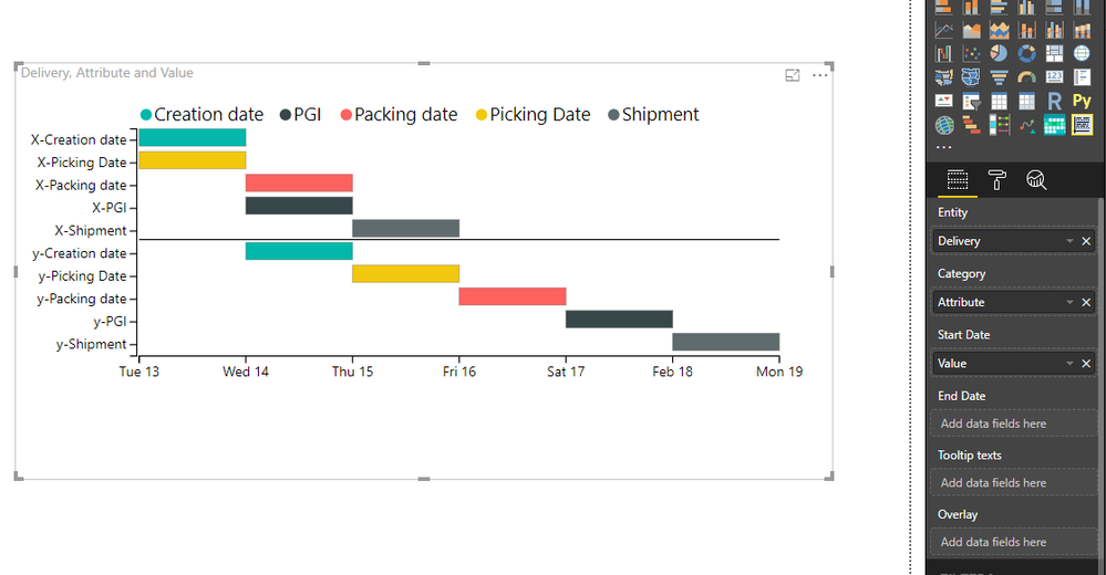
Import custom visuals from Market place,
1."as Timeline"
In picture above, Turn on behavior->stack
If you turn off behavior->stack, it will show as below
2."Gantt"
Please refer to my pbix
Best Regards
Maggie
- Mark as New
- Bookmark
- Subscribe
- Mute
- Subscribe to RSS Feed
- Permalink
- Report Inappropriate Content
Hi @Anonymous
Based on my test, there are two custom visuals you may try.
In Editor Queries, select columns from "Creation date" to "Shipment", then go to "Transform"->Unpivot columns

Import custom visuals from Market place,
1."as Timeline"
In picture above, Turn on behavior->stack
If you turn off behavior->stack, it will show as below
2."Gantt"
Please refer to my pbix
Best Regards
Maggie
- Mark as New
- Bookmark
- Subscribe
- Mute
- Subscribe to RSS Feed
- Permalink
- Report Inappropriate Content
Thank you guys!!
- Mark as New
- Bookmark
- Subscribe
- Mute
- Subscribe to RSS Feed
- Permalink
- Report Inappropriate Content
Try the below:
- Unpivot your dates such that you will end up with three columns: Delivery, Attribute (Creation Date, Picking Date...etc.) & Date
- Create a Line chart
- Add attribute as Legend
- Add Date as Axis
- Add Delivery Values


Helpful resources

Power BI Monthly Update - November 2025
Check out the November 2025 Power BI update to learn about new features.

Fabric Data Days
Advance your Data & AI career with 50 days of live learning, contests, hands-on challenges, study groups & certifications and more!

