FabCon is coming to Atlanta
Join us at FabCon Atlanta from March 16 - 20, 2026, for the ultimate Fabric, Power BI, AI and SQL community-led event. Save $200 with code FABCOMM.
Register now!- Power BI forums
- Get Help with Power BI
- Desktop
- Service
- Report Server
- Power Query
- Mobile Apps
- Developer
- DAX Commands and Tips
- Custom Visuals Development Discussion
- Health and Life Sciences
- Power BI Spanish forums
- Translated Spanish Desktop
- Training and Consulting
- Instructor Led Training
- Dashboard in a Day for Women, by Women
- Galleries
- Data Stories Gallery
- Themes Gallery
- Contests Gallery
- Quick Measures Gallery
- Notebook Gallery
- Translytical Task Flow Gallery
- TMDL Gallery
- R Script Showcase
- Webinars and Video Gallery
- Ideas
- Custom Visuals Ideas (read-only)
- Issues
- Issues
- Events
- Upcoming Events
To celebrate FabCon Vienna, we are offering 50% off select exams. Ends October 3rd. Request your discount now.
- Power BI forums
- Forums
- Get Help with Power BI
- Desktop
- Re: How to create a Line Chart based on 3 tables w...
- Subscribe to RSS Feed
- Mark Topic as New
- Mark Topic as Read
- Float this Topic for Current User
- Bookmark
- Subscribe
- Printer Friendly Page
- Mark as New
- Bookmark
- Subscribe
- Mute
- Subscribe to RSS Feed
- Permalink
- Report Inappropriate Content
How to create a Line Chart based on 3 tables while mantaining a hierarchical relationship ?
Hi!!
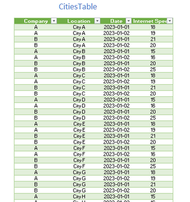
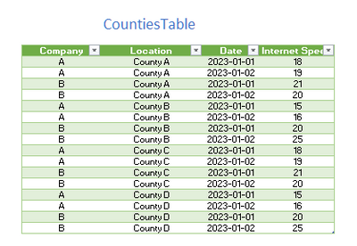
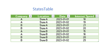
I've been trying tirelessly to solve without success. Let's say that I have 3 tables. one for cities , the other one for counties and the last one for states. for each tables this are the columns : [Company] [Location] [Date] [Internet Speed] .
ATENTION : The value of internet speed of a County or State does not equal the average of the internet speed values of the cities that belong to that state or county ( that is because, to return that data doesn't require just a simple average formula but a weighted average with parameters i don't have )
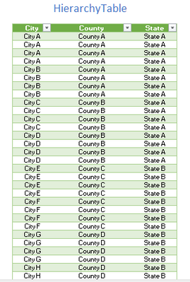
Of course there is a HIerarchical relationship table :
My GOAL is to create a Line Chart that shows Internet Speed vs Date , that is able to display 2 or more cities in the same chart OR 2 or more counties on that same chart OR 2 or more states on the same chart.
- Options that I've already tried
I tried appending the 3 tables and adding a column called LocationLevel ( city , county or state ) and i also tried leaving the 3 separated but creating a slicer where you can select wheter you want to see multiple cities, multiple counties or multiple states on that same exact chart but I've been having trouble making the final user of the dashboard use only that slicer to achieve what i want because I manually changed the legend and date field of the line chart in order to be able to show all options.
Would you be so kind as to help me or give me a hint? I asked chat gpt , bard and bing but thier answers sucked 😞
I tried creating dax measures like a basic switch that depending on a selectedvalue on a LocationLevel slicer it returned different columns ( location of the cityTable , location of the statesTable or location of the countyTable ) so i can place that in the legend field of the line chart visual but it does not seem to work ( it tried using VALUES , DISTINCT , SUMMARIZECOLUMNS but nothing works ) @amitchandak @Ritaf1983 @Ashish_Mathur @Ahmedx @MFelix @mlsx4 @Nathaniel_C @Greg_Deckler
Thanks!!
Ignacio Kairuz
- Mark as New
- Bookmark
- Subscribe
- Mute
- Subscribe to RSS Feed
- Permalink
- Report Inappropriate Content
Hi @ignaciokairuz ,
First of you may wish to google the fairly new Field Parameters in Power BI. Second I would repost this with a copy and paste of the four tables from Excel. If you do this, we may be able to copy your data directly into our Power BI - pictures will not do that. Third, how are you dates set up? Is that year month date? Fourth, are you just comparing two entities at a time? What do the companies have to do with your graph - is that extraneous data? Fifth, I would repost this as a new question after you make the changes and answer those questions. That way you willl get better exposure.
Let me know if you have any questions.
If this solves your issues, please mark it as the solution, so that others can find it easily. Kudos 👍are nice too.
Nathaniel
Did I answer your question? Mark my post as a solution!
Proud to be a Super User!


