- Power BI forums
- Get Help with Power BI
- Desktop
- Service
- Report Server
- Power Query
- Mobile Apps
- Developer
- DAX Commands and Tips
- Custom Visuals Development Discussion
- Health and Life Sciences
- Power BI Spanish forums
- Translated Spanish Desktop
- Training and Consulting
- Instructor Led Training
- Dashboard in a Day for Women, by Women
- Galleries
- Data Stories Gallery
- Themes Gallery
- Contests Gallery
- Quick Measures Gallery
- Notebook Gallery
- Translytical Task Flow Gallery
- TMDL Gallery
- R Script Showcase
- Webinars and Video Gallery
- Ideas
- Custom Visuals Ideas (read-only)
- Issues
- Issues
- Events
- Upcoming Events
To celebrate FabCon Vienna, we are offering 50% off select exams. Ends October 3rd. Request your discount now.
- Power BI forums
- Forums
- Get Help with Power BI
- Desktop
- Re: How to count the number of users who belong to...
- Subscribe to RSS Feed
- Mark Topic as New
- Mark Topic as Read
- Float this Topic for Current User
- Bookmark
- Subscribe
- Printer Friendly Page
- Mark as New
- Bookmark
- Subscribe
- Mute
- Subscribe to RSS Feed
- Permalink
- Report Inappropriate Content
How to count the number of users who belong to only one Category
▷ What you want to achieve
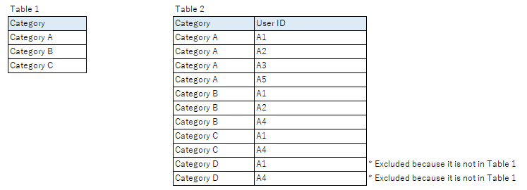
When Table 1 [Category] = Table 2 [Category], I want to count the number of users who belong to only one Category per Category.
For example, there are four users who belong to Category A (A1, A2, A3, A5). Of these, only Category A belongs to two people, A3 and A5, so I would like to display "2".
▷ Data source sample
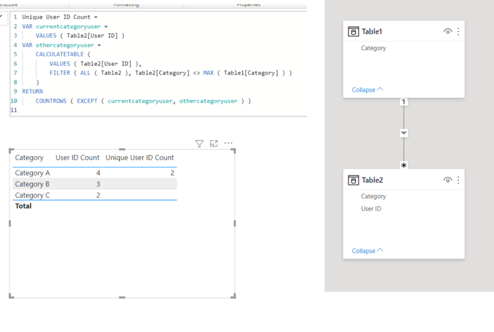
I was able to count the number of users who belong to each Category, but I have not been able to calculate the number of users who belong to only one Category.
If anyone knows how to do that, please let me know.
Thank you.
Solved! Go to Solution.
- Mark as New
- Bookmark
- Subscribe
- Mute
- Subscribe to RSS Feed
- Permalink
- Report Inappropriate Content
Hi, @Lopez0090
Please check the below picture and the sample pbix file's link down below.
Hi, My name is Jihwan Kim.
If this post helps, then please consider accept it as the solution to help other members find it faster, and give a big thumbs up.
Linkedin: linkedin.com/in/jihwankim1975/
Twitter: twitter.com/Jihwan_JHKIM
If this post helps, then please consider accepting it as the solution to help other members find it faster, and give a big thumbs up.
Click here to visit my LinkedIn page
Click here to schedule a short Teams meeting to discuss your question.
- Mark as New
- Bookmark
- Subscribe
- Mute
- Subscribe to RSS Feed
- Permalink
- Report Inappropriate Content
Hi, @Lopez0090
Thank you for your explanation.
Please check the below picture and the link down below.
All measures are in the sample pbix file.
https://www.dropbox.com/s/n905sqv8x6p5iec/lopezv2.pbix?dl=0
If this post helps, then please consider accepting it as the solution to help other members find it faster, and give a big thumbs up.
Click here to visit my LinkedIn page
Click here to schedule a short Teams meeting to discuss your question.
- Mark as New
- Bookmark
- Subscribe
- Mute
- Subscribe to RSS Feed
- Permalink
- Report Inappropriate Content
Hi, @Lopez0090
Please check the below picture and the sample pbix file's link down below.
Hi, My name is Jihwan Kim.
If this post helps, then please consider accept it as the solution to help other members find it faster, and give a big thumbs up.
Linkedin: linkedin.com/in/jihwankim1975/
Twitter: twitter.com/Jihwan_JHKIM
If this post helps, then please consider accepting it as the solution to help other members find it faster, and give a big thumbs up.
Click here to visit my LinkedIn page
Click here to schedule a short Teams meeting to discuss your question.
- Mark as New
- Bookmark
- Subscribe
- Mute
- Subscribe to RSS Feed
- Permalink
- Report Inappropriate Content
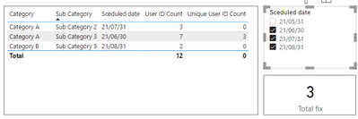
Is there a way to display the total of "Unique User ID Count" on the card visual?
Now it is "1", but I want to make it "3".
- Mark as New
- Bookmark
- Subscribe
- Mute
- Subscribe to RSS Feed
- Permalink
- Report Inappropriate Content
Hi, @Lopez0090
Thank you for your feedback.
I am not sure how you modified the measures.
Please try the below and let me know whether it works.
Total fix =
SUMX ( VALUES ( [yourcategorycolumn] ), [Unique User ID Count] )
Or, please share your sample pbix file's link here, then I can try to look into it and come up with a more accurate measure.
Thanks.
If this post helps, then please consider accepting it as the solution to help other members find it faster, and give a big thumbs up.
Click here to visit my LinkedIn page
Click here to schedule a short Teams meeting to discuss your question.
- Mark as New
- Bookmark
- Subscribe
- Mute
- Subscribe to RSS Feed
- Permalink
- Report Inappropriate Content
It's done. Thank you very much.
If you don't mind, I'd like to ask one more question, and I'll prepare a sample report.
- Mark as New
- Bookmark
- Subscribe
- Mute
- Subscribe to RSS Feed
- Permalink
- Report Inappropriate Content
Hi, @Lopez0090
Thank you for your feedback, and I will wait for your next message.
If this post helps, then please consider accepting it as the solution to help other members find it faster, and give a big thumbs up.
Click here to visit my LinkedIn page
Click here to schedule a short Teams meeting to discuss your question.
- Mark as New
- Bookmark
- Subscribe
- Mute
- Subscribe to RSS Feed
- Permalink
- Report Inappropriate Content
Hi, @Jihwan_Kim
A sample report is attached.
I couldn't attach the file as it is, so I made the file into a URL.
You will be redirected to another page, so please download it.
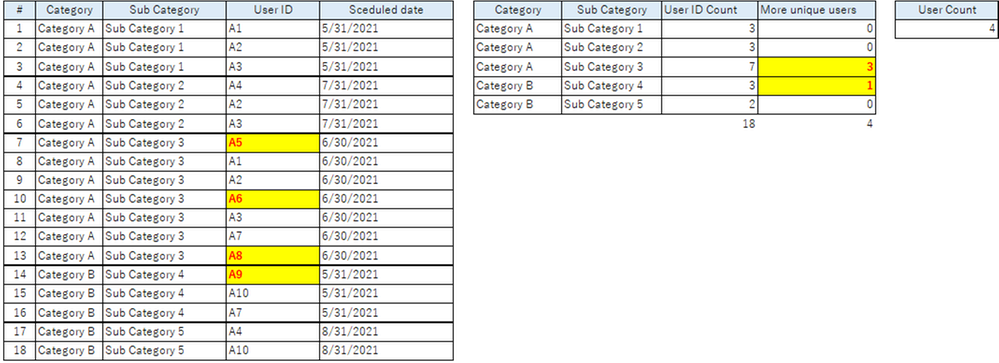
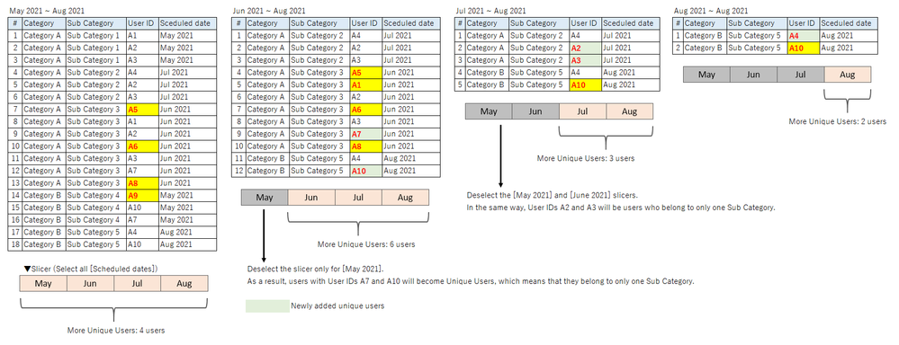
In the period May 2021 - Aug 2021, there are three users in Sub Category 3 and one in Sub Category 4, who belong to only one Sub Category.
Suppose May 2021 has passed.
In the next period from June 2021 to Aug 2021, there will be five users in subcategory 3 and one user in subcategory 5 (for a total of six users) who belong to only one subcategory.
We would like to create a graph showing these numbers of people by month.
Can this be done?
please help me.
- Mark as New
- Bookmark
- Subscribe
- Mute
- Subscribe to RSS Feed
- Permalink
- Report Inappropriate Content
Hi, @Lopez0090
Sorry that I cannot understand the logic.
Can you please explain a little bit more?
More Unique Users
- May: 4
- June: 6
- July: I think it is 3
- August: I think it is 2
SubCategory Count (I cannot know the logic)
- May:
- June:
- July:
- August:
If this post helps, then please consider accepting it as the solution to help other members find it faster, and give a big thumbs up.
Click here to visit my LinkedIn page
Click here to schedule a short Teams meeting to discuss your question.
- Mark as New
- Bookmark
- Subscribe
- Mute
- Subscribe to RSS Feed
- Permalink
- Report Inappropriate Content
I'm sorry I didn't explain the logic better.
We would like to see how the number of unique users changes when we change the range we select each month.
How about this?
- Mark as New
- Bookmark
- Subscribe
- Mute
- Subscribe to RSS Feed
- Permalink
- Report Inappropriate Content
Hi, @Lopez0090
Is the number in this picture different than the previous one?
I cannot know which one you want to show. Is the number in the upper picture below? Or is the number in the lower picture below?
I only can understand the number below.
- May: 4
- June: 6
- July: I think it is 3 (Am I correct or not? I assume I am correct)
- August: I think it is 2 (Am I correct or not? I assume I am correct)
I only can show a line in the pbix file. please check.
https://www.dropbox.com/s/n905sqv8x6p5iec/lopezv2.pbix?dl=0
If this post helps, then please consider accepting it as the solution to help other members find it faster, and give a big thumbs up.
Click here to visit my LinkedIn page
Click here to schedule a short Teams meeting to discuss your question.
- Mark as New
- Bookmark
- Subscribe
- Mute
- Subscribe to RSS Feed
- Permalink
- Report Inappropriate Content
Hi, @Jihwan_Kim
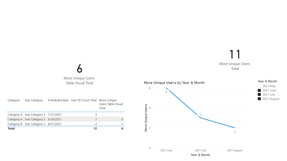
Sorry. The graph was wrong. Here is the correct one.
- May: 4
- June: 6
- July: 3
- August: 2
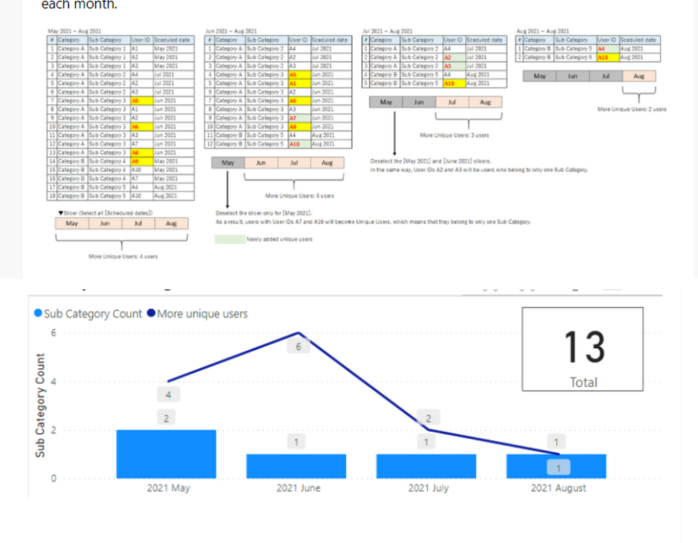
The value of "More Unique Users" in the image (img:1) = The value of the line chart in the image (img:2).
When all [Scheduled date] are selected, "4" will be displayed. This is correct.
Deselect the slicer only for [May 2021].
Right now, "3" is displayed, but I want to display the value "6" as in img:1 and img:2.
I want to use these in Table 1 and Table 2 to create a graph like the one in image (img:2).
img:1
img:2
I am attaching the modified pbix file again, just in case.
- Mark as New
- Bookmark
- Subscribe
- Mute
- Subscribe to RSS Feed
- Permalink
- Report Inappropriate Content
Hi, @Lopez0090
Thank you for your explanation.
Please check the below picture and the link down below.
All measures are in the sample pbix file.
https://www.dropbox.com/s/n905sqv8x6p5iec/lopezv2.pbix?dl=0
If this post helps, then please consider accepting it as the solution to help other members find it faster, and give a big thumbs up.
Click here to visit my LinkedIn page
Click here to schedule a short Teams meeting to discuss your question.
- Mark as New
- Bookmark
- Subscribe
- Mute
- Subscribe to RSS Feed
- Permalink
- Report Inappropriate Content
- Mark as New
- Bookmark
- Subscribe
- Mute
- Subscribe to RSS Feed
- Permalink
- Report Inappropriate Content
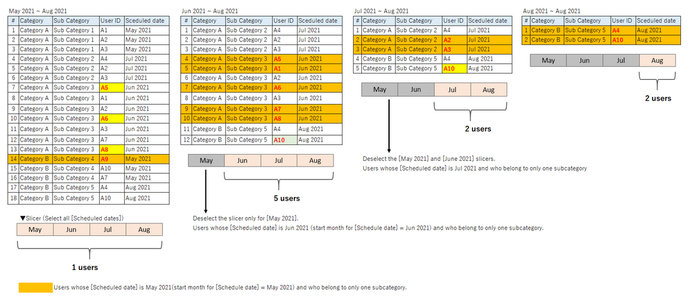
Please tell me one last thing.
Currently, the slicer shows the number of people when the range of [Schedule date] is changed.
furthermore, is it possible to count the number of people who fall under the start month in the range as shown in the figure below?
- May: 1
- June: 5
- July: 2
- August: 2
- Mark as New
- Bookmark
- Subscribe
- Mute
- Subscribe to RSS Feed
- Permalink
- Report Inappropriate Content
Hi, @Lopez0090
Please check the below picture and the link down below.
https://www.dropbox.com/s/n905sqv8x6p5iec/lopezv2.pbix?dl=0
If this post helps, then please consider accepting it as the solution to help other members find it faster, and give a big thumbs up.
Click here to visit my LinkedIn page
Click here to schedule a short Teams meeting to discuss your question.
- Mark as New
- Bookmark
- Subscribe
- Mute
- Subscribe to RSS Feed
- Permalink
- Report Inappropriate Content
Thank you for your prompt reply! It's done!

