Huge last-minute discounts for FabCon Vienna from September 15-18, 2025
Supplies are limited. Contact info@espc.tech right away to save your spot before the conference sells out.
Get your discount- Power BI forums
- Get Help with Power BI
- Desktop
- Service
- Report Server
- Power Query
- Mobile Apps
- Developer
- DAX Commands and Tips
- Custom Visuals Development Discussion
- Health and Life Sciences
- Power BI Spanish forums
- Translated Spanish Desktop
- Training and Consulting
- Instructor Led Training
- Dashboard in a Day for Women, by Women
- Galleries
- Data Stories Gallery
- Themes Gallery
- Contests Gallery
- Quick Measures Gallery
- Notebook Gallery
- Translytical Task Flow Gallery
- TMDL Gallery
- R Script Showcase
- Webinars and Video Gallery
- Ideas
- Custom Visuals Ideas (read-only)
- Issues
- Issues
- Events
- Upcoming Events
Score big with last-minute savings on the final tickets to FabCon Vienna. Secure your discount
- Power BI forums
- Forums
- Get Help with Power BI
- Desktop
- How to connect a list of two xy series (start-end ...
- Subscribe to RSS Feed
- Mark Topic as New
- Mark Topic as Read
- Float this Topic for Current User
- Bookmark
- Subscribe
- Printer Friendly Page
- Mark as New
- Bookmark
- Subscribe
- Mute
- Subscribe to RSS Feed
- Permalink
- Report Inappropriate Content
How to connect a list of two xy series (start-end points)?
Hello
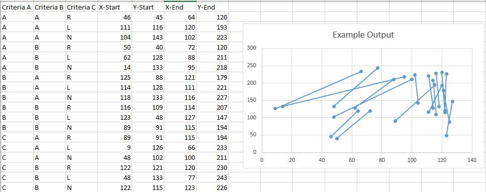
I am trying plot a few hundred or maybe thousands of paired (start and end) xy series with a line connected the two points. I have done it successfully in Excel by follwoing this tutorial The data and the plot look like this:
I am wondering if I can do the same in PowerBI so I can add filters to filter the data base on the criteria.
Thanks
Solved! Go to Solution.
- Mark as New
- Bookmark
- Subscribe
- Mute
- Subscribe to RSS Feed
- Permalink
- Report Inappropriate Content
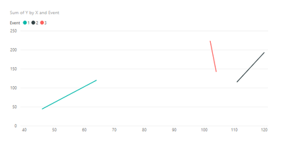
If you model your data like the below then you can use the native line chart visualisation.
You need to do the following:
1) Add a unique transaction \ event id
2) pivot the start and end coordinates onto their own row
I have included the solution on a PBIX workbook you can download here: Download
- Mark as New
- Bookmark
- Subscribe
- Mute
- Subscribe to RSS Feed
- Permalink
- Report Inappropriate Content
To fenchurchio
This is perfect, thanks so much for the help.
To v-chuncz-msft (Community Support Team)
I didn't know that it can interface with R, I will definitely look into it.
- Mark as New
- Bookmark
- Subscribe
- Mute
- Subscribe to RSS Feed
- Permalink
- Report Inappropriate Content
If you model your data like the below then you can use the native line chart visualisation.
You need to do the following:
1) Add a unique transaction \ event id
2) pivot the start and end coordinates onto their own row
I have included the solution on a PBIX workbook you can download here: Download
- Mark as New
- Bookmark
- Subscribe
- Mute
- Subscribe to RSS Feed
- Permalink
- Report Inappropriate Content
Hi,
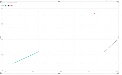
thanks, this is exactly what I was looking for. However, this does not seem to work with vertical lines or am i doing something wrong?
thanks
Stefan
- Mark as New
- Bookmark
- Subscribe
- Mute
- Subscribe to RSS Feed
- Permalink
- Report Inappropriate Content
You may try Create Power BI visuals using R.
https://www.rdocumentation.org/packages/graphics/versions/3.6.1/topics/segments
If this post helps, then please consider Accept it as the solution to help the other members find it more quickly.
Helpful resources
| User | Count |
|---|---|
| 66 | |
| 60 | |
| 47 | |
| 33 | |
| 32 |
| User | Count |
|---|---|
| 87 | |
| 72 | |
| 56 | |
| 49 | |
| 45 |


