FabCon is coming to Atlanta
Join us at FabCon Atlanta from March 16 - 20, 2026, for the ultimate Fabric, Power BI, AI and SQL community-led event. Save $200 with code FABCOMM.
Register now!- Power BI forums
- Get Help with Power BI
- Desktop
- Service
- Report Server
- Power Query
- Mobile Apps
- Developer
- DAX Commands and Tips
- Custom Visuals Development Discussion
- Health and Life Sciences
- Power BI Spanish forums
- Translated Spanish Desktop
- Training and Consulting
- Instructor Led Training
- Dashboard in a Day for Women, by Women
- Galleries
- Data Stories Gallery
- Themes Gallery
- Contests Gallery
- QuickViz Gallery
- Quick Measures Gallery
- Visual Calculations Gallery
- Notebook Gallery
- Translytical Task Flow Gallery
- TMDL Gallery
- R Script Showcase
- Webinars and Video Gallery
- Ideas
- Custom Visuals Ideas (read-only)
- Issues
- Issues
- Events
- Upcoming Events
View all the Fabric Data Days sessions on demand. View schedule
- Power BI forums
- Forums
- Get Help with Power BI
- Desktop
- How to combine 2 report into 1
- Subscribe to RSS Feed
- Mark Topic as New
- Mark Topic as Read
- Float this Topic for Current User
- Bookmark
- Subscribe
- Printer Friendly Page
- Mark as New
- Bookmark
- Subscribe
- Mute
- Subscribe to RSS Feed
- Permalink
- Report Inappropriate Content
How to combine 2 report into 1
Hi all,
We have a table named opportunity and now we want to show the result from 2 report into 1. The main table structure is like below
Opportunity ID | Opportunity Name | Expected Billing Date | Expected Order In Take Date | Amount
The first report, I used the column Expected Billing Date and Amount to form a Stacked column chart.
And the second report, I used the column Expected Order In Take Date and Amount to form another Stacked column chart.
My user request me to show these 2 stacked column charts into 1, so that they can compare the expected billing & expected order in report for each month.
Is it possible to perform on Power BI?
Thank you very much
Solved! Go to Solution.
- Mark as New
- Bookmark
- Subscribe
- Mute
- Subscribe to RSS Feed
- Permalink
- Report Inappropriate Content
Hi @sg0510,
If I understand you correctly, you should be able to follow steps below to show Amount for both Expected billing date and Expected Order In Take date in a single chart.
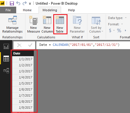
1. Create an individual Date table if you don't have one yet.
Date = CALENDAR("2017/01/01","2017/12/31")
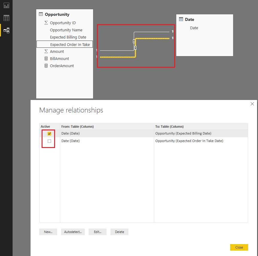
2. Create two relationship between Opportunity table and Date table like below.
- Expected billing date and Date (Active)
- Expected Order In Take Date (Inactive)
3. Use the formulas below to create two measures to calculate Amount for Expected billing date and Expected Order In Take date separately.
BillAmount = SUM(Opportunity[Amount])
OrderAmount =
CALCULATE (
    SUM ( Opportunity[Amount] ),
    USERELATIONSHIP ( Opportunity[Expected Order In Take Date], 'Date'[Date] )
)
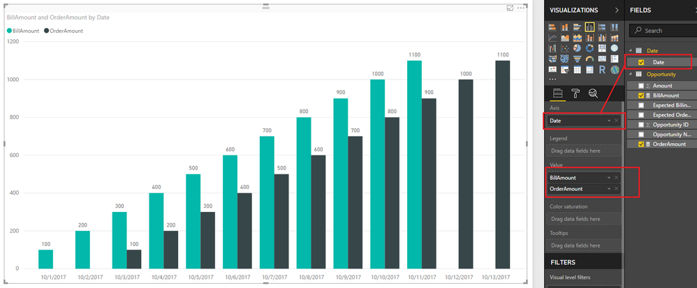
4. Show the two measures as Values, and Date[Date] column as Axis on the Chart visual.
Here is the sample pbix file for your reference. ![]()
Regards
- Mark as New
- Bookmark
- Subscribe
- Mute
- Subscribe to RSS Feed
- Permalink
- Report Inappropriate Content
Hi @sg0510,
If you simply want to use 2 different data sources in one report that is possible in Power BI just import both the sources, and you should be able to use them both.
Here is a link for the documenation about multiple sources:
If you want to use both sources together in one visualisation for example you may need to create a relationship in the "relationship pane"
Here is a link for the documentation about relationships:
https://powerbi.microsoft.com/en-us/documentation/powerbi-desktop-create-and-manage-relationships/
Regards,
L.Meijdam
- Mark as New
- Bookmark
- Subscribe
- Mute
- Subscribe to RSS Feed
- Permalink
- Report Inappropriate Content
Thank you very much L.Meijgam.
I got your message clearly.
But if my 2 reports come from the same data source and same table, is it possible to present in 1 chart?
We need to do this because the amount is store in the opportunity table but they have 2 different date field for grouping
1. Expected billing date
2. Expected Order In Take date.
Thanks again
- Mark as New
- Bookmark
- Subscribe
- Mute
- Subscribe to RSS Feed
- Permalink
- Report Inappropriate Content
Hi @sg0510,
If I understand you correctly, you should be able to follow steps below to show Amount for both Expected billing date and Expected Order In Take date in a single chart.
1. Create an individual Date table if you don't have one yet.
Date = CALENDAR("2017/01/01","2017/12/31")
2. Create two relationship between Opportunity table and Date table like below.
- Expected billing date and Date (Active)
- Expected Order In Take Date (Inactive)
3. Use the formulas below to create two measures to calculate Amount for Expected billing date and Expected Order In Take date separately.
BillAmount = SUM(Opportunity[Amount])
OrderAmount =
CALCULATE (
    SUM ( Opportunity[Amount] ),
    USERELATIONSHIP ( Opportunity[Expected Order In Take Date], 'Date'[Date] )
)
4. Show the two measures as Values, and Date[Date] column as Axis on the Chart visual.
Here is the sample pbix file for your reference. ![]()
Regards
- Mark as New
- Bookmark
- Subscribe
- Mute
- Subscribe to RSS Feed
- Permalink
- Report Inappropriate Content
Thank you so much v-ljerr-msft.
You helped me to solve my problems and thanks again for your clear guideline and reference.![]()
- Mark as New
- Bookmark
- Subscribe
- Mute
- Subscribe to RSS Feed
- Permalink
- Report Inappropriate Content
Hi @sg0510,
I think that should be no problem if you add correct relationships, you could always try it first with a small sample dataset to test it.
L.Meijdam
Helpful resources

Power BI Monthly Update - November 2025
Check out the November 2025 Power BI update to learn about new features.

Fabric Data Days
Advance your Data & AI career with 50 days of live learning, contests, hands-on challenges, study groups & certifications and more!


