FabCon is coming to Atlanta
Join us at FabCon Atlanta from March 16 - 20, 2026, for the ultimate Fabric, Power BI, AI and SQL community-led event. Save $200 with code FABCOMM.
Register now!- Power BI forums
- Get Help with Power BI
- Desktop
- Service
- Report Server
- Power Query
- Mobile Apps
- Developer
- DAX Commands and Tips
- Custom Visuals Development Discussion
- Health and Life Sciences
- Power BI Spanish forums
- Translated Spanish Desktop
- Training and Consulting
- Instructor Led Training
- Dashboard in a Day for Women, by Women
- Galleries
- Data Stories Gallery
- Themes Gallery
- Contests Gallery
- QuickViz Gallery
- Quick Measures Gallery
- Visual Calculations Gallery
- Notebook Gallery
- Translytical Task Flow Gallery
- TMDL Gallery
- R Script Showcase
- Webinars and Video Gallery
- Ideas
- Custom Visuals Ideas (read-only)
- Issues
- Issues
- Events
- Upcoming Events
View all the Fabric Data Days sessions on demand. View schedule
- Power BI forums
- Forums
- Get Help with Power BI
- Desktop
- How to color line chart in power bi
- Subscribe to RSS Feed
- Mark Topic as New
- Mark Topic as Read
- Float this Topic for Current User
- Bookmark
- Subscribe
- Printer Friendly Page
- Mark as New
- Bookmark
- Subscribe
- Mute
- Subscribe to RSS Feed
- Permalink
- Report Inappropriate Content
How to color line chart in power bi
Hello All,
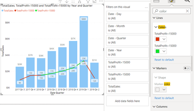
I have a line and stacked column chart where I am showing sales in bar and porfit in line and I need to color the line based on profit.
Is it possible in Power Bi ?
Could any one please help
Solved! Go to Solution.
- Mark as New
- Bookmark
- Subscribe
- Mute
- Subscribe to RSS Feed
- Permalink
- Report Inappropriate Content
Hey @Anonymous ,
I found this interesting thread that states a way of formatting the line according to conditions. You can see if it works out for you.
I even tried it using my data and it is working for me to some extent.
- Mark as New
- Bookmark
- Subscribe
- Mute
- Subscribe to RSS Feed
- Permalink
- Report Inappropriate Content
Can you provide sample data and a depiction of the expected outcome?
Did I answer your question? Mark my post as a solution!
In doing so, you are also helping me. Thank you!
Proud to be a Super User!
Paul on Linkedin.
- Mark as New
- Bookmark
- Subscribe
- Mute
- Subscribe to RSS Feed
- Permalink
- Report Inappropriate Content
Hi @PaulDBrown ,
Below is my sample data
Date Sales Profit
| 1/1/2021 | 100 | 10 |
| 1/2/2021 | 200 | 20 |
| 1/3/2021 | 300 | 30 |
| 1/4/2021 | 400 | 40 |
| 1/5/2021 | 500 | 50 |
I took a line and clisutered column and chart and put sales column values and porfit in line values.
Now I need chnage the color of the line for each date based on the porfit values.
if profit is lesstahan 30 then itb should be red else green
- Mark as New
- Bookmark
- Subscribe
- Mute
- Subscribe to RSS Feed
- Permalink
- Report Inappropriate Content
Hey @Anonymous ,
I found this interesting thread that states a way of formatting the line according to conditions. You can see if it works out for you.
I even tried it using my data and it is working for me to some extent.
- Mark as New
- Bookmark
- Subscribe
- Mute
- Subscribe to RSS Feed
- Permalink
- Report Inappropriate Content
Hi, @PC2790
You appear to be plotting the original line chart in two parts with different colors, right?
greater than 30 = IF(CALCULATE(SUM('Table'[value]))>=30,CALCULATE(SUM('Table'[Sales])),BLANK())less than 30 = IF(CALCULATE(SUM('Table'[value]))<30,CALCULATE(SUM('Table'[Sales])),BLANK())Surprised, didn't expect to achieve the same effect without conditional formatting.
I have learned a lot. Thanks for your sharing.
Best Regards,
Community Support Team _ Eason
- Mark as New
- Bookmark
- Subscribe
- Mute
- Subscribe to RSS Feed
- Permalink
- Report Inappropriate Content
Hi, @Anonymous
You can do the same for other graphs like bar and column chart.
However, it is not possible in line chart. You can't set multiple colors for a line chart. A line chart can only correspond to one color. Conditional formatting doesn't work here either.
But you can add a constant line to ‘Line Values’ to facilitate analyzing the data.
constant line= 30Best Regards,
Community Support Team _ Eason
Helpful resources

Power BI Monthly Update - November 2025
Check out the November 2025 Power BI update to learn about new features.

Fabric Data Days
Advance your Data & AI career with 50 days of live learning, contests, hands-on challenges, study groups & certifications and more!


