FabCon is coming to Atlanta
Join us at FabCon Atlanta from March 16 - 20, 2026, for the ultimate Fabric, Power BI, AI and SQL community-led event. Save $200 with code FABCOMM.
Register now!- Power BI forums
- Get Help with Power BI
- Desktop
- Service
- Report Server
- Power Query
- Mobile Apps
- Developer
- DAX Commands and Tips
- Custom Visuals Development Discussion
- Health and Life Sciences
- Power BI Spanish forums
- Translated Spanish Desktop
- Training and Consulting
- Instructor Led Training
- Dashboard in a Day for Women, by Women
- Galleries
- Data Stories Gallery
- Themes Gallery
- Contests Gallery
- QuickViz Gallery
- Quick Measures Gallery
- Visual Calculations Gallery
- Notebook Gallery
- Translytical Task Flow Gallery
- TMDL Gallery
- R Script Showcase
- Webinars and Video Gallery
- Ideas
- Custom Visuals Ideas (read-only)
- Issues
- Issues
- Events
- Upcoming Events
The Power BI Data Visualization World Championships is back! Get ahead of the game and start preparing now! Learn more
- Power BI forums
- Forums
- Get Help with Power BI
- Desktop
- How to calculate variance ?
- Subscribe to RSS Feed
- Mark Topic as New
- Mark Topic as Read
- Float this Topic for Current User
- Bookmark
- Subscribe
- Printer Friendly Page
- Mark as New
- Bookmark
- Subscribe
- Mute
- Subscribe to RSS Feed
- Permalink
- Report Inappropriate Content
How to calculate variance ?
Hello,
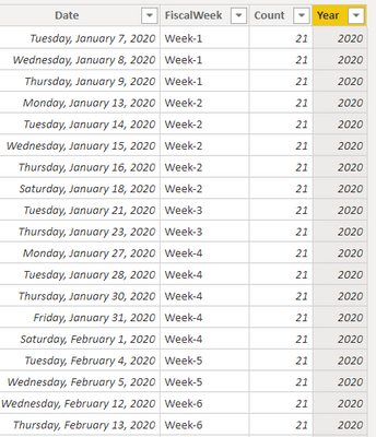
I have table that looks like this:
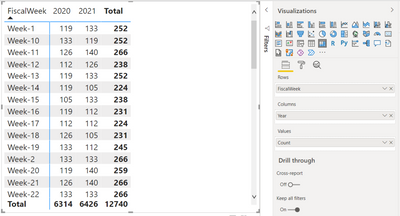
I created matrix like this:
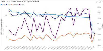
What i really need is matrics that has Variances which is 2021-2020 and also %YoY which would be Variance/2020.
So something like this:
| FiscalWeek | 2020 | 2021 | Variance | %YoY |
| Week-1 | 119 | 133 | 14 | 12% |
| Week-2 | 133 | 133 | 0 | 0% |
| Week-3 | 112 | 126 | 14 | 13% |
| Week-4 | 133 | 119 | -14 | -11% |
| Week-5 | 112 | 112 | 0 | 0% |
| Week-6 | 133 | 140 | 7 | 5% |
| Week-7 | 126 | 112 | -14 | -11% |
| Week-8 | 119 | 126 | 7 | 6% |
| Week-9 | 126 | 126 | 0 | 0% |
| Week-10 | 133 | 119 | -14 | -11% |
| Week-11 | 126 | 140 | 14 | 11% |
| Week-12 | 112 | 126 | 14 | 13% |
| Week-13 | 119 | 133 | 14 | 12% |
| Week-14 | 119 | 105 | -14 | -12% |
| Week-15 | 105 | 133 | 28 | 27% |
| Week-16 | 119 | 112 | -7 | -6% |
| Week-17 | 112 | 112 | 0 | 0% |
And ultimatelly i need to be able to grab data from 2020, 2021 and %YoY and plot it on the line chart.
Can this be done?
- Mark as New
- Bookmark
- Subscribe
- Mute
- Subscribe to RSS Feed
- Permalink
- Report Inappropriate Content
Hi, @Anonymous
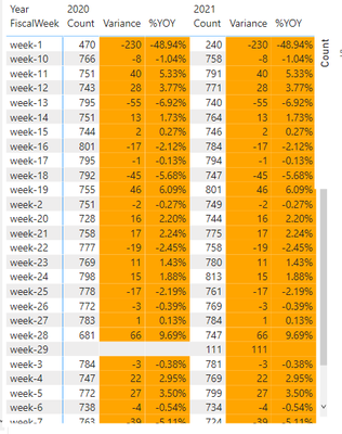
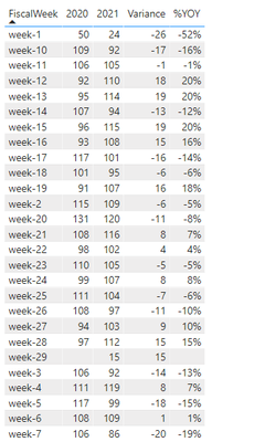
If you keep your data structure, then you can't get the above matrix effect, unless you pivot the year column, and then use a table to achieve such a visual effect.
Matrix:
Pivot the year column and use a table visual.
Please refer to the attachment below for details
Hope this helps.
Best Regards,
Community Support Team _ Zeon Zheng
If this post helps, then please consider Accept it as the solution to help the other members find it more quickly.
Helpful resources

Power BI Dataviz World Championships
The Power BI Data Visualization World Championships is back! Get ahead of the game and start preparing now!

| User | Count |
|---|---|
| 38 | |
| 38 | |
| 36 | |
| 28 | |
| 28 |
| User | Count |
|---|---|
| 124 | |
| 88 | |
| 74 | |
| 66 | |
| 65 |
