FabCon is coming to Atlanta
Join us at FabCon Atlanta from March 16 - 20, 2026, for the ultimate Fabric, Power BI, AI and SQL community-led event. Save $200 with code FABCOMM.
Register now!- Power BI forums
- Get Help with Power BI
- Desktop
- Service
- Report Server
- Power Query
- Mobile Apps
- Developer
- DAX Commands and Tips
- Custom Visuals Development Discussion
- Health and Life Sciences
- Power BI Spanish forums
- Translated Spanish Desktop
- Training and Consulting
- Instructor Led Training
- Dashboard in a Day for Women, by Women
- Galleries
- Data Stories Gallery
- Themes Gallery
- Contests Gallery
- Quick Measures Gallery
- Notebook Gallery
- Translytical Task Flow Gallery
- TMDL Gallery
- R Script Showcase
- Webinars and Video Gallery
- Ideas
- Custom Visuals Ideas (read-only)
- Issues
- Issues
- Events
- Upcoming Events
Calling all Data Engineers! Fabric Data Engineer (Exam DP-700) live sessions are back! Starting October 16th. Sign up.
- Power BI forums
- Forums
- Get Help with Power BI
- Desktop
- How to calculate different payment methods of supp...
- Subscribe to RSS Feed
- Mark Topic as New
- Mark Topic as Read
- Float this Topic for Current User
- Bookmark
- Subscribe
- Printer Friendly Page
- Mark as New
- Bookmark
- Subscribe
- Mute
- Subscribe to RSS Feed
- Permalink
- Report Inappropriate Content
How to calculate different payment methods of supplier and use it in visualizations
Dear all,
consider the following data model:
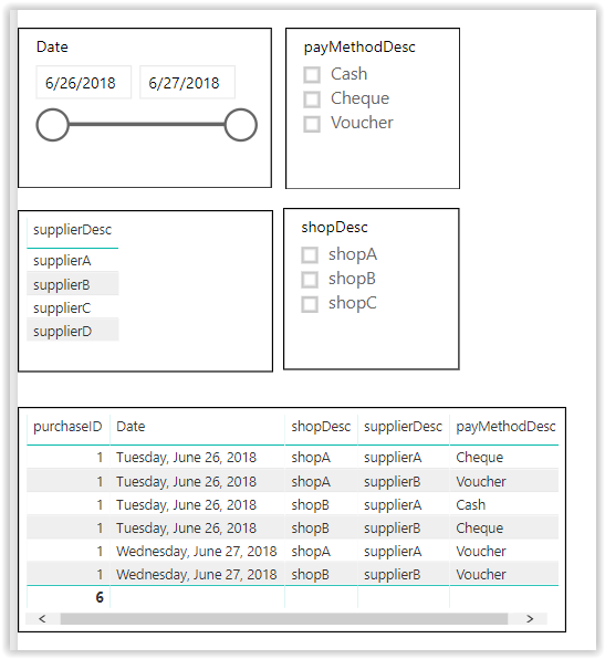
And the following test data:
I would like to visualize the comparison of the different payment methods used by each supplier.
For example
if slicers have no value,
supplier A have used Cheque,Cash and Voucher (3 payment methods)
supplier B have used Cheque and Voucher (2 payment methods)
Therefore a pie chart should have a legend of 2 and 3 with 50% each (because there is one supplier in each different payment method count)
if shopA is selected on slicer
supplier A have used Cheque and Voucher (2 payment methods)
supplier B have used Voucher (1 payment methods
Therefore a pie chart should have a legend of 2 and 1 with 50% each (because there is one supplier in each different payment method count)
pbix link :
https://drive.google.com/file/d/1n3A2FXGdMIvXTwHX_0zEFF8vTrDh3E6e/view?usp=sharing
Can you please help me how to accomplish this?
I have tried a number of things which failed.
For example, if a make a measure on supplier and use distinct count of payment methods, it is computed correctly but cannot use measure as legend on a pie chart.
Any help will be appreciated!
Kind regards,
Ioannis
Solved! Go to Solution.
- Mark as New
- Bookmark
- Subscribe
- Mute
- Subscribe to RSS Feed
- Permalink
- Report Inappropriate Content
I did manage to get it to work after all.
A table having initial values of different payment methods is created as
DiffP = SELECTCOLUMNS(CALENDAR(DATE(1899,12,31),DATE(1900,1,26)),"DiffPayTerms",int([Date]))
Then a measure that counts the suppliers of these different payments methods.
mDiffPTeerms =
IF(
COUNTROWS(
FILTER(SUMMARIZE(Purchases,Purchases[supplierID],"diffPTermsCalc",DISTINCTCOUNT(Purchases[payMethodID])),max(DiffP[DiffPayTerms])=[diffPTermsCalc])
) > 0 ,
COUNTROWS(FILTER(SUMMARIZE(Purchases,Purchases[supplierID],"diffPTermsCalc",DISTINCTCOUNT(Purchases[payMethodID])),max(DiffP[DiffPayTerms])=[diffPTermsCalc])),
BLANK())
if a value of different payment terms does not match the calculation from the data table, blank is returned.
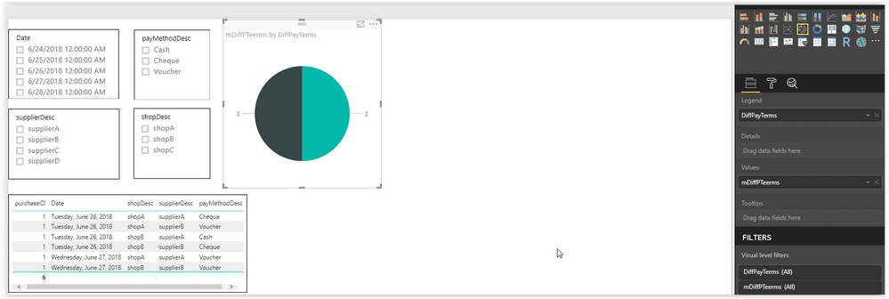
In this fashion, a pie chart can be constructed as
where it is depicted as 1 supplier exists having 3 different payment methodsand 1 supplier exists having 2 different payment methods.
- Mark as New
- Bookmark
- Subscribe
- Mute
- Subscribe to RSS Feed
- Permalink
- Report Inappropriate Content
Hi @jsdrolias
so if I understood correctly you want to count the purchases and differentiate it by suppliers and payment methods then put it on to a visual, correct?
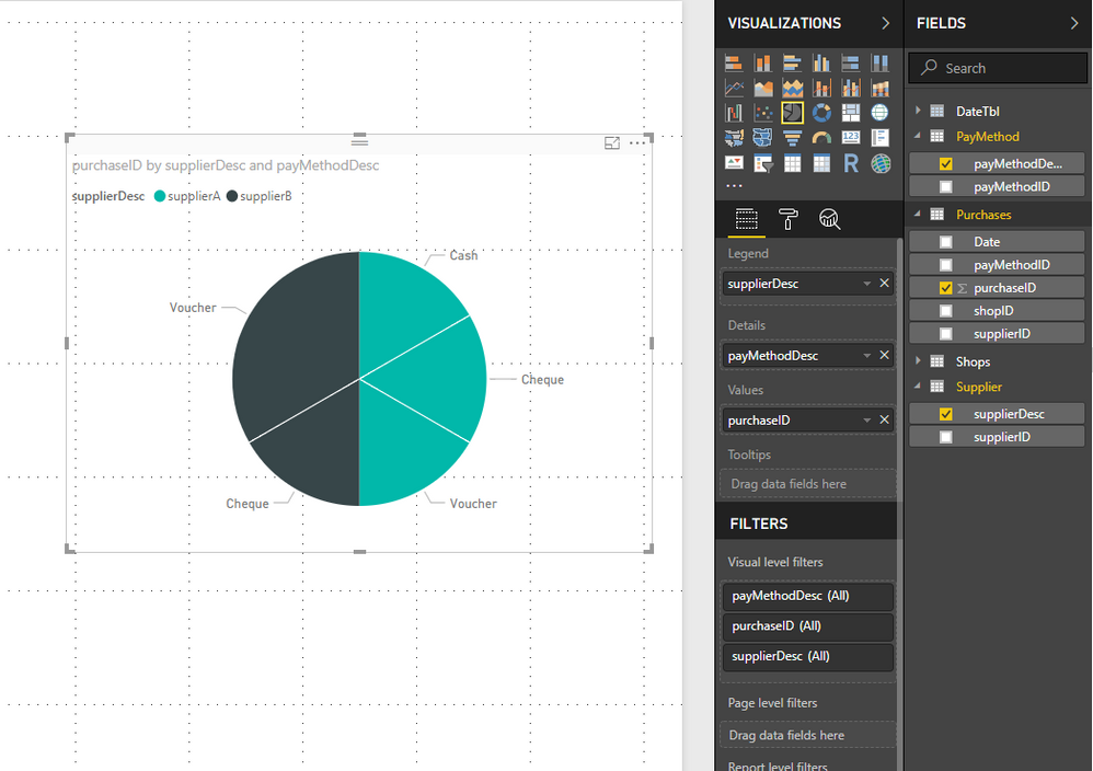
If so I made this pie chart and as far as I see you don't really have to make measures to visualise this problem.
The supplierDesc will provide the color legend and the payMethodDesc will provide the other. then I counted the purchesID-s as values of the chart.
Please tell me if it is what you wanted to achieve, and if not please ellaborate more your goal.
Bests,
Barna
- Mark as New
- Bookmark
- Subscribe
- Mute
- Subscribe to RSS Feed
- Permalink
- Report Inappropriate Content
hi @Barnee,
thank you for the post.
This is not exactly what I want to achieve.
I am not insterested in showing the particular payment methods rather than the different distinct payments methods used.
Therefore, the areas in a pie chart should be e.g. 1,2,3,4,5 depending on the different payments methods.
In simple words,
I want to be depicted that e.g.
33.33% of the supplier have used 1 payment method(only cash for example),
33.33% have used 2 payment methods(e.g. cash and vouchers) and
33.33% have used 3 payment methods (cash, vouchers,cheques).
I am not interested in showing the particular payment methods.
In this way, if a supplier has used cash and cheques and another supplier has used cash and vouchers, both cases count as a supplier having used 2 payment methods.
The only metrics of interest is the different payment methods and the percentage of suppliers using these distinct payment methods count.
Kind regards,
Ioannis
- Mark as New
- Bookmark
- Subscribe
- Mute
- Subscribe to RSS Feed
- Permalink
- Report Inappropriate Content
I did manage to get it to work after all.
A table having initial values of different payment methods is created as
DiffP = SELECTCOLUMNS(CALENDAR(DATE(1899,12,31),DATE(1900,1,26)),"DiffPayTerms",int([Date]))
Then a measure that counts the suppliers of these different payments methods.
mDiffPTeerms =
IF(
COUNTROWS(
FILTER(SUMMARIZE(Purchases,Purchases[supplierID],"diffPTermsCalc",DISTINCTCOUNT(Purchases[payMethodID])),max(DiffP[DiffPayTerms])=[diffPTermsCalc])
) > 0 ,
COUNTROWS(FILTER(SUMMARIZE(Purchases,Purchases[supplierID],"diffPTermsCalc",DISTINCTCOUNT(Purchases[payMethodID])),max(DiffP[DiffPayTerms])=[diffPTermsCalc])),
BLANK())
if a value of different payment terms does not match the calculation from the data table, blank is returned.
In this fashion, a pie chart can be constructed as
where it is depicted as 1 supplier exists having 3 different payment methodsand 1 supplier exists having 2 different payment methods.
Helpful resources

FabCon Global Hackathon
Join the Fabric FabCon Global Hackathon—running virtually through Nov 3. Open to all skill levels. $10,000 in prizes!

Power BI Monthly Update - September 2025
Check out the September 2025 Power BI update to learn about new features.


