Join us at FabCon Vienna from September 15-18, 2025
The ultimate Fabric, Power BI, SQL, and AI community-led learning event. Save €200 with code FABCOMM.
Get registered- Power BI forums
- Get Help with Power BI
- Desktop
- Service
- Report Server
- Power Query
- Mobile Apps
- Developer
- DAX Commands and Tips
- Custom Visuals Development Discussion
- Health and Life Sciences
- Power BI Spanish forums
- Translated Spanish Desktop
- Training and Consulting
- Instructor Led Training
- Dashboard in a Day for Women, by Women
- Galleries
- Data Stories Gallery
- Themes Gallery
- Contests Gallery
- Quick Measures Gallery
- Notebook Gallery
- Translytical Task Flow Gallery
- TMDL Gallery
- R Script Showcase
- Webinars and Video Gallery
- Ideas
- Custom Visuals Ideas (read-only)
- Issues
- Issues
- Events
- Upcoming Events
Compete to become Power BI Data Viz World Champion! First round ends August 18th. Get started.
- Power BI forums
- Forums
- Get Help with Power BI
- Desktop
- Re: How to align the vertical axis in the combined...
- Subscribe to RSS Feed
- Mark Topic as New
- Mark Topic as Read
- Float this Topic for Current User
- Bookmark
- Subscribe
- Printer Friendly Page
- Mark as New
- Bookmark
- Subscribe
- Mute
- Subscribe to RSS Feed
- Permalink
- Report Inappropriate Content
How to align the vertical axis in the combined stacked-column and inline chart
Hello Power Bi Community!
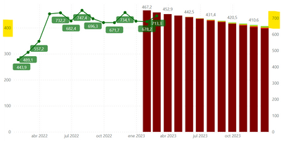
I would like to show a Stacked column and line charts where the y axis and the secundary y axis have the same scale when I apply a filter. I already applied a trick, setting the same data at both axis, but it doesn't work perfectly in some cases, as it can see in the picture below.
I hope I have made myself clear. Thanks in advance for your help.
Solved! Go to Solution.
- Mark as New
- Bookmark
- Subscribe
- Mute
- Subscribe to RSS Feed
- Permalink
- Report Inappropriate Content
Hi, @CarlosOlmos29
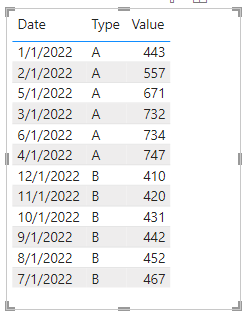
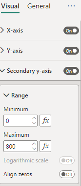
I simulated some data, hoping to match your situation, and you mainly look at the Y-axis setting range.
MeasureA = CALCULATE(SUM('Table'[Value]),FILTER(ALLEXCEPT('Table','Table'[Date]),[Type]="A"))MeasureB = CALCULATE(SUM('Table'[Value]),FILTER(ALLEXCEPT('Table','Table'[Date]),[Type]="B"))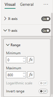
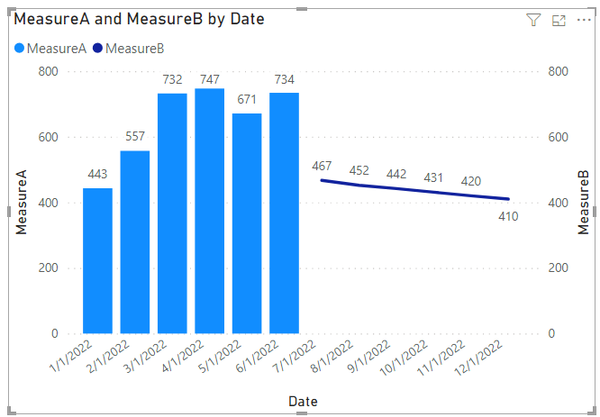
Result:
Is this the result you expect?
Best Regards,
Community Support Team _Charlotte
If this post helps, then please consider Accept it as the solution to help the other members find it more quickly.
- Mark as New
- Bookmark
- Subscribe
- Mute
- Subscribe to RSS Feed
- Permalink
- Report Inappropriate Content
Hi, @CarlosOlmos29
I simulated some data, hoping to match your situation, and you mainly look at the Y-axis setting range.
MeasureA = CALCULATE(SUM('Table'[Value]),FILTER(ALLEXCEPT('Table','Table'[Date]),[Type]="A"))MeasureB = CALCULATE(SUM('Table'[Value]),FILTER(ALLEXCEPT('Table','Table'[Date]),[Type]="B"))
Result:
Is this the result you expect?
Best Regards,
Community Support Team _Charlotte
If this post helps, then please consider Accept it as the solution to help the other members find it more quickly.
