This time we’re going bigger than ever. Fabric, Power BI, SQL, AI and more. We're covering it all. You won't want to miss it.
Learn moreLevel up your Power BI skills this month - build one visual each week and tell better stories with data! Get started
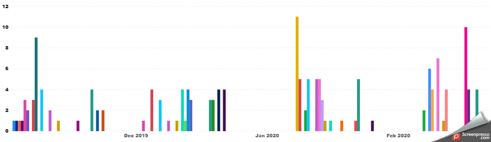
Below is a clustered bar chart that shows data over the past 4 months. The problem with the visual is it is difficult to see where a month's data starts/ends. Is there a way to have background shading to distinguish each month's data or a vertical line to show when a new month's data starts/end? Is there a known visual I should import that will do this? Any other suggestions? Thank you for your assistance.
Solved! Go to Solution.
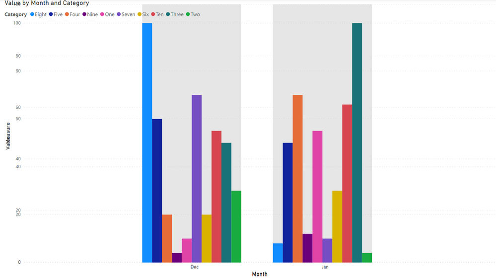
Sure, just turn on the Category Shading option in the Plot area...
Kidding, stacked visuals and no backgrounds. See attached PBIX.
Sure, just turn on the Category Shading option in the Plot area...
Kidding, stacked visuals and no backgrounds. See attached PBIX.
That is tricky, creative and COOL.
Thanks !!
Check out the April 2026 Power BI update to learn about new features.
Sign up to receive a private message when registration opens and key events begin.
If you have recently started exploring Fabric, we'd love to hear how it's going. Your feedback can help with product improvements.
| User | Count |
|---|---|
| 35 | |
| 27 | |
| 26 | |
| 22 | |
| 18 |
| User | Count |
|---|---|
| 67 | |
| 36 | |
| 32 | |
| 26 | |
| 23 |