Join us at the 2025 Microsoft Fabric Community Conference
Microsoft Fabric Community Conference 2025, March 31 - April 2, Las Vegas, Nevada. Use code FABINSIDER for a $400 discount.
Register now- Power BI forums
- Get Help with Power BI
- Desktop
- Service
- Report Server
- Power Query
- Mobile Apps
- Developer
- DAX Commands and Tips
- Custom Visuals Development Discussion
- Health and Life Sciences
- Power BI Spanish forums
- Translated Spanish Desktop
- Training and Consulting
- Instructor Led Training
- Dashboard in a Day for Women, by Women
- Galleries
- Webinars and Video Gallery
- Data Stories Gallery
- Themes Gallery
- Power BI DataViz World Championships Gallery
- Quick Measures Gallery
- R Script Showcase
- COVID-19 Data Stories Gallery
- Community Connections & How-To Videos
- 2021 MSBizAppsSummit Gallery
- 2020 MSBizAppsSummit Gallery
- 2019 MSBizAppsSummit Gallery
- Events
- Ideas
- Custom Visuals Ideas
- Issues
- Issues
- Events
- Upcoming Events
The Power BI DataViz World Championships are on! With four chances to enter, you could win a spot in the LIVE Grand Finale in Las Vegas. Show off your skills.
- Power BI forums
- Forums
- Get Help with Power BI
- Desktop
- Re: How to add in thousand separator to pie chart ...
- Subscribe to RSS Feed
- Mark Topic as New
- Mark Topic as Read
- Float this Topic for Current User
- Bookmark
- Subscribe
- Printer Friendly Page
- Mark as New
- Bookmark
- Subscribe
- Mute
- Subscribe to RSS Feed
- Permalink
- Report Inappropriate Content
How to add in thousand separator to pie chart figures
Hi
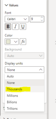
I've got a pie chart which is counting the number of lines that have the words "moved" or "no change". This column is obviously text, so I cannot change the format to number in power query or in the model tab. I also don't want to use the below function as is look strange when I filter on a specific location and the data is only in the 100's (see second screenshot). Is there another way to do this?
Solved! Go to Solution.
- Mark as New
- Bookmark
- Subscribe
- Mute
- Subscribe to RSS Feed
- Permalink
- Report Inappropriate Content
Hi @siddrow
You have to create a measure to count the number of rows so that it can be formatted to show the thousand separator. I'm not sure how the measure you have tried looks like, but a measure is able to be used as a drill-through field. I have created a sample file attached at bottom. Below are my key steps:
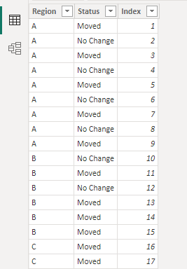
Assume that you want to count based on "Status" (text type) column in below table,
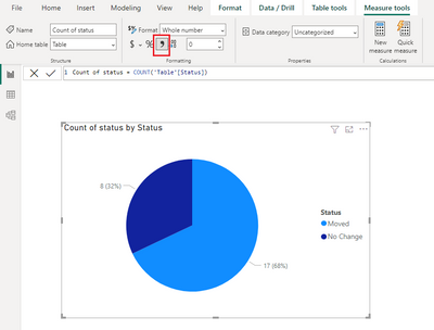
You can create the following measure and add it to the pie chart. Select this measure and select "," as the thousand separator in Measure tools.
Count of status = COUNT('Table'[Status])Then create a page 2 as the destination page of drillthrough. Add [Count of status] measure to the drill-through fileds well on page 2.
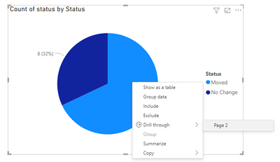
Return back to page 1 where the pie chart is, you will be able to drill through to the page 2.
Hope this helps.
Best Regards,
Community Support Team _ Jing
If this post helps, please Accept it as Solution to help other members find it.
- Mark as New
- Bookmark
- Subscribe
- Mute
- Subscribe to RSS Feed
- Permalink
- Report Inappropriate Content
hi,
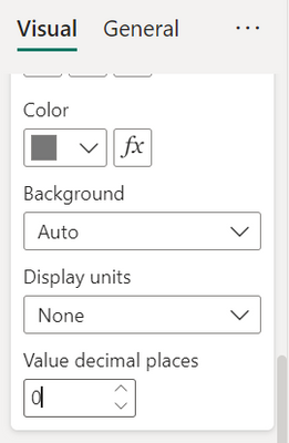
Try selecting following values along with display unit = None
Value Decimal Places = 0
Thanks!
- Mark as New
- Bookmark
- Subscribe
- Mute
- Subscribe to RSS Feed
- Permalink
- Report Inappropriate Content
Hi, that did nothing unfortunately.
- Mark as New
- Bookmark
- Subscribe
- Mute
- Subscribe to RSS Feed
- Permalink
- Report Inappropriate Content
Surprisingly it works like a charm at my end. Well, the measure that you created, can we have a look at it? Also can you try defining the format as
Thanks!
- Mark as New
- Bookmark
- Subscribe
- Mute
- Subscribe to RSS Feed
- Permalink
- Report Inappropriate Content
it's not a measure, the value in the pie chart is based off a custom column I created. I did have measures in there, however it wouldn't allow me to use the drill through page function to display the data for the pie chart in my data table in another tab.
- Mark as New
- Bookmark
- Subscribe
- Mute
- Subscribe to RSS Feed
- Permalink
- Report Inappropriate Content
Hi @siddrow
You have to create a measure to count the number of rows so that it can be formatted to show the thousand separator. I'm not sure how the measure you have tried looks like, but a measure is able to be used as a drill-through field. I have created a sample file attached at bottom. Below are my key steps:
Assume that you want to count based on "Status" (text type) column in below table,
You can create the following measure and add it to the pie chart. Select this measure and select "," as the thousand separator in Measure tools.
Count of status = COUNT('Table'[Status])Then create a page 2 as the destination page of drillthrough. Add [Count of status] measure to the drill-through fileds well on page 2.
Return back to page 1 where the pie chart is, you will be able to drill through to the page 2.
Hope this helps.
Best Regards,
Community Support Team _ Jing
If this post helps, please Accept it as Solution to help other members find it.
- Mark as New
- Bookmark
- Subscribe
- Mute
- Subscribe to RSS Feed
- Permalink
- Report Inappropriate Content
Use None instead of thousands to show the absolute number so when the denomination is 100 still the value will be absolute
Did I answer your question? Mark my post as a solution! Appreciate your Kudos!!
MY Blog || My YouTube Channel || Connect with me on Linkedin || My Latest Data Story - Ageing Analysis
Proud to be a Super User!
- Mark as New
- Bookmark
- Subscribe
- Mute
- Subscribe to RSS Feed
- Permalink
- Report Inappropriate Content
Hi
That's what I'm currently using, which doesn't solve my issue. As I select different locations in my slicers, the visual will change between 100 & 1000. I would like to show the 1000 as 1,000 but keep the 100 as 100, not .1K.
slicer set to a specific location - I want this to stay as is
no slicer selected - i want this to show as 1,679 and 4,476
Helpful resources

Join us at the Microsoft Fabric Community Conference
March 31 - April 2, 2025, in Las Vegas, Nevada. Use code MSCUST for a $150 discount!

Power BI Monthly Update - February 2025
Check out the February 2025 Power BI update to learn about new features.

Join our Community Sticker Challenge 2025
If you love stickers, then you will definitely want to check out our Community Sticker Challenge!

| User | Count |
|---|---|
| 84 | |
| 69 | |
| 68 | |
| 39 | |
| 37 |
