FabCon is coming to Atlanta
Join us at FabCon Atlanta from March 16 - 20, 2026, for the ultimate Fabric, Power BI, AI and SQL community-led event. Save $200 with code FABCOMM.
Register now!- Power BI forums
- Get Help with Power BI
- Desktop
- Service
- Report Server
- Power Query
- Mobile Apps
- Developer
- DAX Commands and Tips
- Custom Visuals Development Discussion
- Health and Life Sciences
- Power BI Spanish forums
- Translated Spanish Desktop
- Training and Consulting
- Instructor Led Training
- Dashboard in a Day for Women, by Women
- Galleries
- Data Stories Gallery
- Themes Gallery
- Contests Gallery
- Quick Measures Gallery
- Notebook Gallery
- Translytical Task Flow Gallery
- TMDL Gallery
- R Script Showcase
- Webinars and Video Gallery
- Ideas
- Custom Visuals Ideas (read-only)
- Issues
- Issues
- Events
- Upcoming Events
Calling all Data Engineers! Fabric Data Engineer (Exam DP-700) live sessions are back! Starting October 16th. Sign up.
- Power BI forums
- Forums
- Get Help with Power BI
- Desktop
- Re: How to add an max /line to column chart?
- Subscribe to RSS Feed
- Mark Topic as New
- Mark Topic as Read
- Float this Topic for Current User
- Bookmark
- Subscribe
- Printer Friendly Page
- Mark as New
- Bookmark
- Subscribe
- Mute
- Subscribe to RSS Feed
- Permalink
- Report Inappropriate Content
How to add an max /line to column chart?
Hello guys,
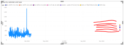
I have a simple lince chart and need to add a max on the chart or line chart.
This seems simple but yet again I'm having trouble.
The red lines in this chart are drawn with a screenshot app. But in data the red line have not the calendar data.
How can I make them using PowerBI?
Raw Data :
| no | model | calendar | value | type |
| 777D | 544 | BS, VMTP, E1A (554) | ||
| 777D | 440 | BS, VMTP, E2A (440) | ||
| 777D | 600 | BS, VMTS, E1A (600) | ||
| 777D | 400 | GY, GT-4B, 4H (400) | ||
| 777D | 654 | MICH, X-TRACTION, B (654) | ||
| 777D | 514 | HAIAN - LUAN H710, E4 (514) | ||
| 16xxx1 | 777D | 12/12/2023 | 400 | tkph site |
| 16xxx1 | 777D | 1/1/2024 | 200 | tkph site |
| 16xxx1 | 777D | 18/11/2023 | 256 | tkph site |
| 16xxx1 | 777D | 25/09/2023 | 396 | tkph site |
Thanks!
- Mark as New
- Bookmark
- Subscribe
- Mute
- Subscribe to RSS Feed
- Permalink
- Report Inappropriate Content
Hi @vividarinda
Create a Measure for Maximum Value: First, you need to create a measure that calculates the maximum value of your data. You can do this by going to the "Modeling" tab in Power BI Desktop, and then selecting "New Measure". Here's an example DAX formula you could use:
MaxValue = MAX('YourTableName'[value])
Add the Measure to Your Chart: Once you have your measure,you can use the Combo chart visual. This allows you to display columns for your primary values and a line for the maximum value measure you just created.
Best Regards,
Jayleny
If this post helps, then please consider Accept it as the solution to help the other members find it more quickly.
- Mark as New
- Bookmark
- Subscribe
- Mute
- Subscribe to RSS Feed
- Permalink
- Report Inappropriate Content
Hi @Anonymous ,
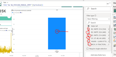
I'll try your suggest but in visual show like this. I want to show 6 line based on type.
- Mark as New
- Bookmark
- Subscribe
- Mute
- Subscribe to RSS Feed
- Permalink
- Report Inappropriate Content
Hi @Anonymous ,
Thanks for your fast response. Can you recommend me visual for combo chart?


