FabCon is coming to Atlanta
Join us at FabCon Atlanta from March 16 - 20, 2026, for the ultimate Fabric, Power BI, AI and SQL community-led event. Save $200 with code FABCOMM.
Register now!- Power BI forums
- Get Help with Power BI
- Desktop
- Service
- Report Server
- Power Query
- Mobile Apps
- Developer
- DAX Commands and Tips
- Custom Visuals Development Discussion
- Health and Life Sciences
- Power BI Spanish forums
- Translated Spanish Desktop
- Training and Consulting
- Instructor Led Training
- Dashboard in a Day for Women, by Women
- Galleries
- Data Stories Gallery
- Themes Gallery
- Contests Gallery
- QuickViz Gallery
- Quick Measures Gallery
- Visual Calculations Gallery
- Notebook Gallery
- Translytical Task Flow Gallery
- TMDL Gallery
- R Script Showcase
- Webinars and Video Gallery
- Ideas
- Custom Visuals Ideas (read-only)
- Issues
- Issues
- Events
- Upcoming Events
View all the Fabric Data Days sessions on demand. View schedule
- Power BI forums
- Forums
- Get Help with Power BI
- Desktop
- How to add a trendline/sparkline in a table/matrix...
- Subscribe to RSS Feed
- Mark Topic as New
- Mark Topic as Read
- Float this Topic for Current User
- Bookmark
- Subscribe
- Printer Friendly Page
- Mark as New
- Bookmark
- Subscribe
- Mute
- Subscribe to RSS Feed
- Permalink
- Report Inappropriate Content
How to add a trendline/sparkline in a table/matrix in power bi?
Hi,
I have this excel table with a column of trendline:
| Customer Name | Jan-19 | Feb-19 | Mar-19 | Apr-19 | May-19 | Jun-19 | Jul-19 | Aug-19 | Sep-19 | Oct-19 | Nov-19 | 12 Month Trend |
| AAA | 619 | 517 | 4,960 | 1,170 | 10 | 236 | 175 | 160 | 0 | 26 | 0 | |
| BBB | 0 | 0 | 0 | 76 | 1,557 | 1,080 | 311 | 885 | 71 | 31 | 1,827 |
Somehow, the trendline doesn't show up in the post... But it's a line that represents the trend of the monthly numbers.
Can I recreate a table like this that has a column with a trendline to show the trend of the monthly numbers?
Thank you in advance!
Regards,
Emma
- Mark as New
- Bookmark
- Subscribe
- Mute
- Subscribe to RSS Feed
- Permalink
- Report Inappropriate Content
Hi, @Anonymous
Based on your description, I have tried to use many visuals to achieve it. You may try to use ‘Power KPI Matrix 3.1.1’ visual from marketplace.
I created the sample as follows:

Then you may put the columns into the corresponding pane as below.

Finally, the result may achieve your requirement.

If I misunderstand your thought, please show me your sample data. I am glad to solve the problem for you. Here is my pbix .
Best Regards,
Allan
If this post helps, then please consider Accept it as the solution to help the other members find it more quickly.
- Mark as New
- Bookmark
- Subscribe
- Mute
- Subscribe to RSS Feed
- Permalink
- Report Inappropriate Content
Hi @v-alq-msft ,
Thank you very much! I tried Power KPI Matrix as well but it is not exactly what I wanted. I'd like to have the exactly same layout as the excel table I pasted in my orignal post: volume by month and by customer with a column showing the trendline/sparkling.
Here's my sample data. Would you take a look and see if you can help me find another solution? Thank you so much!
| Plant Area | Calendar month | Calendar Year | Sold-to party | Volume | |
| Area 1 | JAN | 2019 | 3000323 | Company 1 | 42 |
| Area 1 | FEB | 2019 | 3000445 | Company 2 | 42 |
| Area 1 | MAR | 2019 | 3001626 | Company 3 | 191 |
| Area 2 | JAN | 2019 | 3006888 | Company 1 | 18 |
| Area 2 | MAR | 2019 | 3022805 | Company 2 | 0 |
| Area 2 | FEB | 2019 | 3053753 | Company 3 | 113.5 |
| Area 3 | FEB | 2019 | 3121913 | Company 1 | 156 |
| Area 3 | JAN | 2019 | 3122053 | Company 2 | 43.5 |
| Area 3 | MAR | 2019 | 3122053 | Company 3 | 100 |
- Mark as New
- Bookmark
- Subscribe
- Mute
- Subscribe to RSS Feed
- Permalink
- Report Inappropriate Content
Hi, @Anonymous
Thanks for providing your smaple data. I have tried with Power KPI Matrix on your smaple data several times and it really can not achieve your requirement. You may post a new idea in Idea Forum, and add your comments there to improve Power BI for making this feature coming sooner. Here is the link. Thanks.
https://ideas.powerbi.com/forums/265200-power-bi-ideas
Best Regards
Allan
- Mark as New
- Bookmark
- Subscribe
- Mute
- Subscribe to RSS Feed
- Permalink
- Report Inappropriate Content
Dear @v-alq-msft ,
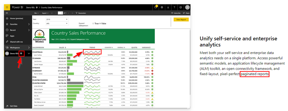
I think you showcase on your "why Power BI" web page what the user is looking for (his pictures from December are not visible anymore in the forum) to demonstrate self-service capabilities. So I think there must be an easy way to do this.

Helpful resources

Power BI Monthly Update - November 2025
Check out the November 2025 Power BI update to learn about new features.

Fabric Data Days
Advance your Data & AI career with 50 days of live learning, contests, hands-on challenges, study groups & certifications and more!

