Fabric Data Days starts November 4th!
Advance your Data & AI career with 50 days of live learning, dataviz contests, hands-on challenges, study groups & certifications and more!
Get registered- Power BI forums
- Get Help with Power BI
- Desktop
- Service
- Report Server
- Power Query
- Mobile Apps
- Developer
- DAX Commands and Tips
- Custom Visuals Development Discussion
- Health and Life Sciences
- Power BI Spanish forums
- Translated Spanish Desktop
- Training and Consulting
- Instructor Led Training
- Dashboard in a Day for Women, by Women
- Galleries
- Data Stories Gallery
- Themes Gallery
- Contests Gallery
- QuickViz Gallery
- Quick Measures Gallery
- Visual Calculations Gallery
- Notebook Gallery
- Translytical Task Flow Gallery
- TMDL Gallery
- R Script Showcase
- Webinars and Video Gallery
- Ideas
- Custom Visuals Ideas (read-only)
- Issues
- Issues
- Events
- Upcoming Events
Get Fabric Certified for FREE during Fabric Data Days. Don't miss your chance! Request now
- Power BI forums
- Forums
- Get Help with Power BI
- Desktop
- Re: How to add Dashed Line (Shape, NOT Chart) in P...
- Subscribe to RSS Feed
- Mark Topic as New
- Mark Topic as Read
- Float this Topic for Current User
- Bookmark
- Subscribe
- Printer Friendly Page
- Mark as New
- Bookmark
- Subscribe
- Mute
- Subscribe to RSS Feed
- Permalink
- Report Inappropriate Content
How to add Dashed Line (Shape, NOT Chart) in Power BI?
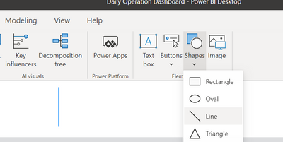
Hi, I want to add Dashed Line in Power BI, just as a shape, not in graph. In Insert->Shape, I can find Line, but the Line is solid. I am unable to change it's properties to Dashed. Is there any way we can do that? Is anything available in the market? Some custom visual, maybe?
Any recommendation would be appreciated. Thanks.
Solved! Go to Solution.
- Mark as New
- Bookmark
- Subscribe
- Mute
- Subscribe to RSS Feed
- Permalink
- Report Inappropriate Content
@Anonymous
Add the following measure and drop it on a card Visual then format as you need, you can adjust the height in the measure:
Dash Line = REPT("|"&UNICHAR(10),20)________________________
Did I answer your question? Mark this post as a solution, this will help others!.
Click on the Thumbs-Up icon if you like this reply 🙂
⭕ Subscribe and learn Power BI from these videos
⚪ Website ⚪ LinkedIn ⚪ PBI User Group
- Mark as New
- Bookmark
- Subscribe
- Mute
- Subscribe to RSS Feed
- Permalink
- Report Inappropriate Content
If you want to do diagonals, I recommend creating in DAX/importing/entering a mini table like this
Value1 Value 2
0 0
1 1
And then making a line chart from it. Remove all the axes, titles etc. and then you can style/size/place it as you like.
Matt
- Mark as New
- Bookmark
- Subscribe
- Mute
- Subscribe to RSS Feed
- Permalink
- Report Inappropriate Content
Add a rectangle, turn off "Fill" and "Border", and type in "- - -" as text & make it bold
Super easy to adjust the length of the dotted line by just adding more dashes and spaces, and optionally rotate the shape by 90 degrees for a verticle line!
- Mark as New
- Bookmark
- Subscribe
- Mute
- Subscribe to RSS Feed
- Permalink
- Report Inappropriate Content
Brilliant! Thanks. If you don't need to rotate it, you can also use a text box. This should be marked as the solution. Adding unnecessary measures is never a good solution.
The fact that Power BI developers waste their time on that 'on-object interaction' craziness rather than getting some basic functionality right is mind-blowing (e.g. making a line shape dashed, being able to specify column widths numerically, being able to LOCK the position of individual visuals, rather than all visuals at once, which is useless, etc, etc).
- Mark as New
- Bookmark
- Subscribe
- Mute
- Subscribe to RSS Feed
- Permalink
- Report Inappropriate Content
@Anonymous
Add the following measure and drop it on a card Visual then format as you need, you can adjust the height in the measure:
Dash Line = REPT("|"&UNICHAR(10),20)________________________
Did I answer your question? Mark this post as a solution, this will help others!.
Click on the Thumbs-Up icon if you like this reply 🙂
⭕ Subscribe and learn Power BI from these videos
⚪ Website ⚪ LinkedIn ⚪ PBI User Group
- Mark as New
- Bookmark
- Subscribe
- Mute
- Subscribe to RSS Feed
- Permalink
- Report Inappropriate Content
wow what a brilliant solution. amazing!
- Mark as New
- Bookmark
- Subscribe
- Mute
- Subscribe to RSS Feed
- Permalink
- Report Inappropriate Content
- Mark as New
- Bookmark
- Subscribe
- Mute
- Subscribe to RSS Feed
- Permalink
- Report Inappropriate Content
@Anonymous ,The information you have provided is not making the problem clear to me. Can you please explain with an example.
refer : https://appsource.microsoft.com/en-us/marketplace/apps?product=power-bi-visuals
develop: https://docs.microsoft.com/en-us/power-bi/developer/visuals/custom-visual-develop-tutorial
Map Json - Shape Map
https://docs.microsoft.com/en-us/power-bi/visuals/desktop-shape-map
https://dataveld.com/2016/09/12/topojson-map-files-for-power-bi-shape-map/
https://medium.com/weareservian/power-bi-custom-maps-part-ii-shape-map-939873da3f66
https://radacad.com/shape-map-better-than-the-filled-map
https://doc.arcgis.com/en/maps-for-powerbi/get-started/prepare-your-data.htm
Appreciate your Kudos.
- Mark as New
- Bookmark
- Subscribe
- Mute
- Subscribe to RSS Feed
- Permalink
- Report Inappropriate Content
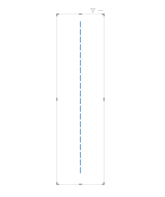
@amitchandak , thank you for reply. Please see below image. This should clear things up. I added this Blue line through Insert->Shapes->Line. I want to make Blue Line Dashed.
- Mark as New
- Bookmark
- Subscribe
- Mute
- Subscribe to RSS Feed
- Permalink
- Report Inappropriate Content
@Anonymous , refer if this can help
https://blog.enterprisedna.co/add-custom-icons-to-power-bi-reports/
- Mark as New
- Bookmark
- Subscribe
- Mute
- Subscribe to RSS Feed
- Permalink
- Report Inappropriate Content
Hi @Anonymous ,
Add a Blank Button,
Go to Power Point and create a Dashed Line. Sve that Dashed line as image.
Bak to Power BI, go to fill section in the Blank Button and add the image (Dashed Line).
You can also try
Regards,
Harsh Nathani
- Mark as New
- Bookmark
- Subscribe
- Mute
- Subscribe to RSS Feed
- Permalink
- Report Inappropriate Content
Thanks! This was the best solution I found! and it worked 😀


