Join the #PBI10 DataViz contest
Power BI is turning 10, and we’re marking the occasion with a special community challenge. Use your creativity to tell a story, uncover trends, or highlight something unexpected.
Get started- Power BI forums
- Get Help with Power BI
- Desktop
- Service
- Report Server
- Power Query
- Mobile Apps
- Developer
- DAX Commands and Tips
- Custom Visuals Development Discussion
- Health and Life Sciences
- Power BI Spanish forums
- Translated Spanish Desktop
- Training and Consulting
- Instructor Led Training
- Dashboard in a Day for Women, by Women
- Galleries
- Webinars and Video Gallery
- Data Stories Gallery
- Themes Gallery
- Contests Gallery
- Quick Measures Gallery
- Notebook Gallery
- Translytical Task Flow Gallery
- R Script Showcase
- Ideas
- Custom Visuals Ideas (read-only)
- Issues
- Issues
- Events
- Upcoming Events
Join us for an expert-led overview of the tools and concepts you'll need to become a Certified Power BI Data Analyst and pass exam PL-300. Register now.
- Power BI forums
- Forums
- Get Help with Power BI
- Desktop
- How to abbreviate the months on the X-axis of a ba...
- Subscribe to RSS Feed
- Mark Topic as New
- Mark Topic as Read
- Float this Topic for Current User
- Bookmark
- Subscribe
- Printer Friendly Page
- Mark as New
- Bookmark
- Subscribe
- Mute
- Subscribe to RSS Feed
- Permalink
- Report Inappropriate Content
How to abbreviate the months on the X-axis of a bar chart?
Hey guys,
Short question. is there a way where I can tell powerbi so shorten these labels to the first 3 lettes? Because they don't really fit properly and I there is no space to make the chart wider. I also tried changing the date format but that doesn't work.
Thanks!
Solved! Go to Solution.
- Mark as New
- Bookmark
- Subscribe
- Mute
- Subscribe to RSS Feed
- Permalink
- Report Inappropriate Content
@Anonymous
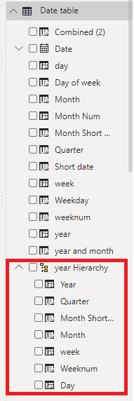
As @Greg_Deckler mentions, you can hold click and drag fields on top of each other to create an hierarchy (you must have done it by mistake once, I have 😁 ). This can also be done for non date fields like product class/ group combinations. For a custom date hierarchy, it would look like this (red box):
- Mark as New
- Bookmark
- Subscribe
- Mute
- Subscribe to RSS Feed
- Permalink
- Report Inappropriate Content
I solved it like this - make a column from the date column as a month name column, change that column to keep first three letters. make your own hierarchy with year and month short name, make month short name sort by column month number. Works for me.
- Mark as New
- Bookmark
- Subscribe
- Mute
- Subscribe to RSS Feed
- Permalink
- Report Inappropriate Content
@Anonymous @DouweMeer @Greg_Deckler
I tried your solutions, and they work to a certain degree.
But sadly It doesn't work when I format the axis to use date hierachy. I really like this because it looks cool when the year numbers are listed below the months, and not mentioned after each month.
I guess the only option that remains is to just make the graph wider.
But still, thanks for your suggestions!
- Mark as New
- Bookmark
- Subscribe
- Mute
- Subscribe to RSS Feed
- Permalink
- Report Inappropriate Content
@Anonymous
As @Greg_Deckler mentions, you can hold click and drag fields on top of each other to create an hierarchy (you must have done it by mistake once, I have 😁 ). This can also be done for non date fields like product class/ group combinations. For a custom date hierarchy, it would look like this (red box):
- Mark as New
- Bookmark
- Subscribe
- Mute
- Subscribe to RSS Feed
- Permalink
- Report Inappropriate Content
Aah yeah. I've accidentillly created those more than I'd like to admit 😄
Thanks to you and @Greg_Deckler
- Mark as New
- Bookmark
- Subscribe
- Mute
- Subscribe to RSS Feed
- Permalink
- Report Inappropriate Content
If you want a date hierarchy of your own formatted styles, just create multiple columns in your table that have the formatting that you want. Then you can drag and drop these columns into a hiearchy for your axis.
Follow on LinkedIn
@ me in replies or I'll lose your thread!!!
Instead of a Kudo, please vote for this idea
Become an expert!: Enterprise DNA
External Tools: MSHGQM
YouTube Channel!: Microsoft Hates Greg
Latest book!: Power BI Cookbook Third Edition (Color)
DAX is easy, CALCULATE makes DAX hard...
- Mark as New
- Bookmark
- Subscribe
- Mute
- Subscribe to RSS Feed
- Permalink
- Report Inappropriate Content
HI @Anonymous,
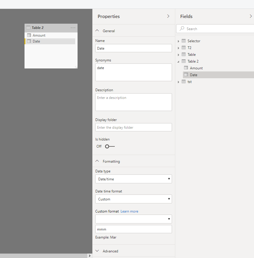
I'd like to suggest you extract month field to a new column with format function or try to configure fields formatting in table properties:
Regards,
Xiaoxin Sheng
- Mark as New
- Bookmark
- Subscribe
- Mute
- Subscribe to RSS Feed
- Permalink
- Report Inappropriate Content
I believe it is FORMAT([Date],"mmm")
Follow on LinkedIn
@ me in replies or I'll lose your thread!!!
Instead of a Kudo, please vote for this idea
Become an expert!: Enterprise DNA
External Tools: MSHGQM
YouTube Channel!: Microsoft Hates Greg
Latest book!: Power BI Cookbook Third Edition (Color)
DAX is easy, CALCULATE makes DAX hard...
- Mark as New
- Bookmark
- Subscribe
- Mute
- Subscribe to RSS Feed
- Permalink
- Report Inappropriate Content
@Anonymous
From my notes:
| General number | No format |
| Currency | As a price value |
| Fixed | 2 decimal no thousand seperator |
| Standard | 2 decimal with thousand seperator |
| Percent | percentage of the number |
| Scientific | Scientific notification with 2 decimals |
| Yes/No | 0 = No, Rest = Yes |
| True/False | 0 = False, Rest = True |
| On/Off | 0 = off, Rest is on |
| General date | Short date + long time |
| Long Date | wednesday, march 12 20018 |
| Medium Date | wednesday, march 12 20018 |
| Short Date | mm/dd/yyyy |
| Long time | 12 hours + seconds |
| Medium time | 12 hours |
| Short time | 24 hours |
| mm | month number |
| mmm | Month short |
| mmmm | Month long |
| yyyy/mm | year / month number |
| yyyy/mmm | year + month short |
| Q | Quarter |
| ddd | Day of week short |
| dddd | Day of week |
| #### | Value to text |
Helpful resources

Join our Fabric User Panel
This is your chance to engage directly with the engineering team behind Fabric and Power BI. Share your experiences and shape the future.

Power BI Monthly Update - June 2025
Check out the June 2025 Power BI update to learn about new features.

| User | Count |
|---|---|
| 80 | |
| 76 | |
| 61 | |
| 36 | |
| 32 |
| User | Count |
|---|---|
| 91 | |
| 60 | |
| 59 | |
| 49 | |
| 45 |


