FabCon is coming to Atlanta
Join us at FabCon Atlanta from March 16 - 20, 2026, for the ultimate Fabric, Power BI, AI and SQL community-led event. Save $200 with code FABCOMM.
Register now!- Power BI forums
- Get Help with Power BI
- Desktop
- Service
- Report Server
- Power Query
- Mobile Apps
- Developer
- DAX Commands and Tips
- Custom Visuals Development Discussion
- Health and Life Sciences
- Power BI Spanish forums
- Translated Spanish Desktop
- Training and Consulting
- Instructor Led Training
- Dashboard in a Day for Women, by Women
- Galleries
- Data Stories Gallery
- Themes Gallery
- Contests Gallery
- Quick Measures Gallery
- Notebook Gallery
- Translytical Task Flow Gallery
- TMDL Gallery
- R Script Showcase
- Webinars and Video Gallery
- Ideas
- Custom Visuals Ideas (read-only)
- Issues
- Issues
- Events
- Upcoming Events
To celebrate FabCon Vienna, we are offering 50% off select exams. Ends October 3rd. Request your discount now.
- Power BI forums
- Forums
- Get Help with Power BI
- Desktop
- How to Use Table as a Slicer?
- Subscribe to RSS Feed
- Mark Topic as New
- Mark Topic as Read
- Float this Topic for Current User
- Bookmark
- Subscribe
- Printer Friendly Page
- Mark as New
- Bookmark
- Subscribe
- Mute
- Subscribe to RSS Feed
- Permalink
- Report Inappropriate Content
How to Use Table as a Slicer?
Hi everyone,
I am creating a project table in my portfolio dashboard and the table includes:
- Project names
- Progress plan
- Progress actual
- Budget
- Actual cost
Simply, I want to show 'Budget' vs 'Actual cost' with a coloumn chart for each project without showing overall sums from the table.
I know If I use slicer, it will work fine. However, due to the visual preference I tend to use table. Yet by using the table total sums budget and actual cost from all project in the table will show up.
Does anybody can help my problem?
Solved! Go to Solution.
- Mark as New
- Bookmark
- Subscribe
- Mute
- Subscribe to RSS Feed
- Permalink
- Report Inappropriate Content
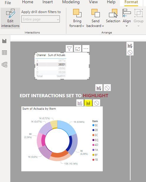
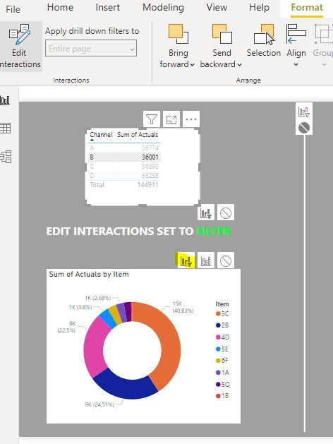
It sounds like you need to change the type of interaction (Format ribbon; edit interactions) from highlight to filter:
see this example:
Go to Format in the ribbon, select "Edit interactions", select your table visual and change the interaction in the bar chart visual to "Filter"
Did I answer your question? Mark my post as a solution!
In doing so, you are also helping me. Thank you!
Proud to be a Super User!
Paul on Linkedin.
- Mark as New
- Bookmark
- Subscribe
- Mute
- Subscribe to RSS Feed
- Permalink
- Report Inappropriate Content
How about a report page tootlip?
Did I answer your question? Mark my post as a solution!
In doing so, you are also helping me. Thank you!
Proud to be a Super User!
Paul on Linkedin.
- Mark as New
- Bookmark
- Subscribe
- Mute
- Subscribe to RSS Feed
- Permalink
- Report Inappropriate Content
Hi @AryaP
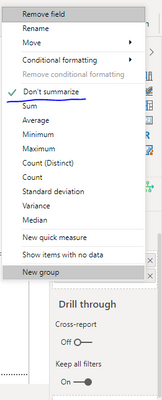
In the values section of your visualization,
There is a Inverted caret symbol next to it.
Click that and select "Don't Summarize".
- Mark as New
- Bookmark
- Subscribe
- Mute
- Subscribe to RSS Feed
- Permalink
- Report Inappropriate Content
In this case, there is no don't summarize option in the value section of the visualization., just sum, average, median,etc.
- Mark as New
- Bookmark
- Subscribe
- Mute
- Subscribe to RSS Feed
- Permalink
- Report Inappropriate Content
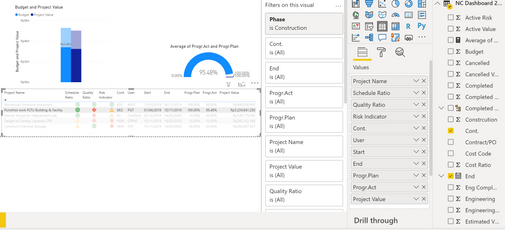
@AryaP Can you post some screen shots of what you are seeing? Include how the table is configured in the Visualizations pane as well as the bar chart. Or post the PBIX to OneDrive/Box and share a link. Hard to tell what is going on.
Follow on LinkedIn
@ me in replies or I'll lose your thread!!!
Instead of a Kudo, please vote for this idea
Become an expert!: Enterprise DNA
External Tools: MSHGQM
YouTube Channel!: Microsoft Hates Greg
Latest book!: DAX For Humans
DAX is easy, CALCULATE makes DAX hard...
- Mark as New
- Bookmark
- Subscribe
- Mute
- Subscribe to RSS Feed
- Permalink
- Report Inappropriate Content
Hi Greg,
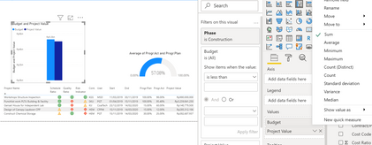
You can see right, in the dirst two pictures, the sums value of the table still appears.
I can't find the setting to make them dissapear.
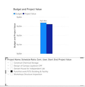
Well, this is the coloumn chart that I want actually, but Iwant to use it from table instead of slicer.
- Mark as New
- Bookmark
- Subscribe
- Mute
- Subscribe to RSS Feed
- Permalink
- Report Inappropriate Content
It sounds like you need to change the type of interaction (Format ribbon; edit interactions) from highlight to filter:
see this example:
Go to Format in the ribbon, select "Edit interactions", select your table visual and change the interaction in the bar chart visual to "Filter"
Did I answer your question? Mark my post as a solution!
In doing so, you are also helping me. Thank you!
Proud to be a Super User!
Paul on Linkedin.
- Mark as New
- Bookmark
- Subscribe
- Mute
- Subscribe to RSS Feed
- Permalink
- Report Inappropriate Content
IT DEFINETELY WORKS!
- Mark as New
- Bookmark
- Subscribe
- Mute
- Subscribe to RSS Feed
- Permalink
- Report Inappropriate Content
Hello
Visual filters on each chart and Page Filters can help you for better handling.
Ss.
- Mark as New
- Bookmark
- Subscribe
- Mute
- Subscribe to RSS Feed
- Permalink
- Report Inappropriate Content
I have tried this but the total sums still appear in coloumn chart
Helpful resources
| User | Count |
|---|---|
| 98 | |
| 76 | |
| 74 | |
| 49 | |
| 26 |
