Fabric Data Days starts November 4th!
Advance your Data & AI career with 50 days of live learning, dataviz contests, hands-on challenges, study groups & certifications and more!
Get registered- Power BI forums
- Get Help with Power BI
- Desktop
- Service
- Report Server
- Power Query
- Mobile Apps
- Developer
- DAX Commands and Tips
- Custom Visuals Development Discussion
- Health and Life Sciences
- Power BI Spanish forums
- Translated Spanish Desktop
- Training and Consulting
- Instructor Led Training
- Dashboard in a Day for Women, by Women
- Galleries
- Data Stories Gallery
- Themes Gallery
- Contests Gallery
- QuickViz Gallery
- Quick Measures Gallery
- Visual Calculations Gallery
- Notebook Gallery
- Translytical Task Flow Gallery
- TMDL Gallery
- R Script Showcase
- Webinars and Video Gallery
- Ideas
- Custom Visuals Ideas (read-only)
- Issues
- Issues
- Events
- Upcoming Events
Get Fabric Certified for FREE during Fabric Data Days. Don't miss your chance! Request now
- Power BI forums
- Forums
- Get Help with Power BI
- Desktop
- Re: How to NOT get sum/count values in a line char...
- Subscribe to RSS Feed
- Mark Topic as New
- Mark Topic as Read
- Float this Topic for Current User
- Bookmark
- Subscribe
- Printer Friendly Page
- Mark as New
- Bookmark
- Subscribe
- Mute
- Subscribe to RSS Feed
- Permalink
- Report Inappropriate Content
How to NOT get sum/count values in a line chart
Hey peeps.
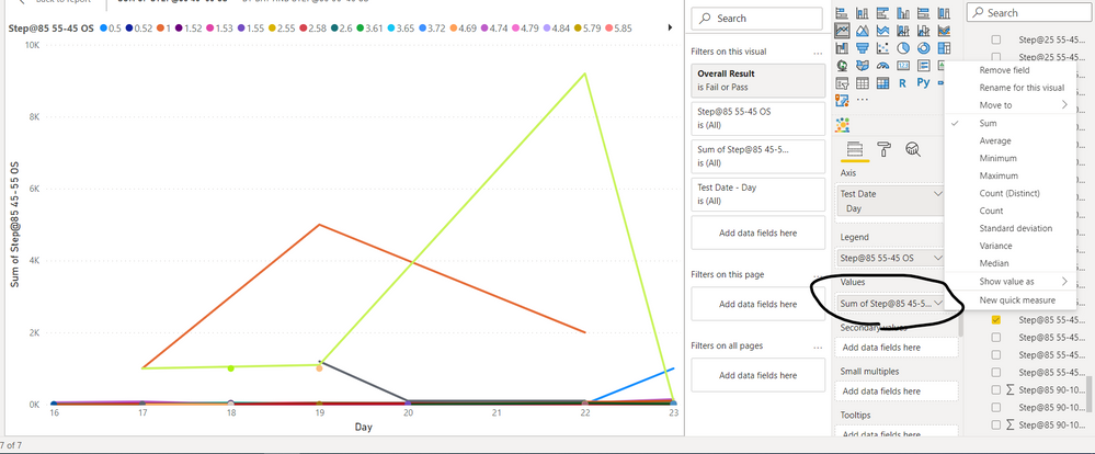
I have pretty much worked with tables and matrixes. This is my first time using a line chart. I have various test readings that I want to show on a line chart but in the Values field, I can't seem to be able to do it. I just want to plot the readings as they are, not summing nor counting. I have played around with the column data type. I tried changing them to "General" "Decimal" but didn't solve my problem. I also set to "Don't Summarize" under Summarize under the column tools.
I saw some other posts with the same issue as mine but they don't seem to be resolved either. What could be the issue here? Is it the way my columns are built? I'm very confused and fraustuated as I can't do a simple line graph. 😕
And similarly, is there any way I could put two column values into a scatter chart?
As I put another column value, it goes under the size field and I can't show normal test readings just like how I want to show in Y axix field.
Thanks everyone in advance.
Solved! Go to Solution.
- Mark as New
- Bookmark
- Subscribe
- Mute
- Subscribe to RSS Feed
- Permalink
- Report Inappropriate Content
It depends on the visual that you use. A table visual? no problem.
Line chart has to make a line so there has to be an aggregation involved.
--
What are you expecting to see if using a line chart with 2 or more values for the same x-axis value?
If there is a separate categorisation that can go in the legend, that would create another line but it would still use an aggregation.
That's my understanding.
- Mark as New
- Bookmark
- Subscribe
- Mute
- Subscribe to RSS Feed
- Permalink
- Report Inappropriate Content
Hi @HotChilli Thanks for the kind reply. After studying the visualization types in PowerBI, I understood more now.
Cheers!
Helpful resources

Fabric Data Days
Advance your Data & AI career with 50 days of live learning, contests, hands-on challenges, study groups & certifications and more!

Power BI Monthly Update - October 2025
Check out the October 2025 Power BI update to learn about new features.


