Join us at FabCon Vienna from September 15-18, 2025
The ultimate Fabric, Power BI, SQL, and AI community-led learning event. Save €200 with code FABCOMM.
Get registered- Power BI forums
- Get Help with Power BI
- Desktop
- Service
- Report Server
- Power Query
- Mobile Apps
- Developer
- DAX Commands and Tips
- Custom Visuals Development Discussion
- Health and Life Sciences
- Power BI Spanish forums
- Translated Spanish Desktop
- Training and Consulting
- Instructor Led Training
- Dashboard in a Day for Women, by Women
- Galleries
- Data Stories Gallery
- Themes Gallery
- Contests Gallery
- Quick Measures Gallery
- Notebook Gallery
- Translytical Task Flow Gallery
- TMDL Gallery
- R Script Showcase
- Webinars and Video Gallery
- Ideas
- Custom Visuals Ideas (read-only)
- Issues
- Issues
- Events
- Upcoming Events
Enhance your career with this limited time 50% discount on Fabric and Power BI exams. Ends September 15. Request your voucher.
- Power BI forums
- Forums
- Get Help with Power BI
- Desktop
- Re: How to, Line chart can zoom in and out follow ...
- Subscribe to RSS Feed
- Mark Topic as New
- Mark Topic as Read
- Float this Topic for Current User
- Bookmark
- Subscribe
- Printer Friendly Page
- Mark as New
- Bookmark
- Subscribe
- Mute
- Subscribe to RSS Feed
- Permalink
- Report Inappropriate Content
How to, Line chart can zoom in and out follow year/month/date/Hr.
I have a lot of data,that is the 1 point per hour and i store data in year, after i use line chart plot for monitor i cant zoom the date for look the date in hour unit. Please HELP! (NOTE. I use timeline tool to help for this case but the timeline tool so big in dashboard, i dont want to use it.)
Thanks
Solved! Go to Solution.
- Mark as New
- Bookmark
- Subscribe
- Mute
- Subscribe to RSS Feed
- Permalink
- Report Inappropriate Content
Hi @kulapjit,
Based on your description, you want to use the drill down option to view data following date time hierarchy, right? If that the case, firstly, drill down feature is not supported in line chart, this is by design. Currently the drill down feature is only available in the following visualizations.
Bar Chart
Column Chart
Clustered Bar Chart
Clustered Column Chart
100% Stacked Bar Chart
100% Stacked Column Chart
Line and Stacked Column Chart
Line and Clustered Column Chart
Waterfall Chart
Scatter Chart
Pie Chart
Treemap
Map
Filled Map
Funnel
Donut Chart
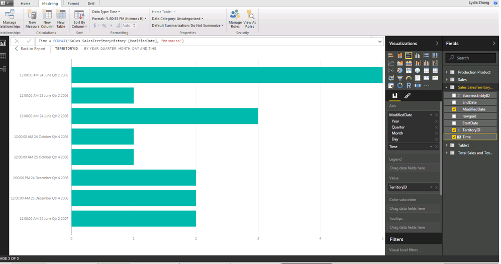
Secondly, you can choose bar chars or column charts to display your data and use drill down feature. And please note that Power BI automatically adds a time hierarchy that includes Year, Quarter, Month and Day. As you need to view hour data, you will need to include time column into your table and drag Date/Datetime column along with time column in the Axis field bucket, here is an example for your reference.
Thanks,
Lydia Zhang
- Mark as New
- Bookmark
- Subscribe
- Mute
- Subscribe to RSS Feed
- Permalink
- Report Inappropriate Content
plz
- Mark as New
- Bookmark
- Subscribe
- Mute
- Subscribe to RSS Feed
- Permalink
- Report Inappropriate Content
Hi @kulapjit,
Based on your description, you want to use the drill down option to view data following date time hierarchy, right? If that the case, firstly, drill down feature is not supported in line chart, this is by design. Currently the drill down feature is only available in the following visualizations.
Bar Chart
Column Chart
Clustered Bar Chart
Clustered Column Chart
100% Stacked Bar Chart
100% Stacked Column Chart
Line and Stacked Column Chart
Line and Clustered Column Chart
Waterfall Chart
Scatter Chart
Pie Chart
Treemap
Map
Filled Map
Funnel
Donut Chart
Secondly, you can choose bar chars or column charts to display your data and use drill down feature. And please note that Power BI automatically adds a time hierarchy that includes Year, Quarter, Month and Day. As you need to view hour data, you will need to include time column into your table and drag Date/Datetime column along with time column in the Axis field bucket, here is an example for your reference.
Thanks,
Lydia Zhang
Helpful resources
| User | Count |
|---|---|
| 68 | |
| 63 | |
| 59 | |
| 54 | |
| 28 |
| User | Count |
|---|---|
| 182 | |
| 81 | |
| 64 | |
| 46 | |
| 41 |


