FabCon is coming to Atlanta
Join us at FabCon Atlanta from March 16 - 20, 2026, for the ultimate Fabric, Power BI, AI and SQL community-led event. Save $200 with code FABCOMM.
Register now!- Power BI forums
- Get Help with Power BI
- Desktop
- Service
- Report Server
- Power Query
- Mobile Apps
- Developer
- DAX Commands and Tips
- Custom Visuals Development Discussion
- Health and Life Sciences
- Power BI Spanish forums
- Translated Spanish Desktop
- Training and Consulting
- Instructor Led Training
- Dashboard in a Day for Women, by Women
- Galleries
- Data Stories Gallery
- Themes Gallery
- Contests Gallery
- QuickViz Gallery
- Quick Measures Gallery
- Visual Calculations Gallery
- Notebook Gallery
- Translytical Task Flow Gallery
- TMDL Gallery
- R Script Showcase
- Webinars and Video Gallery
- Ideas
- Custom Visuals Ideas (read-only)
- Issues
- Issues
- Events
- Upcoming Events
The Power BI Data Visualization World Championships is back! Get ahead of the game and start preparing now! Learn more
- Power BI forums
- Forums
- Get Help with Power BI
- Desktop
- How to Change the Line Chart to a Step Chart (Or m...
- Subscribe to RSS Feed
- Mark Topic as New
- Mark Topic as Read
- Float this Topic for Current User
- Bookmark
- Subscribe
- Printer Friendly Page
- Mark as New
- Bookmark
- Subscribe
- Mute
- Subscribe to RSS Feed
- Permalink
- Report Inappropriate Content
How to Change the Line Chart to a Step Chart (Or make a Step Chart)
Hello All,
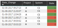
I have this table refering to a system wich has specific dates when the system changes states from online (1) to offline (0).

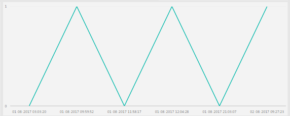
The only thing i can do in Power Bi is a grafic like this:
Hope you can help me 🙂
- Mark as New
- Bookmark
- Subscribe
- Mute
- Subscribe to RSS Feed
- Permalink
- Report Inappropriate Content
This is now an easy change in the 2021 versions of Power BI:
- Select the line chart
- Go to Formatting
- Under "Shapes" click the "Stepped" radio button:
- Mark as New
- Bookmark
- Subscribe
- Mute
- Subscribe to RSS Feed
- Permalink
- Report Inappropriate Content
You would go to Line Chart > Format > Shapes - turn on Stepped
- Mark as New
- Bookmark
- Subscribe
- Mute
- Subscribe to RSS Feed
- Permalink
- Report Inappropriate Content
Hi @Guilherme3 ,
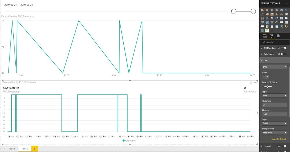
Maybe this isn't a solution but i used Power KPI 2.0.0 from Marketplace and in Format -> Line options choose Step-After. I used fields Axis and Values only. In my case it looks like that:
- Mark as New
- Bookmark
- Subscribe
- Mute
- Subscribe to RSS Feed
- Permalink
- Report Inappropriate Content
Hi Guilherme3
Not sure of this is still relevant, but one method that I've used is to create a line graph with Date_Change as the axis and State as the values, then under Shapes I've set Stepped to on. This should make a graph like what you need.
Cheers!
- Mark as New
- Bookmark
- Subscribe
- Mute
- Subscribe to RSS Feed
- Permalink
- Report Inappropriate Content
Hi @Guilherme3,
After research, there is no such an visual to display like what you want. The second graph you did is got from line chart, which draw the line based on the point(values) in different time. For your expected result, there are two values(0,1) where the state is 1.
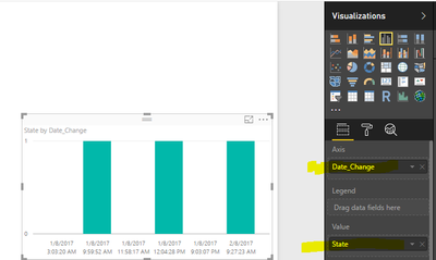
You can create a similar bar chart like the following screenshot.
Best Regards,
Angelia
Helpful resources

Power BI Dataviz World Championships
The Power BI Data Visualization World Championships is back! Get ahead of the game and start preparing now!

| User | Count |
|---|---|
| 38 | |
| 36 | |
| 33 | |
| 30 | |
| 28 |
| User | Count |
|---|---|
| 126 | |
| 88 | |
| 78 | |
| 66 | |
| 65 |


