Fabric Data Days starts November 4th!
Advance your Data & AI career with 50 days of live learning, dataviz contests, hands-on challenges, study groups & certifications and more!
Get registered- Power BI forums
- Get Help with Power BI
- Desktop
- Service
- Report Server
- Power Query
- Mobile Apps
- Developer
- DAX Commands and Tips
- Custom Visuals Development Discussion
- Health and Life Sciences
- Power BI Spanish forums
- Translated Spanish Desktop
- Training and Consulting
- Instructor Led Training
- Dashboard in a Day for Women, by Women
- Galleries
- Data Stories Gallery
- Themes Gallery
- Contests Gallery
- QuickViz Gallery
- Quick Measures Gallery
- Visual Calculations Gallery
- Notebook Gallery
- Translytical Task Flow Gallery
- TMDL Gallery
- R Script Showcase
- Webinars and Video Gallery
- Ideas
- Custom Visuals Ideas (read-only)
- Issues
- Issues
- Events
- Upcoming Events
Get Fabric Certified for FREE during Fabric Data Days. Don't miss your chance! Request now
- Power BI forums
- Forums
- Get Help with Power BI
- Desktop
- Re: How reproduce an excel chart into PBI ?
- Subscribe to RSS Feed
- Mark Topic as New
- Mark Topic as Read
- Float this Topic for Current User
- Bookmark
- Subscribe
- Printer Friendly Page
- Mark as New
- Bookmark
- Subscribe
- Mute
- Subscribe to RSS Feed
- Permalink
- Report Inappropriate Content
How reproduce an excel chart into PBI ?
Hi everybody,
i don't know how explain my problem without picture, so :
I wan't to create the excel chart :
All datas are from MS Project.
I think I need to create a new table, but how I can create a dynamic table with columns names is project name with planned work for each Employee ?
Have you any idea ?
Best regard,
Draner
Solved! Go to Solution.
- Mark as New
- Bookmark
- Subscribe
- Mute
- Subscribe to RSS Feed
- Permalink
- Report Inappropriate Content
So if you have data with those three columns, just use Stacked column chart visual and put Employee Name to Axis, Project Name to Legend and Planned Work to Value.
If you have data like the pic, then do some transformation as described below. (I use my sample data)
Highlight "project" columns (to chose more fields use CTRL key) and hit "Unpivot columns" on Transfrom Card.
Rename new field as Project.
Use the columns in Stacked column chart visual as described in the beginning of my post.
Also it is better to create measure for Planned work, then just use the source column.
Regards.
Pavel
- Mark as New
- Bookmark
- Subscribe
- Mute
- Subscribe to RSS Feed
- Permalink
- Report Inappropriate Content
- Mark as New
- Bookmark
- Subscribe
- Mute
- Subscribe to RSS Feed
- Permalink
- Report Inappropriate Content
Hi PavelR,
I know where is datas, but I don't know how use/store it to create same depicted visual.
P.S: Sorry for my bad English.
- Mark as New
- Bookmark
- Subscribe
- Mute
- Subscribe to RSS Feed
- Permalink
- Report Inappropriate Content
Could you show sample of data?
- Mark as New
- Bookmark
- Subscribe
- Mute
- Subscribe to RSS Feed
- Permalink
- Report Inappropriate Content
Yes, in MS Project I have Table "Affectations".
With columns :
"Nom Projet" => Project Name
"Nom Ressource" => Employee Name
"Affectation Travail" => planed Work
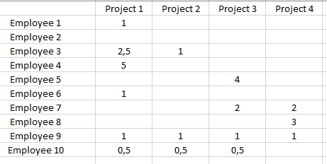
With Excel, I use datas like this :
I think I need to create dynamical table, but I don't know if it correct, and I don't know how ...
- Mark as New
- Bookmark
- Subscribe
- Mute
- Subscribe to RSS Feed
- Permalink
- Report Inappropriate Content
So if you have data with those three columns, just use Stacked column chart visual and put Employee Name to Axis, Project Name to Legend and Planned Work to Value.
If you have data like the pic, then do some transformation as described below. (I use my sample data)
Highlight "project" columns (to chose more fields use CTRL key) and hit "Unpivot columns" on Transfrom Card.
Rename new field as Project.
Use the columns in Stacked column chart visual as described in the beginning of my post.
Also it is better to create measure for Planned work, then just use the source column.
Regards.
Pavel
- Mark as New
- Bookmark
- Subscribe
- Mute
- Subscribe to RSS Feed
- Permalink
- Report Inappropriate Content
I am fu***ng ba***rd, practice makes perfect.
Thank you very much for your help and your time!
Helpful resources

Power BI Monthly Update - November 2025
Check out the November 2025 Power BI update to learn about new features.

Fabric Data Days
Advance your Data & AI career with 50 days of live learning, contests, hands-on challenges, study groups & certifications and more!

| User | Count |
|---|---|
| 97 | |
| 74 | |
| 50 | |
| 47 | |
| 44 |


