Huge last-minute discounts for FabCon Vienna from September 15-18, 2025
Supplies are limited. Contact info@espc.tech right away to save your spot before the conference sells out.
Get your discount- Power BI forums
- Get Help with Power BI
- Desktop
- Service
- Report Server
- Power Query
- Mobile Apps
- Developer
- DAX Commands and Tips
- Custom Visuals Development Discussion
- Health and Life Sciences
- Power BI Spanish forums
- Translated Spanish Desktop
- Training and Consulting
- Instructor Led Training
- Dashboard in a Day for Women, by Women
- Galleries
- Data Stories Gallery
- Themes Gallery
- Contests Gallery
- Quick Measures Gallery
- Notebook Gallery
- Translytical Task Flow Gallery
- TMDL Gallery
- R Script Showcase
- Webinars and Video Gallery
- Ideas
- Custom Visuals Ideas (read-only)
- Issues
- Issues
- Events
- Upcoming Events
Score big with last-minute savings on the final tickets to FabCon Vienna. Secure your discount
- Power BI forums
- Forums
- Get Help with Power BI
- Desktop
- Re: How do i create dynamics CRM funnel chart in P...
- Subscribe to RSS Feed
- Mark Topic as New
- Mark Topic as Read
- Float this Topic for Current User
- Bookmark
- Subscribe
- Printer Friendly Page
- Mark as New
- Bookmark
- Subscribe
- Mute
- Subscribe to RSS Feed
- Permalink
- Report Inappropriate Content
How do i create dynamics CRM funnel chart in Power BI?
Hi everyone,
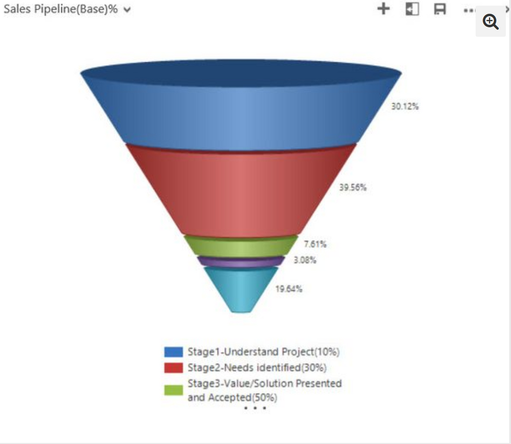
I'm very new to Power BI and currently using free version of the software that come along with your Office 365 subscription. We have a requirement to build CRM data custom report where i wanted to display FUNNEL chart with various sales stages.
I'm currently using out of the box FUNNEL chart which doesn't look exactly the above dislayed funnle chart. However our business users are more interested in the traditional FUNNEL chart rather than the one provided out of the box. As i was searching on the communicty the below article says there is a custom Power BI visual called "PYRAMID CHART" available on the marketplace that would suffice my requirement, unfortunately i'm not able to find PYRAMID chart anymore on the marketplace.
The link i'm refereing to the marketplace is below;
https://app.powerbi.com/visuals/
Does anyone has achieved my requirement previously or any ideas or suggestions are really appreciated.
Thanks,
Prajwal Shambhu
Solved! Go to Solution.
- Mark as New
- Bookmark
- Subscribe
- Mute
- Subscribe to RSS Feed
- Permalink
- Report Inappropriate Content
- Mark as New
- Bookmark
- Subscribe
- Mute
- Subscribe to RSS Feed
- Permalink
- Report Inappropriate Content
- Mark as New
- Bookmark
- Subscribe
- Mute
- Subscribe to RSS Feed
- Permalink
- Report Inappropriate Content
Thanks for the link. it worked the treat for me 🙂
Cheers,
Prajwal


