Fabric Data Days starts November 4th!
Advance your Data & AI career with 50 days of live learning, dataviz contests, hands-on challenges, study groups & certifications and more!
Get registered- Power BI forums
- Get Help with Power BI
- Desktop
- Service
- Report Server
- Power Query
- Mobile Apps
- Developer
- DAX Commands and Tips
- Custom Visuals Development Discussion
- Health and Life Sciences
- Power BI Spanish forums
- Translated Spanish Desktop
- Training and Consulting
- Instructor Led Training
- Dashboard in a Day for Women, by Women
- Galleries
- Data Stories Gallery
- Themes Gallery
- Contests Gallery
- Quick Measures Gallery
- Visual Calculations Gallery
- Notebook Gallery
- Translytical Task Flow Gallery
- TMDL Gallery
- R Script Showcase
- Webinars and Video Gallery
- Ideas
- Custom Visuals Ideas (read-only)
- Issues
- Issues
- Events
- Upcoming Events
Join us at FabCon Atlanta from March 16 - 20, 2026, for the ultimate Fabric, Power BI, AI and SQL community-led event. Save $200 with code FABCOMM. Register now.
- Power BI forums
- Forums
- Get Help with Power BI
- Desktop
- How do I increase my line widths in my JSON file
- Subscribe to RSS Feed
- Mark Topic as New
- Mark Topic as Read
- Float this Topic for Current User
- Bookmark
- Subscribe
- Printer Friendly Page
- Mark as New
- Bookmark
- Subscribe
- Mute
- Subscribe to RSS Feed
- Permalink
- Report Inappropriate Content
How do I increase my line widths in my JSON file
Hello
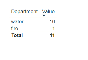
I am very new to JSON syntax so I mainly stole this off someone else on google. I currently have the below JSON which presents a tablix in Power BI as I want it too. All I am looking to do is increase the width of the yellow lines at the top and bottom of the tablix(Screenshot below). Is this possible? If so does anyone know how?
Many Thanks
{
   "name":"Branding",
   "dataColors":[
      "#223B47",
      "#FFCB05",
      "#00A5A6",
      "#3B408F",
      "#61A524",
      "#854158"
   ],
   "background":"#FFFFFF",
   "foreground":"#223B47",
   "tableAccent":"#223B47",
   "visualStyles":{
      "*":{
         "*":{
            "*":[
               {
                  "fontFamily":"Arial"
               }
            ]
         }
      },
	  "*":{
            "*":{
               "grid":[
                  {
                     "outlineColor":{"solid":{"color":"#FFCB05"}},
                     "gridVertical":false,
                     "gridHorizontal":true,
					 "gridHorizontalColor":{"solid":{"color":"E7ECE1"}}
                  }
               ],
               "columnHeaders":[
                  {
                     "fontColor":{"solid":{"color":"#223B47"}},
                     "backColor":{"solid":{"color":"#FFFFFF"}},
                     "fontFamily":"Arial"
                  }
               ],
               "values":[
                  {
                     "backColorSecondary":{"solid":{"color":"#FFFFFF"}},
					 "fontFamily":"Arial"
                  }
               ]
            }
         }
   }
}
Solved! Go to Solution.
- Mark as New
- Bookmark
- Subscribe
- Mute
- Subscribe to RSS Feed
- Permalink
- Report Inappropriate Content
Worked it out by further googling the answer. I needed to add an additional line in the grid section which was:
"outlineWeight": 2,
This previous post gave me the answer https://community.powerbi.com/t5/Desktop/Custom-Report-Theme-JSON-Property-settings-in-Tables-Matrix...
so now my code looks like this
{
   "name":"HodgeBranding",
   "dataColors":[
      "#223B47",
      "#FFCB05",
      "#00A5A6",
      "#3B408F",
      "#61A524",
      "#854158"
   ],
   "background":"#FFFFFF",
   "foreground":"#223B47",
   "tableAccent":"#223B47",
   "visualStyles":{
      "*":{
         "*":{
            "*":[
               {
                  "fontFamily":"Arial"
               }
            ]
         }
      },
	  "*":{
            "*":{
               "grid":[
                  {
                     "outlineColor":{"solid":{"color":"#FFCB05"}},
					 "outlineWeight":3,
                     "gridVertical":false,
                     "gridHorizontal":true,
					 "gridHorizontalColor":{"solid":{"color":"E7ECE1"}}
                  }
               ],
               "columnHeaders":[
                  {
                     "fontColor":{"solid":{"color":"#223B47"}},
                     "backColor":{"solid":{"color":"#FFFFFF"}},
                     "fontFamily":"Arial"
                  }
               ],
               "values":[
                  {
                     "backColorSecondary":{"solid":{"color":"#FFFFFF"}},
					 "fontFamily":"Arial"
                  }
               ],
			   "total":[
                  {
                     "fontColor": { "solid": { "color": "#223B47"}},
					 "fontFamily": "Arial",
					 "fontSize": 10,
					 "bold":true
                  }
               ]

            }
         }
   }
}
Helpful resources
| User | Count |
|---|---|
| 76 | |
| 34 | |
| 31 | |
| 29 | |
| 25 |


