Join us at FabCon Vienna from September 15-18, 2025
The ultimate Fabric, Power BI, SQL, and AI community-led learning event. Save €200 with code FABCOMM.
Get registered- Power BI forums
- Get Help with Power BI
- Desktop
- Service
- Report Server
- Power Query
- Mobile Apps
- Developer
- DAX Commands and Tips
- Custom Visuals Development Discussion
- Health and Life Sciences
- Power BI Spanish forums
- Translated Spanish Desktop
- Training and Consulting
- Instructor Led Training
- Dashboard in a Day for Women, by Women
- Galleries
- Data Stories Gallery
- Themes Gallery
- Contests Gallery
- Quick Measures Gallery
- Notebook Gallery
- Translytical Task Flow Gallery
- TMDL Gallery
- R Script Showcase
- Webinars and Video Gallery
- Ideas
- Custom Visuals Ideas (read-only)
- Issues
- Issues
- Events
- Upcoming Events
Compete to become Power BI Data Viz World Champion! First round ends August 18th. Get started.
- Power BI forums
- Forums
- Get Help with Power BI
- DAX Commands and Tips
- How do I create a percentage ratio using two table...
- Subscribe to RSS Feed
- Mark Topic as New
- Mark Topic as Read
- Float this Topic for Current User
- Bookmark
- Subscribe
- Printer Friendly Page
- Mark as New
- Bookmark
- Subscribe
- Mute
- Subscribe to RSS Feed
- Permalink
- Report Inappropriate Content
How do I create a percentage ratio using two tables?
Hello, I'm new to the world of Power BI and I'm facing a challenge.
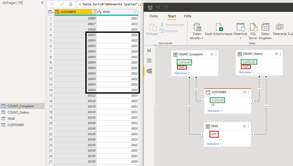
I'd like to analyze the complaint ratio for each customer and visualize it in a nice pie chart. I have two tables at my disposal, where each entry contains a customer number and a year in one table representing orders and complaints in the other table.
In the pie chart, I want to display the percentage of complaints relative to orders for the same time period. The lists COUNT_Complaint and COUNT_Orders have the same structure. I'd also like to be able to filter by customers and year.
I already am able to calculate the overall complaint ratio and, after filtering for individual customers, using a measure (Measure 1 = COUNTROWS('COUNT_Complaint')/COUNT_Orders*100), but I'd like to view them all simultaneously in one chart.
Thank you very much for any help!
Helpful resources
| User | Count |
|---|---|
| 17 | |
| 8 | |
| 7 | |
| 6 | |
| 6 |
| User | Count |
|---|---|
| 26 | |
| 13 | |
| 12 | |
| 9 | |
| 8 |


