Join us at the 2025 Microsoft Fabric Community Conference
March 31 - April 2, 2025, in Las Vegas, Nevada. Use code MSCUST for a $150 discount! Early bird discount ends December 31.
Register Now- Power BI forums
- Get Help with Power BI
- Desktop
- Service
- Report Server
- Power Query
- Mobile Apps
- Developer
- DAX Commands and Tips
- Custom Visuals Development Discussion
- Health and Life Sciences
- Power BI Spanish forums
- Translated Spanish Desktop
- Training and Consulting
- Instructor Led Training
- Dashboard in a Day for Women, by Women
- Galleries
- Community Connections & How-To Videos
- COVID-19 Data Stories Gallery
- Themes Gallery
- Data Stories Gallery
- R Script Showcase
- Webinars and Video Gallery
- Quick Measures Gallery
- 2021 MSBizAppsSummit Gallery
- 2020 MSBizAppsSummit Gallery
- 2019 MSBizAppsSummit Gallery
- Events
- Ideas
- Custom Visuals Ideas
- Issues
- Issues
- Events
- Upcoming Events
Be one of the first to start using Fabric Databases. View on-demand sessions with database experts and the Microsoft product team to learn just how easy it is to get started. Watch now
- Power BI forums
- Forums
- Get Help with Power BI
- Desktop
- Re: How do I color the stacked bar chart by Dax qu...
- Subscribe to RSS Feed
- Mark Topic as New
- Mark Topic as Read
- Float this Topic for Current User
- Bookmark
- Subscribe
- Printer Friendly Page
- Mark as New
- Bookmark
- Subscribe
- Mute
- Subscribe to RSS Feed
- Permalink
- Report Inappropriate Content
How do I color the stacked bar chart by Dax query according to the condition in Power BI?
Hello all,
I want to colorize the stacked bar chart according to the condition with Dax query in Power BI. For example; If (count <30) count value will turn green. If (count> 30 && count <60) count will take the color green and blue. How can I do that?
Solved! Go to Solution.
- Mark as New
- Bookmark
- Subscribe
- Mute
- Subscribe to RSS Feed
- Permalink
- Report Inappropriate Content
Hi @Anonymous ,
Currently, Power BI doesn't support it directly. You could post your idea on Power BI Ideas.
It is a place for customers to provide feedback about Power BI.
What's more, if a feedback is highly voted there by other customers, it will be promising that Microsoft Product Team will take it into consideration when designing the next version in the future.
However, there is a workaround.
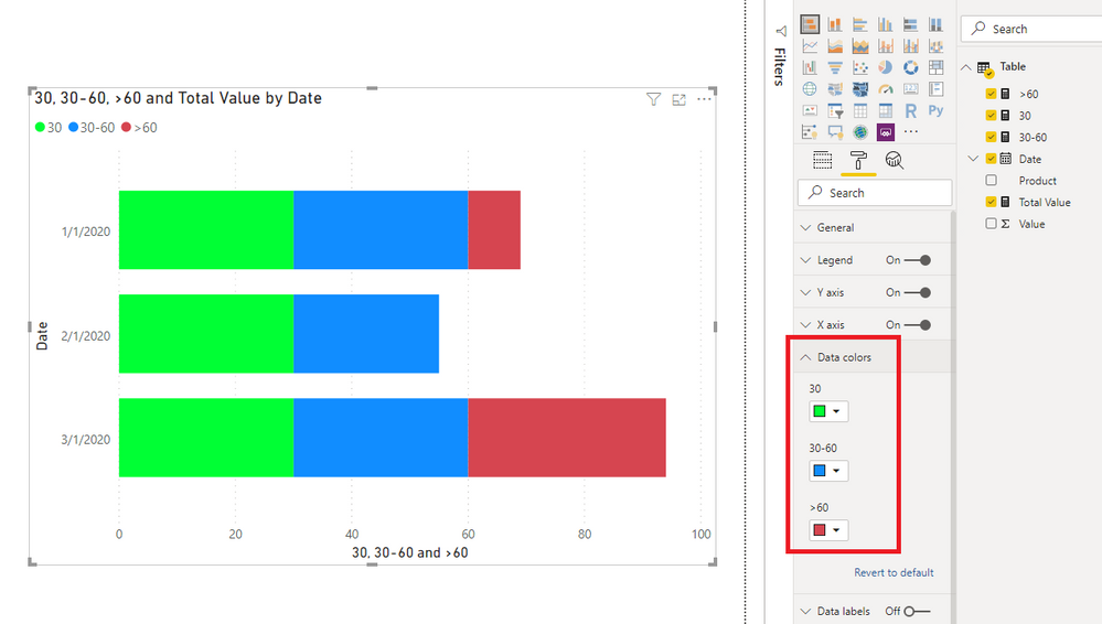
1. Create measures like so:
Total Value = SUM('Table'[Value])30 = IF([Total Value]<=30,[Total Value],30)30-60 =
IF (
[Total Value] <= 30,
BLANK (),
IF (
[Total Value] > 30
&& [Total Value] <= 60,
[Total Value] - 30,
IF ( [Total Value] > 60, 30 )
)
)
>60 = IF([Total Value]>=60,[Total Value]-60)
2. Create a Stacked bar chart.
Best Regards,
Icey
If this post helps, then please consider Accept it as the solution to help the other members find it more quickly.
- Mark as New
- Bookmark
- Subscribe
- Mute
- Subscribe to RSS Feed
- Permalink
- Report Inappropriate Content
Hi @Anonymous ,
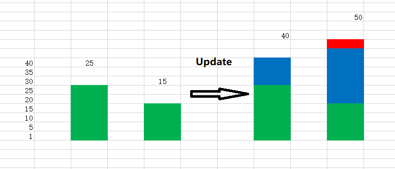
Is what you want like below?
If so, based on my knowledge, I can't resolve it.
Best Regards,
Icey
If this post helps, then please consider Accept it as the solution to help the other members find it more quickly.
- Mark as New
- Bookmark
- Subscribe
- Mute
- Subscribe to RSS Feed
- Permalink
- Report Inappropriate Content
Hi @Icey,
Thank you for your help. Exactly what I want; If the value is 25, it will be green, if it is 40, then 25 of it will be green and 15 of it will be blue. But I understood the logic. I will try to apply.
- Mark as New
- Bookmark
- Subscribe
- Mute
- Subscribe to RSS Feed
- Permalink
- Report Inappropriate Content
@Anonymous you can use conditional formatting for the bar color and put the rules for formatting. Here is the doc on it.
Ask anything Power BI. Book free appointment at https://www.perytus.com
Would appreciate Kudos 🙂 if my solution helped.
Subscribe to the @PowerBIHowTo YT channel for an upcoming video on List and Record functions in Power Query!!
Learn Power BI and Fabric - subscribe to our YT channel - Click here: @PowerBIHowTo
If my solution proved useful, I'd be delighted to receive Kudos. When you put effort into asking a question, it's equally thoughtful to acknowledge and give Kudos to the individual who helped you solve the problem. It's a small gesture that shows appreciation and encouragement! ❤
Did I answer your question? Mark my post as a solution. Proud to be a Super User! Appreciate your Kudos 🙂
Feel free to email me with any of your BI needs.
- Mark as New
- Bookmark
- Subscribe
- Mute
- Subscribe to RSS Feed
- Permalink
- Report Inappropriate Content
@parry2k Thank you for answering my question. I tried conditional formatting but I could not get the result I wanted. I want, for example; If (count> 30 & count <60) count value will be green and blue value will be added next to it. Just like the append in javascript.
- Mark as New
- Bookmark
- Subscribe
- Mute
- Subscribe to RSS Feed
- Permalink
- Report Inappropriate Content
Hi @Anonymous,
Follow the steps to have more control over conditional formatting -
1) Create a measure
Color code = if(count < 30, "#008000","FF0000")
#FF0000 - hex code of red
#008000 - hex code of green
2) Go the values of the stacked bar chart, right click "Conditional Formatting", font color/background color.
3) Under "Format By", choose "Field Value"
4) Select the measure created in step 1.
This should give you expected results.
- Mark as New
- Bookmark
- Subscribe
- Mute
- Subscribe to RSS Feed
- Permalink
- Report Inappropriate Content
@Anonymous Thank you for answering my question. I tried conditional formatting but I could not get the result I wanted. I want, for example; If (count> 30 & count <60) count value will be green and blue value will be added next to it. Just like the append in javascript.
- Mark as New
- Bookmark
- Subscribe
- Mute
- Subscribe to RSS Feed
- Permalink
- Report Inappropriate Content
Hi @Anonymous ,
Please share with us a specific example. Then, we can conduct specific tests.
Best Regards,
Icey
- Mark as New
- Bookmark
- Subscribe
- Mute
- Subscribe to RSS Feed
- Permalink
- Report Inappropriate Content
Hi @Icey,
That's exactly what I want. When count exceeds 30, I want the values below 30 to be green, the values between 30 and 60 will be blue, and the values above 60 will be red. In other words, when the value in the database is less than 30, it will show green on the screen, and between 30 and 60 it will show green and blue, and over 60 it will show green, blue and red.
- Mark as New
- Bookmark
- Subscribe
- Mute
- Subscribe to RSS Feed
- Permalink
- Report Inappropriate Content
Hi @Anonymous ,
Currently, Power BI doesn't support it directly. You could post your idea on Power BI Ideas.
It is a place for customers to provide feedback about Power BI.
What's more, if a feedback is highly voted there by other customers, it will be promising that Microsoft Product Team will take it into consideration when designing the next version in the future.
However, there is a workaround.
1. Create measures like so:
Total Value = SUM('Table'[Value])30 = IF([Total Value]<=30,[Total Value],30)30-60 =
IF (
[Total Value] <= 30,
BLANK (),
IF (
[Total Value] > 30
&& [Total Value] <= 60,
[Total Value] - 30,
IF ( [Total Value] > 60, 30 )
)
)
>60 = IF([Total Value]>=60,[Total Value]-60)
2. Create a Stacked bar chart.
Best Regards,
Icey
If this post helps, then please consider Accept it as the solution to help the other members find it more quickly.
- Mark as New
- Bookmark
- Subscribe
- Mute
- Subscribe to RSS Feed
- Permalink
- Report Inappropriate Content
Hi @Icey,
Thank you for answer the question.
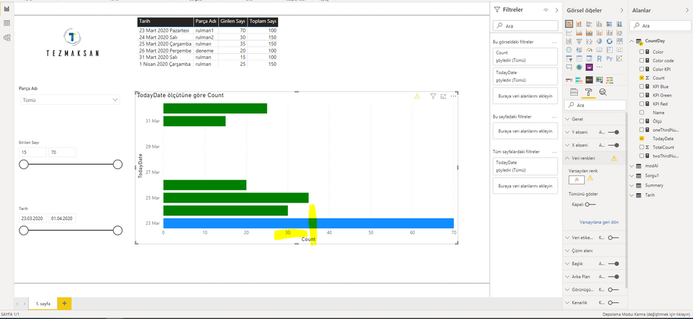
I approached the desired result. The colors come right, but when I change the value from the database, the colors must come. For example; If the value is 25, the bar color will be green, when I update the value to 40, the bar color should be green up to 25 and the remaining 15 should be blue.
- Mark as New
- Bookmark
- Subscribe
- Mute
- Subscribe to RSS Feed
- Permalink
- Report Inappropriate Content
Did you follow the steps ? Before applying conditional formatting, you will have to create a calculated measure.
If the steps dint help, do you mind sharing the pbix?
- Mark as New
- Bookmark
- Subscribe
- Mute
- Subscribe to RSS Feed
- Permalink
- Report Inappropriate Content
Hi @Anonymous,
Yes, don't follow the steps. I created a computed column before following the steps. But I still could not get the result I wanted. I want, for example; if (count> = 30 & count <= 60) shows green and blue in this range, that is, the bar shows two colors at the same time. I do not know how to share the .pbix yet I am very new. How can I share?
Helpful resources

Join us at the Microsoft Fabric Community Conference
March 31 - April 2, 2025, in Las Vegas, Nevada. Use code MSCUST for a $150 discount!

Microsoft Fabric Community Conference 2025
Arun Ulag shares exciting details about the Microsoft Fabric Conference 2025, which will be held in Las Vegas, NV.

| User | Count |
|---|---|
| 114 | |
| 76 | |
| 57 | |
| 52 | |
| 44 |
| User | Count |
|---|---|
| 165 | |
| 116 | |
| 63 | |
| 57 | |
| 50 |


