Party with Power BI’s own Guy in a Cube
Power BI is turning 10! Tune in for a special live episode on July 24 with behind-the-scenes stories, product evolution highlights, and a sneak peek at what’s in store for the future.
Save the date- Power BI forums
- Get Help with Power BI
- Desktop
- Service
- Report Server
- Power Query
- Mobile Apps
- Developer
- DAX Commands and Tips
- Custom Visuals Development Discussion
- Health and Life Sciences
- Power BI Spanish forums
- Translated Spanish Desktop
- Training and Consulting
- Instructor Led Training
- Dashboard in a Day for Women, by Women
- Galleries
- Data Stories Gallery
- Themes Gallery
- Contests Gallery
- Quick Measures Gallery
- Notebook Gallery
- Translytical Task Flow Gallery
- TMDL Gallery
- R Script Showcase
- Webinars and Video Gallery
- Ideas
- Custom Visuals Ideas (read-only)
- Issues
- Issues
- Events
- Upcoming Events
Enhance your career with this limited time 50% discount on Fabric and Power BI exams. Ends August 31st. Request your voucher.
- Power BI forums
- Forums
- Get Help with Power BI
- Desktop
- Re: How can i resize the pie chart?
- Subscribe to RSS Feed
- Mark Topic as New
- Mark Topic as Read
- Float this Topic for Current User
- Bookmark
- Subscribe
- Printer Friendly Page
- Mark as New
- Bookmark
- Subscribe
- Mute
- Subscribe to RSS Feed
- Permalink
- Report Inappropriate Content
How can i resize the pie chart?
I need to manipulate the size of my pie chart. I can edit the font size and colors but there are times i want to shrink or expand the actual pie chart. I can't figure out how to do that.
Solved! Go to Solution.
- Mark as New
- Bookmark
- Subscribe
- Mute
- Subscribe to RSS Feed
- Permalink
- Report Inappropriate Content
My desire was to manipulate the size of the pie within the frame to reduce white space, i didn't think it was possible so thank you for confirming. However, i did work with location of the ledgend and based on that location it helped reduce white space.
- Mark as New
- Bookmark
- Subscribe
- Mute
- Subscribe to RSS Feed
- Permalink
- Report Inappropriate Content
- Mark as New
- Bookmark
- Subscribe
- Mute
- Subscribe to RSS Feed
- Permalink
- Report Inappropriate Content
Did you find a solution for this yet?
I need to decrease the size of the pie itself and increase the legend area.
- Mark as New
- Bookmark
- Subscribe
- Mute
- Subscribe to RSS Feed
- Permalink
- Report Inappropriate Content
Hi @Anonymous,
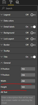
You can specify the values for Width and Height. Or directly drag the frame of visual to enlarge or decrease the size of pie chart.
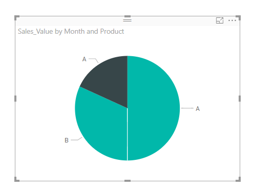
But, what you said "shrink or expand the actual pie chart", do you want to just change the size of pie chart inside, while keep the size of frame, so that the white space between chart and frame is decreased? If so, I'm afraid it is not available to achieve that right now.
Best regards,
Yuliana Gu
If this post helps, then please consider Accept it as the solution to help the other members find it more quickly.
- Mark as New
- Bookmark
- Subscribe
- Mute
- Subscribe to RSS Feed
- Permalink
- Report Inappropriate Content
"change the size of pie chart inside, while keep the size of frame, so that the white space between chart and frame is decreased? If so, I'm afraid it is not available to achieve that right now." Do you know if this is somehow available now of if they're planning to release in the future? I wanna resize the pie chart itself without resizing the frame visual
- Mark as New
- Bookmark
- Subscribe
- Mute
- Subscribe to RSS Feed
- Permalink
- Report Inappropriate Content
My desire was to manipulate the size of the pie within the frame to reduce white space, i didn't think it was possible so thank you for confirming. However, i did work with location of the ledgend and based on that location it helped reduce white space.
- Mark as New
- Bookmark
- Subscribe
- Mute
- Subscribe to RSS Feed
- Permalink
- Report Inappropriate Content
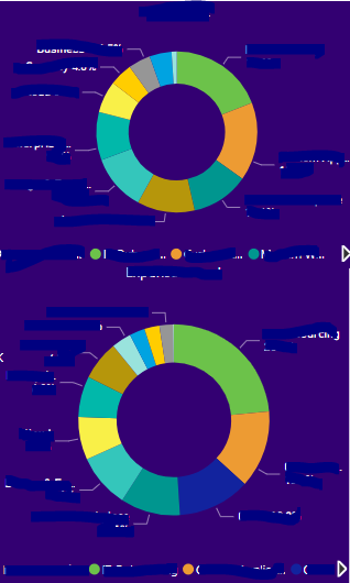
Hi, I was having the same need for resizing on a page with multiple doughnut charts that due to the order of the page I wanted to keep the same size for all doughnut charts even though the sizes of the visuals were different. To the best of my knowledge the only way to resize the size of the doughnut is by changing the visual itself. What I did to work around this is the following:
- Size the doughnut or pie to the size you want it by "shrink or expand the actual pie chart" visual.
- Create a blank text box with a white background (or the color of your dashboard) that you place in the missing space.
- Highlight the two visuals and group them together. This way you can move the group and it would stick together.
In my example here you can see that due to the order of the two charts the space below is bigger than the size of the chart visual above. If you would re-size the visual itself also the pie / doughnut would grow or shrink accordingly. But with placing a colored blank text box as placeholder on the gap, your users of your dashboard wouldn't notice it.

This is how it would look when you only resize the visual itself:
Helpful resources
| User | Count |
|---|---|
| 78 | |
| 74 | |
| 42 | |
| 32 | |
| 28 |
| User | Count |
|---|---|
| 100 | |
| 93 | |
| 51 | |
| 50 | |
| 48 |


