FabCon is coming to Atlanta
Join us at FabCon Atlanta from March 16 - 20, 2026, for the ultimate Fabric, Power BI, AI and SQL community-led event. Save $200 with code FABCOMM.
Register now!- Power BI forums
- Get Help with Power BI
- Desktop
- Service
- Report Server
- Power Query
- Mobile Apps
- Developer
- DAX Commands and Tips
- Custom Visuals Development Discussion
- Health and Life Sciences
- Power BI Spanish forums
- Translated Spanish Desktop
- Training and Consulting
- Instructor Led Training
- Dashboard in a Day for Women, by Women
- Galleries
- Data Stories Gallery
- Themes Gallery
- Contests Gallery
- QuickViz Gallery
- Quick Measures Gallery
- Visual Calculations Gallery
- Notebook Gallery
- Translytical Task Flow Gallery
- TMDL Gallery
- R Script Showcase
- Webinars and Video Gallery
- Ideas
- Custom Visuals Ideas (read-only)
- Issues
- Issues
- Events
- Upcoming Events
Learn from the best! Meet the four finalists headed to the FINALS of the Power BI Dataviz World Championships! Register now
- Power BI forums
- Forums
- Get Help with Power BI
- Desktop
- How can I visualize it?
- Subscribe to RSS Feed
- Mark Topic as New
- Mark Topic as Read
- Float this Topic for Current User
- Bookmark
- Subscribe
- Printer Friendly Page
- Mark as New
- Bookmark
- Subscribe
- Mute
- Subscribe to RSS Feed
- Permalink
- Report Inappropriate Content
How can I visualize it?
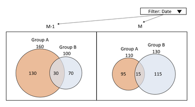
I'd like to visualize a 2-way venn diagram that is both proportional and dynamic.
The overlapping areas when two fields are true is also proportional to the rest of the segments of the visualization.
The current month and the previous month will be compared, and visualization should also change as the date changes.
And I want to label each circle as below.
There is no option custom visual that I can use.
Is there anyone who has a good idea?
If it is difficult, recommend other visualization method please.
- Mark as New
- Bookmark
- Subscribe
- Mute
- Subscribe to RSS Feed
- Permalink
- Report Inappropriate Content
This might be possible with a Scatterplot visual and some trickery.
Please provide sanitized sample data that fully covers your issue. If you paste the data into a table in your post or use one of the file services it will be easier to work with.
- Mark as New
- Bookmark
- Subscribe
- Mute
- Subscribe to RSS Feed
- Permalink
- Report Inappropriate Content
Thanks for helping.
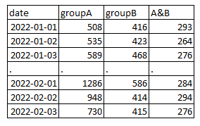
Data is being collected now, so I post the data I made for testing.
I would appreciate it if you could tell me how to draw it with a Scatterplot visual.
Thanks.
- Mark as New
- Bookmark
- Subscribe
- Mute
- Subscribe to RSS Feed
- Permalink
- Report Inappropriate Content
If you paste the data into a table in your post or use one of the file services it will be easier to work with.
Helpful resources

Join our Fabric User Panel
Share feedback directly with Fabric product managers, participate in targeted research studies and influence the Fabric roadmap.

Power BI Monthly Update - February 2026
Check out the February 2026 Power BI update to learn about new features.

| User | Count |
|---|---|
| 53 | |
| 51 | |
| 36 | |
| 15 | |
| 14 |
| User | Count |
|---|---|
| 93 | |
| 77 | |
| 41 | |
| 26 | |
| 26 |


