Become a Certified Power BI Data Analyst!
Join us for an expert-led overview of the tools and concepts you'll need to pass exam PL-300. The first session starts on June 11th. See you there!
Get registered- Power BI forums
- Get Help with Power BI
- Desktop
- Service
- Report Server
- Power Query
- Mobile Apps
- Developer
- DAX Commands and Tips
- Custom Visuals Development Discussion
- Health and Life Sciences
- Power BI Spanish forums
- Translated Spanish Desktop
- Training and Consulting
- Instructor Led Training
- Dashboard in a Day for Women, by Women
- Galleries
- Webinars and Video Gallery
- Data Stories Gallery
- Themes Gallery
- Contests Gallery
- Quick Measures Gallery
- Notebook Gallery
- Translytical Task Flow Gallery
- R Script Showcase
- Ideas
- Custom Visuals Ideas (read-only)
- Issues
- Issues
- Events
- Upcoming Events
Power BI is turning 10! Let’s celebrate together with dataviz contests, interactive sessions, and giveaways. Register now.
- Power BI forums
- Forums
- Get Help with Power BI
- Desktop
- Re: How can I create a visual to show growth?
- Subscribe to RSS Feed
- Mark Topic as New
- Mark Topic as Read
- Float this Topic for Current User
- Bookmark
- Subscribe
- Printer Friendly Page
- Mark as New
- Bookmark
- Subscribe
- Mute
- Subscribe to RSS Feed
- Permalink
- Report Inappropriate Content
How can I create a visual to show growth?
Hi!!
How can I show colored up and down arrows to represent Quarter over Quarter growth? I have tried the KPI card but that didn't work out as per my expectations.
Here's how my data looks -
Solved! Go to Solution.
- Mark as New
- Bookmark
- Subscribe
- Mute
- Subscribe to RSS Feed
- Permalink
- Report Inappropriate Content
Hi @saipawar ,
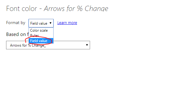
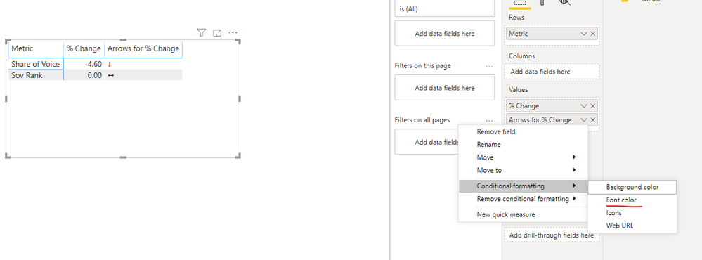
Please set conditional formatting of the visual like that.
Before that, we should create two measures as below.
Arrows for % Change = var result = MAX('Table'[% Change ])
var output = SWITCH(
    true,
	result > 0, UNICHAR(8593),
    result < 0, UNICHAR(8595),
    UNICHAR(8596)
)
RETURN
OUTPUT
Arrows for % Change_ = var result = MAX('Table'[% Change ])
var output = SWITCH(
true,
result > 0, "Green",
result < 0, "Red",
"black"
)
RETURN
OUTPUT
For more details, please check the pbix as attached.
If this post helps, then please consider Accept it as the solution to help the others find it more quickly.
- Mark as New
- Bookmark
- Subscribe
- Mute
- Subscribe to RSS Feed
- Permalink
- Report Inappropriate Content
One option can be to create a measure that returns one of these unicode arrows based on your other measure UNICHAR(8593), UNICHAR(8595), UNICHAR(8596). You can then use conditional formatting to colour them.
This could be:
Arrows for % Change:= var result = [% Change]
var output = SWITCH(
    true,
	result > 0, UNICHAR(8593),
    result < 0, UNICHAR(8595),
    UNICHAR(8596)
)
RETURN
OUTPUT- Mark as New
- Bookmark
- Subscribe
- Mute
- Subscribe to RSS Feed
- Permalink
- Report Inappropriate Content
Hi @Anonymous
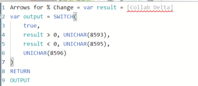
My % change column name is not being picked up by DAX. The column name is greyed out as you can see below -
Please help me get this right.
Thanks!!
- Mark as New
- Bookmark
- Subscribe
- Mute
- Subscribe to RSS Feed
- Permalink
- Report Inappropriate Content
When writing a measure you have told DAX to use the column but not told DAX what to do with the column. In my example [% Change] was assumed to be a measure that calculated the % Change.
You might need to add something like MAX() or MIN() around the column name, but you need to be aware of the effect this will have depending on how you intend to use the measure.
- Mark as New
- Bookmark
- Subscribe
- Mute
- Subscribe to RSS Feed
- Permalink
- Report Inappropriate Content
Hi @Anonymous thanks for the input.
Here's the code that worked for me -
- Mark as New
- Bookmark
- Subscribe
- Mute
- Subscribe to RSS Feed
- Permalink
- Report Inappropriate Content
There are 2 parts to this. This measure is creating the "data". The conditional formatting is a separate thing you set up on the visual itself. You can either set up the rules using the visual's interface for conditional formatting, or you can create another measure that returns hexadecimal colour codes that the conditional formatting interface points to.
- Mark as New
- Bookmark
- Subscribe
- Mute
- Subscribe to RSS Feed
- Permalink
- Report Inappropriate Content
Hi @saipawar ,
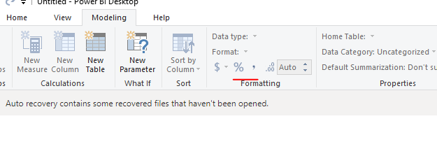
Set the formatting of the measure/ column using the Formatting section of the Modeling tab in the ribbon.
If this post helps, then please consider Accept it as the solution to help the others find it more quickly.
- Mark as New
- Bookmark
- Subscribe
- Mute
- Subscribe to RSS Feed
- Permalink
- Report Inappropriate Content
Using the value of % change, you can add icon as explained here:
https://docs.microsoft.com/en-us/power-bi/desktop-conditional-table-formatting#add-icons
- Mark as New
- Bookmark
- Subscribe
- Mute
- Subscribe to RSS Feed
- Permalink
- Report Inappropriate Content
Hi @tarunsingla
Thanks for sharing the link. I imported the data in PBI and changed the data type for both the "Delta" columns to "Percentage" but looks like when and hit "Close and Apply", I still see the delta numbers as decimals and not percentages. Would you know what might be causing this?
Thanks!!
- Mark as New
- Bookmark
- Subscribe
- Mute
- Subscribe to RSS Feed
- Permalink
- Report Inappropriate Content
Hi,
Share the link from where i can download your PBI file.
Regards,
Ashish Mathur
http://www.ashishmathur.com
https://www.linkedin.com/in/excelenthusiasts/
- Mark as New
- Bookmark
- Subscribe
- Mute
- Subscribe to RSS Feed
- Permalink
- Report Inappropriate Content
Hi Ashish!! Thanks for helping here 😌
You can download the excel and pbix file from here - https://drive.google.com/drive/folders/1OTlOzkAIH8e2Py5wB7ISd3c8ptKdS4vr?usp=sharing.
The dataset shows the number of followers for each social channel and for two teams/products.
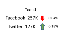
Ultimately depending on the delta % (column D and G), I would like to show a colored upward or downward arrow next to the QTD number (Column B and E) -
Here's a mockup -
Thanks!!
- Mark as New
- Bookmark
- Subscribe
- Mute
- Subscribe to RSS Feed
- Permalink
- Report Inappropriate Content
In the matrix table, you have an option in the conditional formatting: icon. You can check that and you will get an advance control.
But this metric * metric format will not work so easily. You need to do something like this
union(
summarize("Measure","Share of Voice", "YTD",[Share of Voice YTD], "LYTD",[Share of Voice LYTD], "Change %",[Share of Voice %]),
summarize("Measure","SOV Rank", "YTD",[SOV Rank YTD], "LYTD",[SOV Rank LYTD], "Change %",[SOV Rank %])
)
No in conditional formatting choose Change %, enable icon and use advance control.
Appreciate your Kudos. In case, this is the solution you are looking for, mark it as the Solution.
In case it does not help, please provide additional information and mark me with @
Thanks. My Recent Blogs -Decoding Direct Query - Time Intelligence, Winner Coloring on MAP, HR Analytics, Power BI Working with Non-Standard TimeAnd Comparing Data Across Date Ranges
Proud to be a Datanaut Connect on Linkedin
Helpful resources
| User | Count |
|---|---|
| 84 | |
| 80 | |
| 70 | |
| 47 | |
| 43 |
| User | Count |
|---|---|
| 108 | |
| 54 | |
| 50 | |
| 40 | |
| 40 |

