Join us at FabCon Vienna from September 15-18, 2025
The ultimate Fabric, Power BI, SQL, and AI community-led learning event. Save €200 with code FABCOMM.
Get registered- Power BI forums
- Get Help with Power BI
- Desktop
- Service
- Report Server
- Power Query
- Mobile Apps
- Developer
- DAX Commands and Tips
- Custom Visuals Development Discussion
- Health and Life Sciences
- Power BI Spanish forums
- Translated Spanish Desktop
- Training and Consulting
- Instructor Led Training
- Dashboard in a Day for Women, by Women
- Galleries
- Data Stories Gallery
- Themes Gallery
- Contests Gallery
- Quick Measures Gallery
- Notebook Gallery
- Translytical Task Flow Gallery
- TMDL Gallery
- R Script Showcase
- Webinars and Video Gallery
- Ideas
- Custom Visuals Ideas (read-only)
- Issues
- Issues
- Events
- Upcoming Events
Compete to become Power BI Data Viz World Champion! First round ends August 18th. Get started.
- Power BI forums
- Forums
- Get Help with Power BI
- Desktop
- How can I create a interactive venn diagram
- Subscribe to RSS Feed
- Mark Topic as New
- Mark Topic as Read
- Float this Topic for Current User
- Bookmark
- Subscribe
- Printer Friendly Page
- Mark as New
- Bookmark
- Subscribe
- Mute
- Subscribe to RSS Feed
- Permalink
- Report Inappropriate Content
How can I create a interactive venn diagram
Hi
I am trying to create an interactive ven diagram the outline draft of how I would like it to look is below:
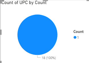
Everything is perfect the only trouble I am having is the venn diagram itself. I have tried to use a pie charts example below to create the ven diagram so i was going to have 6 of these based on the slicers, and when the user selects the chart the table I would want it to filter out the list of products within that pie chart but it isnt working. When I select the pie chart the table isnt cross filtering. Please could you advise on what to do?
Solved! Go to Solution.
- Mark as New
- Bookmark
- Subscribe
- Mute
- Subscribe to RSS Feed
- Permalink
- Report Inappropriate Content
Hi @Powerbing1,
If both common visuals and custom visuals not suitable for your requirement, you can also try to use script-based visuals (r, python) if you are familiar with these scripts.
Venn Diagram with R or RStudio: A Million Ways - Datanovia
How to Create and Customize Venn Diagrams in Python | by Julia Kho | Towards Data Science
Notice: script-based visuals can respond with other visuals' interactions but they cannot directly affect other visuals.
Regards,
Xiaoxin Sheng
- Mark as New
- Bookmark
- Subscribe
- Mute
- Subscribe to RSS Feed
- Permalink
- Report Inappropriate Content
Hey @Powerbing1 ,
I think the Venn Diagram by MAQ could be an option for you:
Venn Diagram by MAQ Software (microsoft.com)
Here a video and description of the custom visual:
Power BI Custom Visuals - Venn Diagram by MAQ Software (pragmaticworks.com)
- Mark as New
- Bookmark
- Subscribe
- Mute
- Subscribe to RSS Feed
- Permalink
- Report Inappropriate Content
Hi Denis,
Thank you, however I already tried using this visual but it is not interactive. I would want the user to select each set and have the table filtered out. For example if I select 1 of the sets in the ven diagram which shows 5 i would want 5 of the products to show up in the table.
Are you able to help me with this?
THank you,
- Mark as New
- Bookmark
- Subscribe
- Mute
- Subscribe to RSS Feed
- Permalink
- Report Inappropriate Content
Hi @Powerbing1,
If both common visuals and custom visuals not suitable for your requirement, you can also try to use script-based visuals (r, python) if you are familiar with these scripts.
Venn Diagram with R or RStudio: A Million Ways - Datanovia
How to Create and Customize Venn Diagrams in Python | by Julia Kho | Towards Data Science
Notice: script-based visuals can respond with other visuals' interactions but they cannot directly affect other visuals.
Regards,
Xiaoxin Sheng


