Join us at FabCon Vienna from September 15-18, 2025
The ultimate Fabric, Power BI, SQL, and AI community-led learning event. Save €200 with code FABCOMM.
Get registered- Power BI forums
- Get Help with Power BI
- Desktop
- Service
- Report Server
- Power Query
- Mobile Apps
- Developer
- DAX Commands and Tips
- Custom Visuals Development Discussion
- Health and Life Sciences
- Power BI Spanish forums
- Translated Spanish Desktop
- Training and Consulting
- Instructor Led Training
- Dashboard in a Day for Women, by Women
- Galleries
- Data Stories Gallery
- Themes Gallery
- Contests Gallery
- Quick Measures Gallery
- Notebook Gallery
- Translytical Task Flow Gallery
- TMDL Gallery
- R Script Showcase
- Webinars and Video Gallery
- Ideas
- Custom Visuals Ideas (read-only)
- Issues
- Issues
- Events
- Upcoming Events
Enhance your career with this limited time 50% discount on Fabric and Power BI exams. Ends August 31st. Request your voucher.
- Power BI forums
- Forums
- Get Help with Power BI
- Desktop
- Re: How can I achieve this in Power BI?
- Subscribe to RSS Feed
- Mark Topic as New
- Mark Topic as Read
- Float this Topic for Current User
- Bookmark
- Subscribe
- Printer Friendly Page
- Mark as New
- Bookmark
- Subscribe
- Mute
- Subscribe to RSS Feed
- Permalink
- Report Inappropriate Content
How can I achieve this in Power BI?
Hi guys,
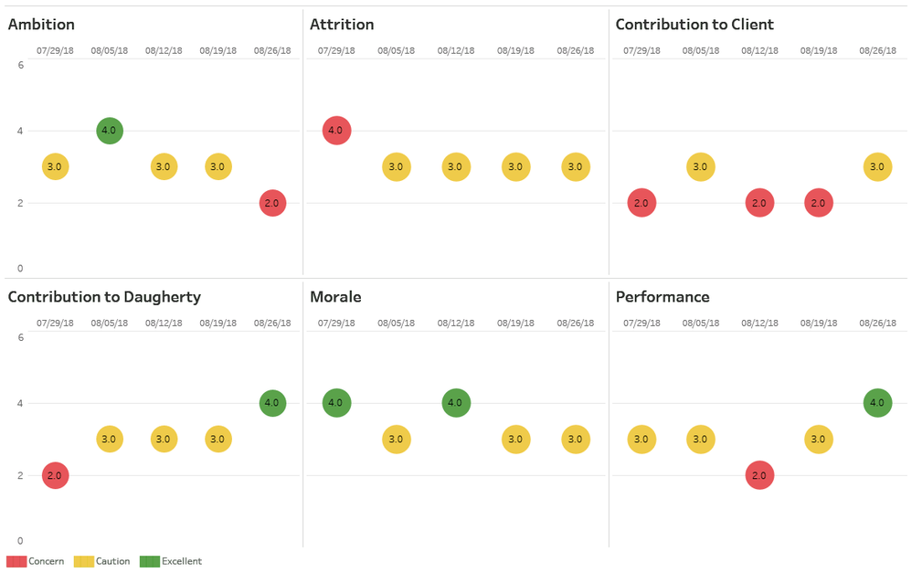
I am a Tableau developer and I am trying to learn Power BI. I need to buid an app in Powr BI that looks like this:
The app has to have a filter where I can either pick a single consultant or all of consultants. So, the circles would either show a team average or the values for a particular consultant.
A sample of data is below:
- Mark as New
- Bookmark
- Subscribe
- Mute
- Subscribe to RSS Feed
- Permalink
- Report Inappropriate Content
Hi @cageybee,
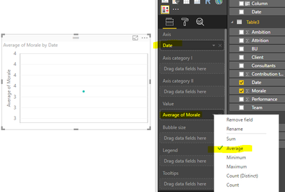
There is no same visual in Power BI. After research, I find a similar custom visual: Dot Plot by MAQ Software. Then you can create per visual for Ambition, Morale, Attrition, Performance and Contribution to Daughterty. I post an example for creating a visual for Morale using your sample data. Select the data as X-axis, the average of Morale as value.
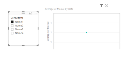
Then you create a slicer including consultants field, when you select one consultant in slicer, it will make an impact on the visual.
Best Regards,
Angelia
- Mark as New
- Bookmark
- Subscribe
- Mute
- Subscribe to RSS Feed
- Permalink
- Report Inappropriate Content
v-huizhn-msft,
Thank you for looking into this for me. However, this doesn't really look like what I need. I experimented with that viz package and it doesn't really do what I need it to do. First, I need to make the bubbles bigger than the max size of the bubbles that they have and then, I need to put a label inside of the bubble.
Also, I need to incorporate a logic that colors the bubble based on the criteria:
For Attrition only the following logic applies:
IF  (6 - ROUND(AVG([Attrition]), 1)) >= [Upper Bound] THEN

    "Excellent"

ELSEIF (6 - ROUND(AVG([Attrition]), 1)) < [Upper Bound] AND (6 - ROUND(AVG([Attrition]), 1)) >= [Lower Bound] THEN

    "Caution"

ELSEIF (6 - ROUND(AVG([Attrition]), 1)) < [Lower Bound] THEN

    "Concern"

END
For all others, the following logic applies (Replace [Measure] with either [Ambition], [Morale], [Performance], [Contribution to Client], or [Contribution to Daugherty]):
IF  ROUND(AVG([Measure]), 1) >= [Upper Bound] THEN

    "Excellent"

ELSEIF ROUND(AVG([Measure]), 1) < [Upper Bound] AND ROUND(AVG([Measure]), 1) >= [Lower Bound] THEN

    "Caution"

ELSEIF ROUND(AVG([Measure]), 1) < [Lower Bound] THEN

    "Concern"

END
Note: [Lower Bound] = 3; [Upper Bound] = 4.
- Mark as New
- Bookmark
- Subscribe
- Mute
- Subscribe to RSS Feed
- Permalink
- Report Inappropriate Content
Hi @cageybee,
Yes, got it. But Power BI features can't achieve your requirement until now. Thanks for understanding.
Best Regards,
Angelia
Helpful resources
| User | Count |
|---|---|
| 81 | |
| 74 | |
| 42 | |
| 30 | |
| 28 |
| User | Count |
|---|---|
| 108 | |
| 96 | |
| 53 | |
| 48 | |
| 47 |


