Huge last-minute discounts for FabCon Vienna from September 15-18, 2025
Supplies are limited. Contact info@espc.tech right away to save your spot before the conference sells out.
Get your discount- Power BI forums
- Get Help with Power BI
- Desktop
- Service
- Report Server
- Power Query
- Mobile Apps
- Developer
- DAX Commands and Tips
- Custom Visuals Development Discussion
- Health and Life Sciences
- Power BI Spanish forums
- Translated Spanish Desktop
- Training and Consulting
- Instructor Led Training
- Dashboard in a Day for Women, by Women
- Galleries
- Data Stories Gallery
- Themes Gallery
- Contests Gallery
- Quick Measures Gallery
- Notebook Gallery
- Translytical Task Flow Gallery
- TMDL Gallery
- R Script Showcase
- Webinars and Video Gallery
- Ideas
- Custom Visuals Ideas (read-only)
- Issues
- Issues
- Events
- Upcoming Events
Score big with last-minute savings on the final tickets to FabCon Vienna. Secure your discount
- Power BI forums
- Forums
- Get Help with Power BI
- Desktop
- Re: How are point sizes decided based on point val...
- Subscribe to RSS Feed
- Mark Topic as New
- Mark Topic as Read
- Float this Topic for Current User
- Bookmark
- Subscribe
- Printer Friendly Page
- Mark as New
- Bookmark
- Subscribe
- Mute
- Subscribe to RSS Feed
- Permalink
- Report Inappropriate Content
How are point sizes decided based on point value?
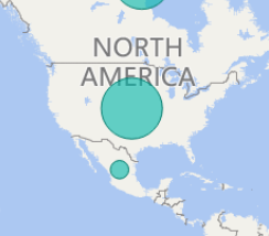
I ploted sales of US and Mexican on the map, the values ratio of US:Mexico is about 1.2:1, however the circles radius I got on the map are like 4:1, which makes the circle for US way more bigger than that of Mexico. This can be misleading so I wonder how the sizes are related to values ?
Solved! Go to Solution.
- Mark as New
- Bookmark
- Subscribe
- Mute
- Subscribe to RSS Feed
- Permalink
- Report Inappropriate Content
Hi @rliu,
I can reproduce the above behavior in Map visual using your sample data. Based on my test, it seems that map visual always shows a fixed point size for the minimum value, it ignores the proportion between US and Mexico when Mexico has the least Gross Sales among different countries. And actually, the point sizes in Map visual are not related to point values, you can check the examples which I test with different values from this link: https://1drv.ms/u/s!AhsotbnGu1NogWrNknwQ8eaULOLh .
I will report this issue internally and post back once I get any update.
There is also a similar thread about map point size issue for your reference.
http://community.powerbi.com/t5/Desktop/Map-point-sizes-almost-all-the-same/m-p/50798#M20335
Thanks,
Lydia Zhang
- Mark as New
- Bookmark
- Subscribe
- Mute
- Subscribe to RSS Feed
- Permalink
- Report Inappropriate Content
I see. Alright. Thank you very much @Anonymous
- Mark as New
- Bookmark
- Subscribe
- Mute
- Subscribe to RSS Feed
- Permalink
- Report Inappropriate Content
Hi @rliu,
I am not able to reproduce your issue when creating map visualization in the latest version of Power BI Desktop(2.36.4434.381).
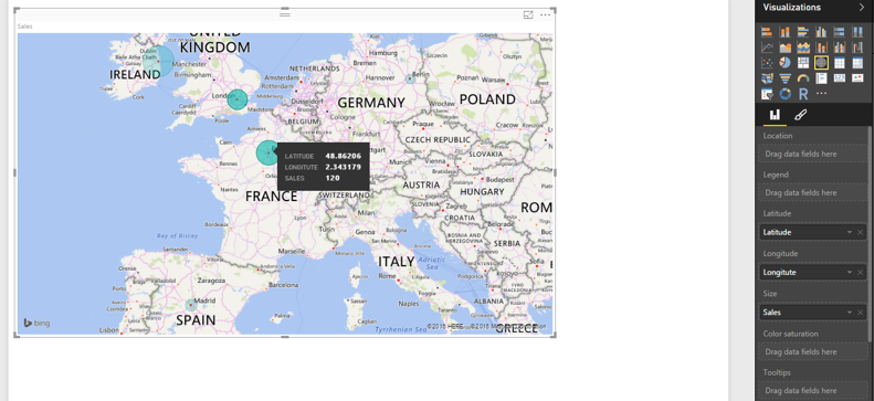
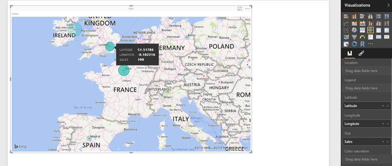
As per my test, the point size renders based on the point value as illustrated in the following screenshots. Could you please share sample data of your scenario so that I can test it in my environment?
Thanks,
Lydia Zhang
- Mark as New
- Bookmark
- Subscribe
- Mute
- Subscribe to RSS Feed
- Permalink
- Report Inappropriate Content
Hi Lydia,
Here is the link to my sample data. I was comparing US and Mexico's gross sales.
http://go.microsoft.com/fwlink/?LinkID=521962
And here is what I got. The ratio of size is much bigger than the ratio of actual gross sales values. i.e seems to me that the sizes do not reflect real ratio of point values. Thank you for looking into this


