FabCon is coming to Atlanta
Join us at FabCon Atlanta from March 16 - 20, 2026, for the ultimate Fabric, Power BI, AI and SQL community-led event. Save $200 with code FABCOMM.
Register now!- Power BI forums
- Get Help with Power BI
- Desktop
- Service
- Report Server
- Power Query
- Mobile Apps
- Developer
- DAX Commands and Tips
- Custom Visuals Development Discussion
- Health and Life Sciences
- Power BI Spanish forums
- Translated Spanish Desktop
- Training and Consulting
- Instructor Led Training
- Dashboard in a Day for Women, by Women
- Galleries
- Data Stories Gallery
- Themes Gallery
- Contests Gallery
- QuickViz Gallery
- Quick Measures Gallery
- Visual Calculations Gallery
- Notebook Gallery
- Translytical Task Flow Gallery
- TMDL Gallery
- R Script Showcase
- Webinars and Video Gallery
- Ideas
- Custom Visuals Ideas (read-only)
- Issues
- Issues
- Events
- Upcoming Events
The Power BI Data Visualization World Championships is back! Get ahead of the game and start preparing now! Learn more
- Power BI forums
- Forums
- Get Help with Power BI
- Desktop
- How Can I Show all the categories in a Waterfall G...
- Subscribe to RSS Feed
- Mark Topic as New
- Mark Topic as Read
- Float this Topic for Current User
- Bookmark
- Subscribe
- Printer Friendly Page
- Mark as New
- Bookmark
- Subscribe
- Mute
- Subscribe to RSS Feed
- Permalink
- Report Inappropriate Content
How Can I Show all the categories in a Waterfall Graph?
Hi all,
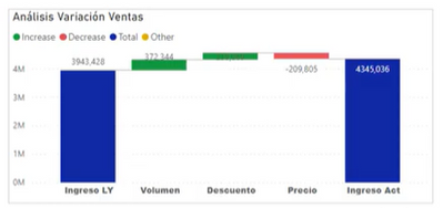
I have created a Waterfall Chart but at some point the graph doesn't show the categories and shows the values as "Others", and I need to have each single category shown on the graph.
Can somebody help me, please?
I am using the standard chart in Power Bi, and as values a calculated measure, as shown in this video, that in this video works fine because it only have three categories, but I have more than 8 categories.
Crear Gráfica personalizada de Cascada en PowerBI
Variación ingresos =
VAR SelectCtegoria = SELECTEDVALUE (Categoria [Categoria[)
VAR SelectEscalera =SELECTEDVALUE (Escalera[Desc])
Return
SWITCH(SelecCategoria,
"Ingreso LY"
Switch(SelectEscalera.
"Volumen",-1*[ImpactoVol],
"Precio",-1*[ImpactoPrecio],
"Descuento",-1*[Diff Desc],
[IngresosLY]
),
"Ingreso Act",
SWITCH(SelectEscalera,
"Volumen",0
"precio",0,
"Descuento",0,
[Ingresos]
)
Many thanks in advance,
Marina
Solved! Go to Solution.
- Mark as New
- Bookmark
- Subscribe
- Mute
- Subscribe to RSS Feed
- Permalink
- Report Inappropriate Content
Hi , @Anonymous
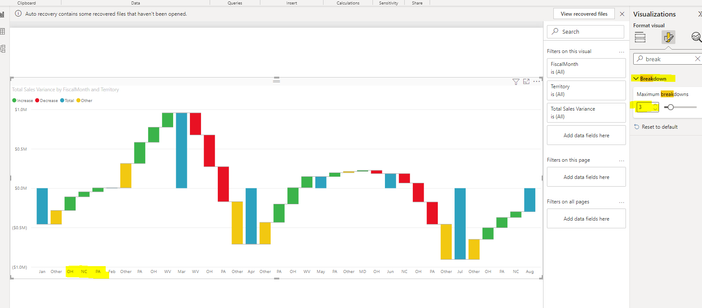
Do you mean you want to show the "Breakdown" you want ?
If it is this , you can configure it in "Format" Pane , like this:
Best Regards,
Aniya Zhang
If this post helps, then please consider Accept it as the solution to help the other members find it more quickly
- Mark as New
- Bookmark
- Subscribe
- Mute
- Subscribe to RSS Feed
- Permalink
- Report Inappropriate Content
Hi , @Anonymous
Based on my testing and research, the Waterfall chart is designed to show the total of data in Power BI as it increases and subtracts values. These charts are useful for understanding how initial values, such as net income, are affected by a range of positive and negative changes. Its columns are not meant to be grouped according to your "Category", if you want to implement the ability to group columns in your chart according to your "Category", you can try "Clustered column chart".
For more information , you can refer to :
Waterfall charts in Power BI - Power BI | Microsoft Learn
Clustered column chart in Power BI - Power BI Docs
Best Regards,
Aniya Zhang
If this post helps, then please consider Accept it as the solution to help the other members find it more quickly
- Mark as New
- Bookmark
- Subscribe
- Mute
- Subscribe to RSS Feed
- Permalink
- Report Inappropriate Content
Thanks for your reply, but I am afraid my problem is just the other way roun 😞 Power Bi groups automatically my categories and I need all the categories to be snow.
Anyhow, many thanks to take your time to help me.
Kindest Regards,
Marina Maqueda ARiz
- Mark as New
- Bookmark
- Subscribe
- Mute
- Subscribe to RSS Feed
- Permalink
- Report Inappropriate Content
Hi , @Anonymous
Do you mean you want to show the "Breakdown" you want ?
If it is this , you can configure it in "Format" Pane , like this:
Best Regards,
Aniya Zhang
If this post helps, then please consider Accept it as the solution to help the other members find it more quickly
- Mark as New
- Bookmark
- Subscribe
- Mute
- Subscribe to RSS Feed
- Permalink
- Report Inappropriate Content
Hello I was struggling with the same issue. This was a great help!
I have one question.
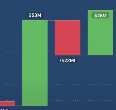
I have a waterfall chart like below.
By default, the waterfall shows all the increases then all the decreases.
How can I change the order of the categories so that the chart shows increases and decreases in the order that I prefer.
Sort of like below.
Many thanks!
H
- Mark as New
- Bookmark
- Subscribe
- Mute
- Subscribe to RSS Feed
- Permalink
- Report Inappropriate Content
yes, exactly! Thank you very much!
Helpful resources

Power BI Dataviz World Championships
The Power BI Data Visualization World Championships is back! Get ahead of the game and start preparing now!

| User | Count |
|---|---|
| 39 | |
| 38 | |
| 38 | |
| 28 | |
| 27 |
| User | Count |
|---|---|
| 124 | |
| 88 | |
| 73 | |
| 66 | |
| 65 |


