FabCon is coming to Atlanta
Join us at FabCon Atlanta from March 16 - 20, 2026, for the ultimate Fabric, Power BI, AI and SQL community-led event. Save $200 with code FABCOMM.
Register now!- Power BI forums
- Get Help with Power BI
- Desktop
- Service
- Report Server
- Power Query
- Mobile Apps
- Developer
- DAX Commands and Tips
- Custom Visuals Development Discussion
- Health and Life Sciences
- Power BI Spanish forums
- Translated Spanish Desktop
- Training and Consulting
- Instructor Led Training
- Dashboard in a Day for Women, by Women
- Galleries
- Data Stories Gallery
- Themes Gallery
- Contests Gallery
- QuickViz Gallery
- Quick Measures Gallery
- Visual Calculations Gallery
- Notebook Gallery
- Translytical Task Flow Gallery
- TMDL Gallery
- R Script Showcase
- Webinars and Video Gallery
- Ideas
- Custom Visuals Ideas (read-only)
- Issues
- Issues
- Events
- Upcoming Events
The Power BI Data Visualization World Championships is back! Get ahead of the game and start preparing now! Learn more
- Power BI forums
- Forums
- Get Help with Power BI
- Desktop
- Re: How Can I Make a Chart Like This in Power BI?
- Subscribe to RSS Feed
- Mark Topic as New
- Mark Topic as Read
- Float this Topic for Current User
- Bookmark
- Subscribe
- Printer Friendly Page
- Mark as New
- Bookmark
- Subscribe
- Mute
- Subscribe to RSS Feed
- Permalink
- Report Inappropriate Content
How Can I Make a Chart Like This in Power BI?
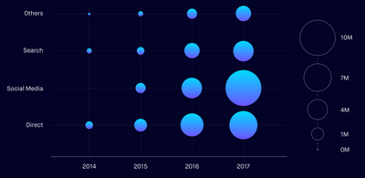
Is it possible to create this sort of chart in Power BI desktop?
Time along the x-axis, categories on the y-axis and a count of something which would determine the size of the bubbles.
Solved! Go to Solution.
- Mark as New
- Bookmark
- Subscribe
- Mute
- Subscribe to RSS Feed
- Permalink
- Report Inappropriate Content
You should be able to do that with one of the Dot Plot options (e.g., the one by MAQ) in the Custom Visuals marketplace (hit the ellipsis in the visuals section and choose Get More Visuals). Since you are using Year, you can plot that as a number on the axis in the Dot Plot and it should work. If you have two category columns to compare, I don't think it would work, and you would need Charticulator or use SVGs in a matrix visual.
Regards,
Pat
Did I answer your question? Mark my post as a solution! Kudos are also appreciated!
To learn more about Power BI, follow me on Twitter or subscribe on YouTube.
@mahoneypa HoosierBI on YouTube
- Mark as New
- Bookmark
- Subscribe
- Mute
- Subscribe to RSS Feed
- Permalink
- Report Inappropriate Content
Thank you @mahoneypat I've pretty much got it now. I created a test chart using this;
| TEAM | MONTH | GOALS |
| A | 1 | 10 |
| A | 2 | 2 |
| A | 3 | 20 |
| A | 4 | 15 |
| A | 5 | 20 |
| B | 1 | 7 |
| B | 2 | 12 |
| B | 3 | 11 |
| B | 4 | 28 |
| B | 5 | 13 |
| C | 1 | 6 |
| C | 2 | 1 |
| C | 3 | 0 |
| C | 4 | 9 |
| C | 5 | 11 |
| D | 1 | 17 |
| D | 2 | 5 |
| D | 3 | 4 |
| D | 4 | 16 |
| D | 5 | 10 |
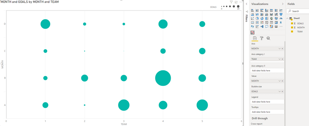
I've got it to visualise in the way I want using MAQ Dot Plot but somehow the axes labels have switched round. The x-axis is month but the label says name and vice versa. Do you know what I might be able to do to switch it back?
- Mark as New
- Bookmark
- Subscribe
- Mute
- Subscribe to RSS Feed
- Permalink
- Report Inappropriate Content
Hi @DHB ,
Basically it looks like strange. I have created a dot plot chart based on your picture and it gave me the correct corresponding value:
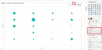
Maybe you can try to re-create a new chart to check or put the fields like this and use drill down to try:
Best Regards,
Community Support Team _ Yingjie Li
If this post helps, then please consider Accept it as the solution to help the other members find it more quickly.
- Mark as New
- Bookmark
- Subscribe
- Mute
- Subscribe to RSS Feed
- Permalink
- Report Inappropriate Content
Thanks @v-yingjl I've done that but when I flip orientation to horizontal to put Month on the x-axis the titles don't switch with them. I have to manually overwrite which is fine but not ideal/
- Mark as New
- Bookmark
- Subscribe
- Mute
- Subscribe to RSS Feed
- Permalink
- Report Inappropriate Content
Hi @DHB ,
Could you please consider sharing the 'problem' dummy .pbix file for further?
Best Regards,
Community Support Team _ Yingjie Li
- Mark as New
- Bookmark
- Subscribe
- Mute
- Subscribe to RSS Feed
- Permalink
- Report Inappropriate Content
It's not letting me upload a pbix but it's the MAQ Dot plot with the dummy data posted above
- Mark as New
- Bookmark
- Subscribe
- Mute
- Subscribe to RSS Feed
- Permalink
- Report Inappropriate Content
@v-yingjl It won't let me add a pbix file but it's basically just the MAQ Bubble chart and I used the test data posted above (20 rows, 3 columns).
- Mark as New
- Bookmark
- Subscribe
- Mute
- Subscribe to RSS Feed
- Permalink
- Report Inappropriate Content
This seems weird, but in the format options you can turn on the title and put Month and Team in the title text boxes and those text values will overwrite what is shown.
Regards,
Pat
Did I answer your question? Mark my post as a solution! Kudos are also appreciated!
To learn more about Power BI, follow me on Twitter or subscribe on YouTube.
@mahoneypa HoosierBI on YouTube
- Mark as New
- Bookmark
- Subscribe
- Mute
- Subscribe to RSS Feed
- Permalink
- Report Inappropriate Content
Hi @DHB,
Use a scatter chart for this.
Regards
Miguel Félix
Did I answer your question? Mark my post as a solution!
Proud to be a Super User!
Check out my blog: Power BI em Português- Mark as New
- Bookmark
- Subscribe
- Mute
- Subscribe to RSS Feed
- Permalink
- Report Inappropriate Content
Thanks @MFelix. The scatter chart won't accept categorical data in the y-axis. The only way I could make it work was by giving each category a number but then you lose the category values on the axis.
- Mark as New
- Bookmark
- Subscribe
- Mute
- Subscribe to RSS Feed
- Permalink
- Report Inappropriate Content
Hi @DHB
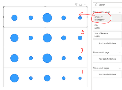
Please Check the sample outcome, i purposed couple of days back:
at least in power BI you can achieve something like this-
Hope this helps
Cheers,
-Namish B
Helpful resources

Power BI Dataviz World Championships
The Power BI Data Visualization World Championships is back! Get ahead of the game and start preparing now!

| User | Count |
|---|---|
| 38 | |
| 38 | |
| 36 | |
| 28 | |
| 28 |
| User | Count |
|---|---|
| 124 | |
| 88 | |
| 74 | |
| 66 | |
| 65 |


