FabCon is coming to Atlanta
Join us at FabCon Atlanta from March 16 - 20, 2026, for the ultimate Fabric, Power BI, AI and SQL community-led event. Save $200 with code FABCOMM.
Register now!- Power BI forums
- Get Help with Power BI
- Desktop
- Service
- Report Server
- Power Query
- Mobile Apps
- Developer
- DAX Commands and Tips
- Custom Visuals Development Discussion
- Health and Life Sciences
- Power BI Spanish forums
- Translated Spanish Desktop
- Training and Consulting
- Instructor Led Training
- Dashboard in a Day for Women, by Women
- Galleries
- Data Stories Gallery
- Themes Gallery
- Contests Gallery
- QuickViz Gallery
- Quick Measures Gallery
- Visual Calculations Gallery
- Notebook Gallery
- Translytical Task Flow Gallery
- TMDL Gallery
- R Script Showcase
- Webinars and Video Gallery
- Ideas
- Custom Visuals Ideas (read-only)
- Issues
- Issues
- Events
- Upcoming Events
Get Fabric Certified for FREE during Fabric Data Days. Don't miss your chance! Request now
- Power BI forums
- Forums
- Get Help with Power BI
- Desktop
- Horizontal bar charts with custom center line
- Subscribe to RSS Feed
- Mark Topic as New
- Mark Topic as Read
- Float this Topic for Current User
- Bookmark
- Subscribe
- Printer Friendly Page
- Mark as New
- Bookmark
- Subscribe
- Mute
- Subscribe to RSS Feed
- Permalink
- Report Inappropriate Content
Horizontal bar charts with custom center line
Hi everyone,
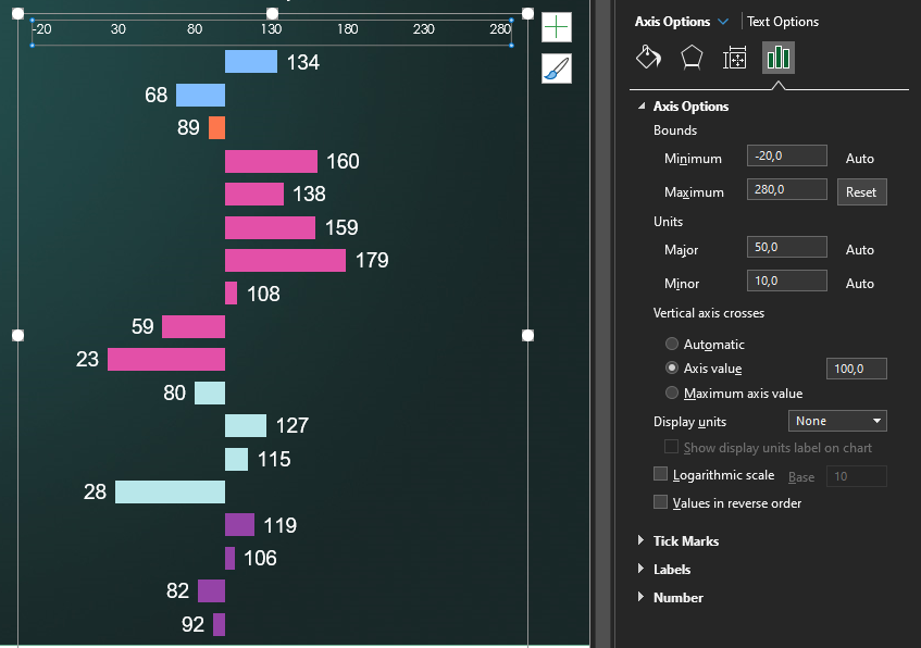
I'm trying to replicate in Power BI a visual I had no problems creating in excel.
It's a horizontal bar chart where the center line on the x axis is 100. If a value is over 100 the bar goes right, otherwise it goes left (See below)
From what I've found reading other threads I didn't find a solution: it seems in Power BI there's no equivalent option to that "vertical axis crosses" you see in excel. I've tried a workaround using the tornado visual but it doesn't suit my needs, since the bars diverge differently.
Does anybody have any idea on how to solve this?
Thanks,
Gianluca
Solved! Go to Solution.
- Mark as New
- Bookmark
- Subscribe
- Mute
- Subscribe to RSS Feed
- Permalink
- Report Inappropriate Content
Hi @Gianlucariotti ,
You can do this by making some measures and tweaking the chart in order to have the correct values.
Create the following measures:
Values below 100 =
IF(SUM('Table (2)'[VAlue]) <= 100 , SUM('Table (2)'[VAlue]))

Until 100 values = IF(SUM('Table (2)'[VAlue])<= 100, 100-SUM('Table (2)'[VAlue]))

100 values = IF(SUM('Table (2)'[VAlue])> 100, 100)

values above 100 = if(SUM('Table (2)'[VAlue]) > 100 , SUM('Table (2)'[VAlue]) -100 )


Label over 100 = if(SUM('Table (2)'[VAlue]) > 100, SUM('Table (2)'[VAlue]))
Now create a stacked bar chart and place the measures in the following order:
Values below 100
Until 100 values
100 Values
values above 100
label over 100
Now on the setup of your chart do the following:
Colors of the measure below should be white (or equal to background)
values below 100
100 values
label over 100
data labels for all of the measure below should be turn off:
until 100 values
values above 100
100 values
Labels for the measure below should be place on specified location:
values below 100 - inside end
Label over 100 - inside start
Set the x-axis maximum value to 100
You should also do a custom tooltip instead of the normal one.
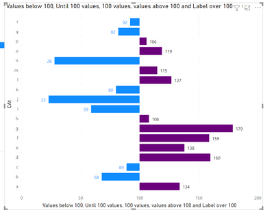
Result below and in attach file.
Regards
Miguel Félix
Did I answer your question? Mark my post as a solution!
Proud to be a Super User!
Check out my blog: Power BI em Português- Mark as New
- Bookmark
- Subscribe
- Mute
- Subscribe to RSS Feed
- Permalink
- Report Inappropriate Content
Hi @Gianlucariotti ,
You can do this by making some measures and tweaking the chart in order to have the correct values.
Create the following measures:
Values below 100 =
IF(SUM('Table (2)'[VAlue]) <= 100 , SUM('Table (2)'[VAlue]))

Until 100 values = IF(SUM('Table (2)'[VAlue])<= 100, 100-SUM('Table (2)'[VAlue]))

100 values = IF(SUM('Table (2)'[VAlue])> 100, 100)

values above 100 = if(SUM('Table (2)'[VAlue]) > 100 , SUM('Table (2)'[VAlue]) -100 )


Label over 100 = if(SUM('Table (2)'[VAlue]) > 100, SUM('Table (2)'[VAlue]))
Now create a stacked bar chart and place the measures in the following order:
Values below 100
Until 100 values
100 Values
values above 100
label over 100
Now on the setup of your chart do the following:
Colors of the measure below should be white (or equal to background)
values below 100
100 values
label over 100
data labels for all of the measure below should be turn off:
until 100 values
values above 100
100 values
Labels for the measure below should be place on specified location:
values below 100 - inside end
Label over 100 - inside start
Set the x-axis maximum value to 100
You should also do a custom tooltip instead of the normal one.
Result below and in attach file.
Regards
Miguel Félix
Did I answer your question? Mark my post as a solution!
Proud to be a Super User!
Check out my blog: Power BI em PortuguêsHelpful resources

Power BI Monthly Update - November 2025
Check out the November 2025 Power BI update to learn about new features.

Fabric Data Days
Advance your Data & AI career with 50 days of live learning, contests, hands-on challenges, study groups & certifications and more!

| User | Count |
|---|---|
| 102 | |
| 79 | |
| 57 | |
| 51 | |
| 46 |

