FabCon is coming to Atlanta
Join us at FabCon Atlanta from March 16 - 20, 2026, for the ultimate Fabric, Power BI, AI and SQL community-led event. Save $200 with code FABCOMM.
Register now!- Power BI forums
- Get Help with Power BI
- Desktop
- Service
- Report Server
- Power Query
- Mobile Apps
- Developer
- DAX Commands and Tips
- Custom Visuals Development Discussion
- Health and Life Sciences
- Power BI Spanish forums
- Translated Spanish Desktop
- Training and Consulting
- Instructor Led Training
- Dashboard in a Day for Women, by Women
- Galleries
- Data Stories Gallery
- Themes Gallery
- Contests Gallery
- Quick Measures Gallery
- Visual Calculations Gallery
- Notebook Gallery
- Translytical Task Flow Gallery
- TMDL Gallery
- R Script Showcase
- Webinars and Video Gallery
- Ideas
- Custom Visuals Ideas (read-only)
- Issues
- Issues
- Events
- Upcoming Events
Calling all Data Engineers! Fabric Data Engineer (Exam DP-700) live sessions are back! Starting October 16th. Sign up.
- Power BI forums
- Forums
- Get Help with Power BI
- Desktop
- Histogram Based on Rank
- Subscribe to RSS Feed
- Mark Topic as New
- Mark Topic as Read
- Float this Topic for Current User
- Bookmark
- Subscribe
- Printer Friendly Page
- Mark as New
- Bookmark
- Subscribe
- Mute
- Subscribe to RSS Feed
- Permalink
- Report Inappropriate Content
Histogram Based on Rank
Hi,
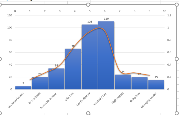
I have to create histogram(SS) based on data.Any idea how to get below chart.
| Employee ID | Name | Rank Performance | Rank |
| 122 | Michael David | Underperformer | 9 |
| 150 | Lisa Douglas | Underperformer | 9 |
| 125 | Jennifer Smith | Inconsistent | 8 |
| 130 | Mohammad Rafi | Assess Fit to Role | 7 |
| 131 | Keith Loving | Effective | 6 |
| 132 | Riz Carl | Key Performer | 5 |
| 133 | Glen Rafael | Trusted / Key | 4 |
| 134 | Emily Painter | High Impact | 3 |
| 135 | Alex Mogno | Rising Star | 2 |
| 136 | Rookie Thomas | Emerging Leader | 1 |
| 141 | James Watt | Emerging Leader | 1 |
| 155 | Suzie Orman | Rising Star | 2 |
| 165 | Jim Ares | Effective | 6 |
| 171 | Jennah Magdoom | Key Performer | 5 |
Solved! Go to Solution.
- Mark as New
- Bookmark
- Subscribe
- Mute
- Subscribe to RSS Feed
- Permalink
- Report Inappropriate Content
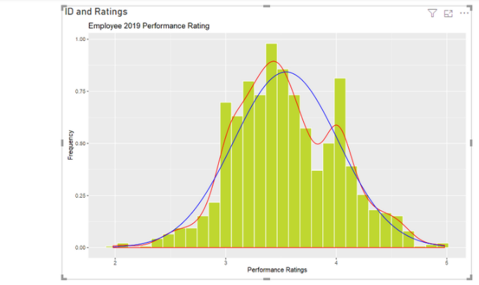
I think you may need to build a R visual to achieve your goal.
The visual will look like as below.
You may refer to this blog: R Script - Overlay Normal Distribution Curve
For more info about how to build R visual in Power BI: Create Power BI visuals using R
Best Regards,
Rico Zhou
If this post helps, then please consider Accept it as the solution to help the other members find it more quickly.
- Mark as New
- Bookmark
- Subscribe
- Mute
- Subscribe to RSS Feed
- Permalink
- Report Inappropriate Content
Could you tell me if your problem has been solved? If it is, kindly Accept the helpful reply as the solution. More people will benefit from it. Or you are still confused about it, please provide me with more details about your table and your problem or share me with your pbix file from your Onedrive for Business.
Best Regards,
Rico Zhou
- Mark as New
- Bookmark
- Subscribe
- Mute
- Subscribe to RSS Feed
- Permalink
- Report Inappropriate Content
I think you may need to build a R visual to achieve your goal.
The visual will look like as below.
You may refer to this blog: R Script - Overlay Normal Distribution Curve
For more info about how to build R visual in Power BI: Create Power BI visuals using R
Best Regards,
Rico Zhou
If this post helps, then please consider Accept it as the solution to help the other members find it more quickly.
- Mark as New
- Bookmark
- Subscribe
- Mute
- Subscribe to RSS Feed
- Permalink
- Report Inappropriate Content
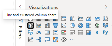
Hi, @redcotton9063 , you might want to use "Line and clustered column chart" viz in Power BI to visualize the data.
| Thanks to the great efforts by MS engineers to simplify syntax of DAX! Most beginners are SUCCESSFULLY MISLED to think that they could easily master DAX; but it turns out that the intricacy of the most frequently used RANKX() is still way beyond their comprehension! |
DAX is simple, but NOT EASY! |
- Mark as New
- Bookmark
- Subscribe
- Mute
- Subscribe to RSS Feed
- Permalink
- Report Inappropriate Content
@redcotton9063 , Not very clear , see if these viusal can help
https://appsource.microsoft.com/en-us/product/power-bi-visuals/WA104380776?tab=Overview
https://blog.pragmaticworks.com/power-bi-custom-visuals-histogram
Or this blog
https://www.mssqltips.com/sqlservertip/4076/power-bi-histogram-example-using-dax/
Helpful resources

FabCon Global Hackathon
Join the Fabric FabCon Global Hackathon—running virtually through Nov 3. Open to all skill levels. $10,000 in prizes!

Power BI Monthly Update - October 2025
Check out the October 2025 Power BI update to learn about new features.


