FabCon is coming to Atlanta
Join us at FabCon Atlanta from March 16 - 20, 2026, for the ultimate Fabric, Power BI, AI and SQL community-led event. Save $200 with code FABCOMM.
Register now!- Power BI forums
- Get Help with Power BI
- Desktop
- Service
- Report Server
- Power Query
- Mobile Apps
- Developer
- DAX Commands and Tips
- Custom Visuals Development Discussion
- Health and Life Sciences
- Power BI Spanish forums
- Translated Spanish Desktop
- Training and Consulting
- Instructor Led Training
- Dashboard in a Day for Women, by Women
- Galleries
- Data Stories Gallery
- Themes Gallery
- Contests Gallery
- QuickViz Gallery
- Quick Measures Gallery
- Visual Calculations Gallery
- Notebook Gallery
- Translytical Task Flow Gallery
- TMDL Gallery
- R Script Showcase
- Webinars and Video Gallery
- Ideas
- Custom Visuals Ideas (read-only)
- Issues
- Issues
- Events
- Upcoming Events
The Power BI Data Visualization World Championships is back! Get ahead of the game and start preparing now! Learn more
- Power BI forums
- Forums
- Get Help with Power BI
- Desktop
- Highlight current month in yearly view
- Subscribe to RSS Feed
- Mark Topic as New
- Mark Topic as Read
- Float this Topic for Current User
- Bookmark
- Subscribe
- Printer Friendly Page
- Mark as New
- Bookmark
- Subscribe
- Mute
- Subscribe to RSS Feed
- Permalink
- Report Inappropriate Content
Highlight current month in yearly view
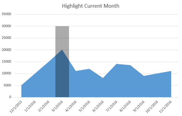
I need to highlight the current month (background or overlay or additional column in gray) in a view that shows data for a whole year. Example attached below (assumes the current month is 3/1/2016):

Is this possible? The highlighted month would obviously change to be 2/1/2016 if the chart was viewed in February 2016, and 4/1/2016 if the chart was viewed in April 2016.
Thanks in advance!
Solved! Go to Solution.
- Mark as New
- Bookmark
- Subscribe
- Mute
- Subscribe to RSS Feed
- Permalink
- Report Inappropriate Content
A bit hacky, but you could just make a measure that only displays in the current month, then put that measure on a combo chart with your actual series.
The measure you'd need looks like this:
CurrentMonth =
IF(
	HASONEVALUE( 'Date'[YearMonth] )
	,IF(
		VALUES( 'Date'[YearMonth] )
			= LOOKUPVALUE(
				'Date'[YearMonth]
				,'Date'[Date]
				,TODAY()
			)
		,<expression for height>
	)
)
You could just put 1 as your height expression and use two y axes, but you'll end up with an extra axis on one side ranging from 0 to 1. If you want to plot them on the same y axis, then you'd need to define something that's larger than the values in your line series. I used something like the following:
CurrentMonth =
IF(
	HASONEVALUE( 'Date'[YearMonth] )
	,IF(
		VALUES( 'Date'[YearMonth] )
			= LOOKUPVALUE(
				'Date'[YearMonth]
				,'Date'[Date]
				,TODAY()
			)
		,MAXX(
			ALL( 'Date'[YearMonth] )
			,CALCULATE( SUM( FakeData[Value] ) )
		) * 1.25
	)
)
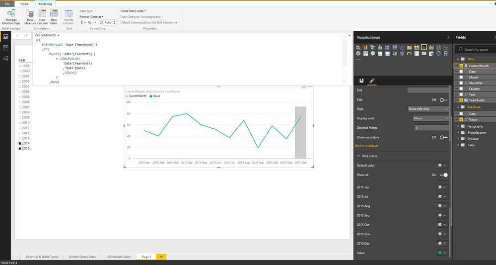
The only difference is the MAXX() in there. It finds the largest monthly value of FakeData[Value] and then multiplies it by 1.25 This guarantees it's larger than my line series (which is just SUM( FakeData[Value] )), but still proportional, allowing it to fit well on the same y axis.
The measure is fairly simple. First we check if there's exactly one value for [YearMonth] in context (necessary for the next IF() function).
Then we evaluate VALUES( 'Date'[YearMonth] ) - this gives us all distinct values of that field in context, if there's only 1, then it is cast as a scalar value implicitly, allowing us to compare with the result of LOOKUPVALUE() for equality.
LOOKUPVALUE() just returns the value of [YearMonth] where [Date] = TODAY(). If the [YearMonth] in context is the same as today's, we return the MAXX() or whatever other expression you used there. If not, we return blank. If there's more than one [YearMonth] in context (like in a subtotal of any sort), the measure returns blank.
Here's a sample PBI report where I've implemented this:
- Mark as New
- Bookmark
- Subscribe
- Mute
- Subscribe to RSS Feed
- Permalink
- Report Inappropriate Content
Hi @tatlar,
I don't think it's possible given the existing charts that are available. Surely staff can hover their mouse pointer over the month they are interested in ?
The only workaround solution that I can think of is to have 2 charts, with the current month overlaid on top of the yearly chart.
UPDATE:
SORRY... tried and it doesn't work. I thought I could get the front graph to show its relative position. But it just centres the current month in the middle of the chart... my bad
Cheers,
Daniel
- Mark as New
- Bookmark
- Subscribe
- Mute
- Subscribe to RSS Feed
- Permalink
- Report Inappropriate Content
- Mark as New
- Bookmark
- Subscribe
- Mute
- Subscribe to RSS Feed
- Permalink
- Report Inappropriate Content
A bit hacky, but you could just make a measure that only displays in the current month, then put that measure on a combo chart with your actual series.
The measure you'd need looks like this:
CurrentMonth =
IF(
	HASONEVALUE( 'Date'[YearMonth] )
	,IF(
		VALUES( 'Date'[YearMonth] )
			= LOOKUPVALUE(
				'Date'[YearMonth]
				,'Date'[Date]
				,TODAY()
			)
		,<expression for height>
	)
)
You could just put 1 as your height expression and use two y axes, but you'll end up with an extra axis on one side ranging from 0 to 1. If you want to plot them on the same y axis, then you'd need to define something that's larger than the values in your line series. I used something like the following:
CurrentMonth =
IF(
	HASONEVALUE( 'Date'[YearMonth] )
	,IF(
		VALUES( 'Date'[YearMonth] )
			= LOOKUPVALUE(
				'Date'[YearMonth]
				,'Date'[Date]
				,TODAY()
			)
		,MAXX(
			ALL( 'Date'[YearMonth] )
			,CALCULATE( SUM( FakeData[Value] ) )
		) * 1.25
	)
)
The only difference is the MAXX() in there. It finds the largest monthly value of FakeData[Value] and then multiplies it by 1.25 This guarantees it's larger than my line series (which is just SUM( FakeData[Value] )), but still proportional, allowing it to fit well on the same y axis.
The measure is fairly simple. First we check if there's exactly one value for [YearMonth] in context (necessary for the next IF() function).
Then we evaluate VALUES( 'Date'[YearMonth] ) - this gives us all distinct values of that field in context, if there's only 1, then it is cast as a scalar value implicitly, allowing us to compare with the result of LOOKUPVALUE() for equality.
LOOKUPVALUE() just returns the value of [YearMonth] where [Date] = TODAY(). If the [YearMonth] in context is the same as today's, we return the MAXX() or whatever other expression you used there. If not, we return blank. If there's more than one [YearMonth] in context (like in a subtotal of any sort), the measure returns blank.
Here's a sample PBI report where I've implemented this:
- Mark as New
- Bookmark
- Subscribe
- Mute
- Subscribe to RSS Feed
- Permalink
- Report Inappropriate Content
Thanks @greggyb! I will look into that - although hacky looks like it solves the problem! Much obliged.
Helpful resources

Power BI Dataviz World Championships
The Power BI Data Visualization World Championships is back! Get ahead of the game and start preparing now!

| User | Count |
|---|---|
| 38 | |
| 38 | |
| 36 | |
| 28 | |
| 28 |
| User | Count |
|---|---|
| 124 | |
| 89 | |
| 73 | |
| 66 | |
| 65 |


