A new Data Days event is coming soon!
This time we’re going bigger than ever. Fabric, Power BI, SQL, AI and more. We're covering it all. You won't want to miss it.
Learn more- Power BI forums
- Get Help with Power BI
- Desktop
- Service
- Report Server
- Power Query
- Mobile Apps
- Developer
- DAX Commands and Tips
- Custom Visuals Development Discussion
- Health and Life Sciences
- Power BI Spanish forums
- Translated Spanish Desktop
- Training and Consulting
- Instructor Led Training
- Dashboard in a Day for Women, by Women
- Galleries
- Data Stories Gallery
- Themes Gallery
- Contests Gallery
- QuickViz Gallery
- Quick Measures Gallery
- Visual Calculations Gallery
- Notebook Gallery
- Translytical Task Flow Gallery
- TMDL Gallery
- R Script Showcase
- Webinars and Video Gallery
- Ideas
- Custom Visuals Ideas (read-only)
- Issues
- Issues
- Events
- Upcoming Events
Level up your Power BI skills this month - build one visual each week and tell better stories with data! Get started
- Power BI forums
- Forums
- Get Help with Power BI
- Desktop
- Highlight Area in Data Visualization for Emphasis ...
- Subscribe to RSS Feed
- Mark Topic as New
- Mark Topic as Read
- Float this Topic for Current User
- Bookmark
- Subscribe
- Printer Friendly Page
- Mark as New
- Bookmark
- Subscribe
- Mute
- Subscribe to RSS Feed
- Permalink
- Report Inappropriate Content
Highlight Area in Data Visualization for Emphasis - Please Help!
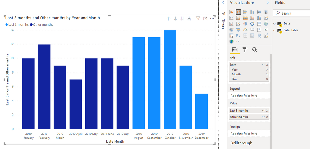
In the simple visualization below, I am hoping to emphasize a portion of the timeline, the last 3 months for instance, to emphasize a specific time period of focus, but also connecting the relevancy to earlier months.
So for instance, October through June may be a subtle color, while July - September would be emphasized with an alternative (brighter) color.
Anybody have a recommendation how to do this from a technique perspective? I am looking for a solution that can create the contrasting colors as the data changes...i.e. Highlight the last 3 mos, as opposed to highlight Jul, Aug, Sept if a conditional formatting is the recommended approach.
Thanks in advance.
Solved! Go to Solution.
- Mark as New
- Bookmark
- Subscribe
- Mute
- Subscribe to RSS Feed
- Permalink
- Report Inappropriate Content
Hi @Anonymous ,
one approach would be to create to different measures and have them both in the same chart.
As the DATEADD-function only accepts columns as input, I prefer to create a year-month number in my date table like this:
YearMonthNumber =
 ( YEAR ( Date[Date] ) - 2016 ) * 12
    + MONTH ( Date[Date] )
Your last 3 months-measure would when then look like this
Last 3 months =
VAR currentYearMontNumber =
    ( YEAR ( TODAY () ) - 2016 ) * 12
        + MONTH ( TODAY () )
RETURN
    CALCULATE (
        SUM ( 'Sales table'[Sales] );
        FILTER ( 'Date'; 'Date'[YearMonthNumber] > currentYearMontNumber - 3 )
    )
and the other months like this:
Other months =
VAR currentYearMontNumber =
    ( YEAR ( TODAY () ) - 2016 ) * 12
        + MONTH ( TODAY () )
RETURN
    CALCULATE (
        SUM ( 'Sales table'[Sales] );
        FILTER ( 'Date'; 'Date'[YearMonthNumber] <= currentYearMontNumber - 3 )
    )
Then add both measures to a chart and it will look somethink like this
Cheers,
Sturla
If this post helps, then please consider Accepting it as the solution. Kudos are nice too.
Helpful resources

Power BI Monthly Update - April 2026
Check out the April 2026 Power BI update to learn about new features.

Data Days 2026 coming soon!
Sign up to receive a private message when registration opens and key events begin.

New to Fabric Survey
If you have recently started exploring Fabric, we'd love to hear how it's going. Your feedback can help with product improvements.

| User | Count |
|---|---|
| 36 | |
| 33 | |
| 27 | |
| 24 | |
| 18 |
| User | Count |
|---|---|
| 66 | |
| 50 | |
| 33 | |
| 24 | |
| 24 |


