FabCon is coming to Atlanta
Join us at FabCon Atlanta from March 16 - 20, 2026, for the ultimate Fabric, Power BI, AI and SQL community-led event. Save $200 with code FABCOMM.
Register now!- Power BI forums
- Get Help with Power BI
- Desktop
- Service
- Report Server
- Power Query
- Mobile Apps
- Developer
- DAX Commands and Tips
- Custom Visuals Development Discussion
- Health and Life Sciences
- Power BI Spanish forums
- Translated Spanish Desktop
- Training and Consulting
- Instructor Led Training
- Dashboard in a Day for Women, by Women
- Galleries
- Data Stories Gallery
- Themes Gallery
- Contests Gallery
- Quick Measures Gallery
- Notebook Gallery
- Translytical Task Flow Gallery
- TMDL Gallery
- R Script Showcase
- Webinars and Video Gallery
- Ideas
- Custom Visuals Ideas (read-only)
- Issues
- Issues
- Events
- Upcoming Events
To celebrate FabCon Vienna, we are offering 50% off select exams. Ends October 3rd. Request your discount now.
- Power BI forums
- Forums
- Get Help with Power BI
- Desktop
- Re: Hierarchy slicer - question about expand/colla...
- Subscribe to RSS Feed
- Mark Topic as New
- Mark Topic as Read
- Float this Topic for Current User
- Bookmark
- Subscribe
- Printer Friendly Page
- Mark as New
- Bookmark
- Subscribe
- Mute
- Subscribe to RSS Feed
- Permalink
- Report Inappropriate Content
Hierarchy slicer - question about expand/collapse all and advanced search features
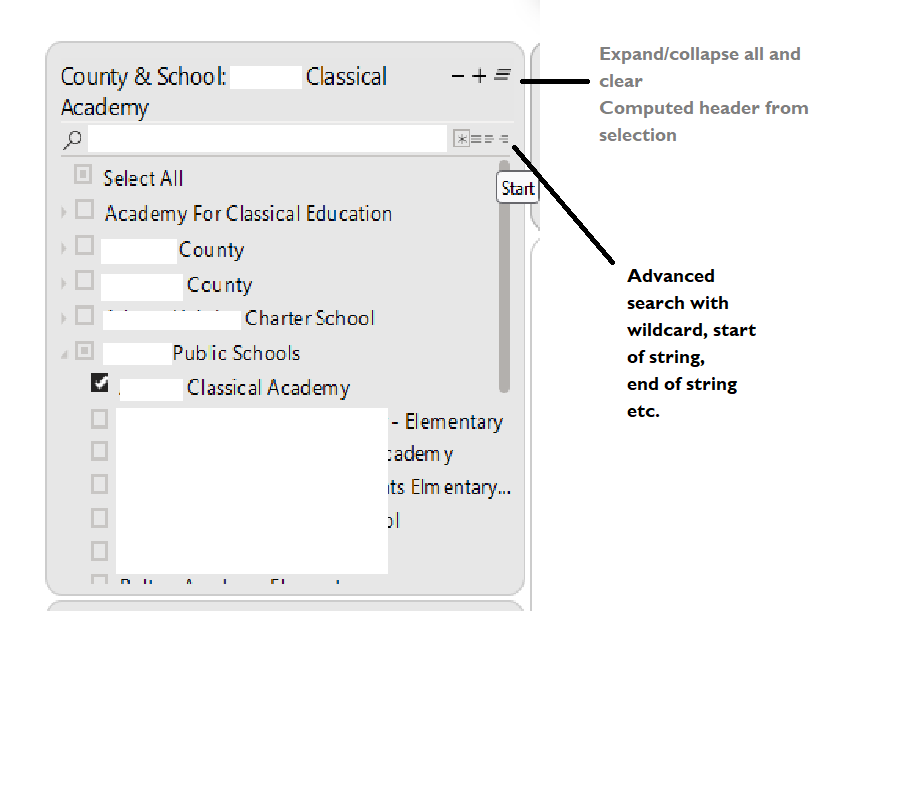
Trying to understand how the below features was added to a hierarchy slicer on a report that was shared with me (please see picture).
I am a bit rusty, getting back into PBI after two years or more, was this done using bookmark etc or are there readily available visuals that can help do this?
Thanks.
Solved! Go to Solution.
- Mark as New
- Bookmark
- Subscribe
- Mute
- Subscribe to RSS Feed
- Permalink
- Report Inappropriate Content
HI @sanimesa ,
This is a custom visual in Power BI called - Hierarchy Slicer.
You can find more details about it here:
https://appsource.microsoft.com/en-us/product/power-bi-visuals/wa104380820?tab=overview
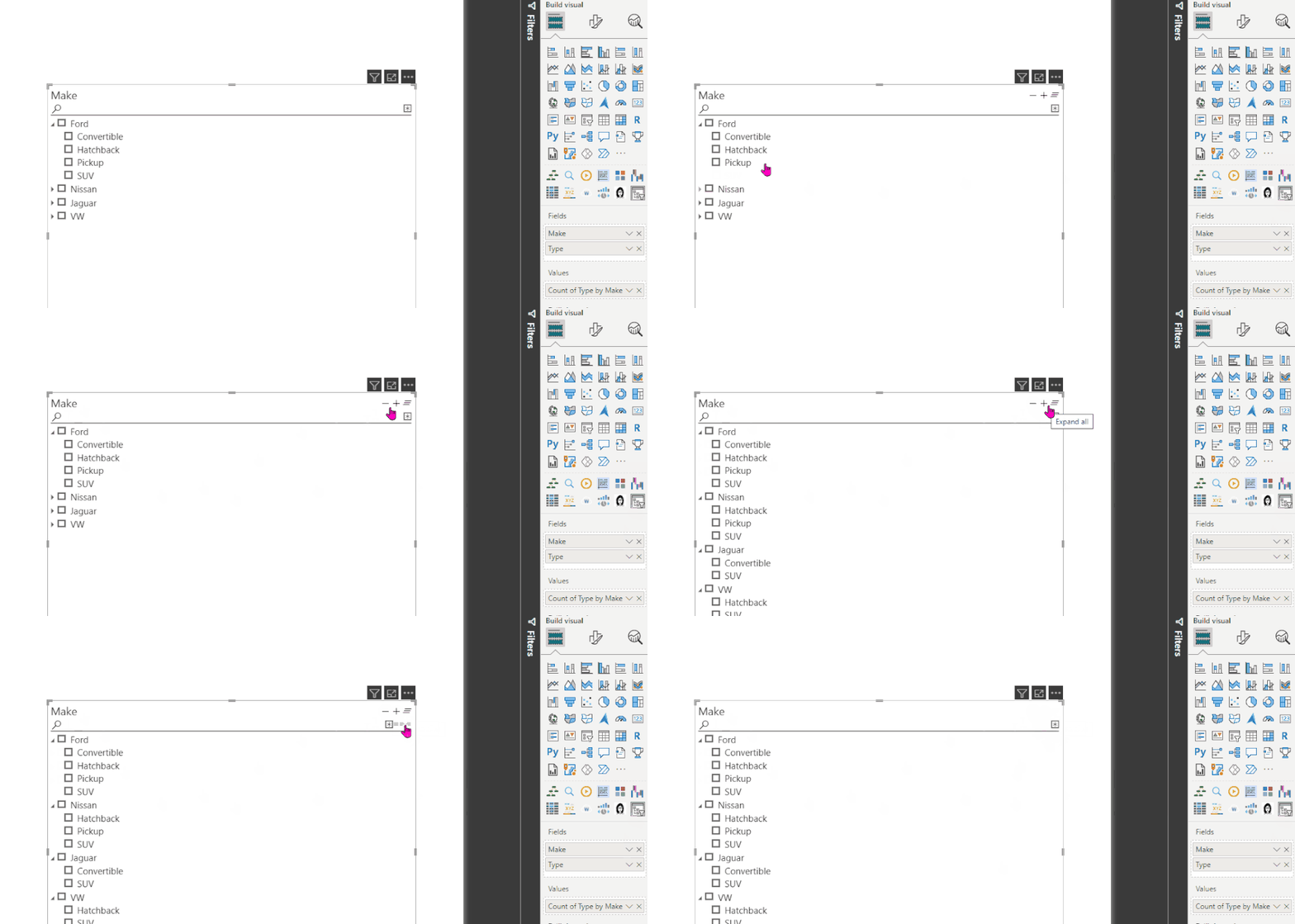
I just tried testing it on my data and can see all the option as per your screenshot:
Hope this helps.
- Mark as New
- Bookmark
- Subscribe
- Mute
- Subscribe to RSS Feed
- Permalink
- Report Inappropriate Content
- Mark as New
- Bookmark
- Subscribe
- Mute
- Subscribe to RSS Feed
- Permalink
- Report Inappropriate Content
HI @sanimesa ,
This is a custom visual in Power BI called - Hierarchy Slicer.
You can find more details about it here:
https://appsource.microsoft.com/en-us/product/power-bi-visuals/wa104380820?tab=overview
I just tried testing it on my data and can see all the option as per your screenshot:
Hope this helps.


