Join us at the 2025 Microsoft Fabric Community Conference
Microsoft Fabric Community Conference 2025, March 31 - April 2, Las Vegas, Nevada. Use code FABINSIDER for a $400 discount.
Register now- Power BI forums
- Get Help with Power BI
- Desktop
- Service
- Report Server
- Power Query
- Mobile Apps
- Developer
- DAX Commands and Tips
- Custom Visuals Development Discussion
- Health and Life Sciences
- Power BI Spanish forums
- Translated Spanish Desktop
- Training and Consulting
- Instructor Led Training
- Dashboard in a Day for Women, by Women
- Galleries
- Webinars and Video Gallery
- Data Stories Gallery
- Themes Gallery
- Power BI DataViz World Championships Gallery
- Quick Measures Gallery
- R Script Showcase
- COVID-19 Data Stories Gallery
- Community Connections & How-To Videos
- 2021 MSBizAppsSummit Gallery
- 2020 MSBizAppsSummit Gallery
- 2019 MSBizAppsSummit Gallery
- Events
- Ideas
- Custom Visuals Ideas
- Issues
- Issues
- Events
- Upcoming Events
The Power BI DataViz World Championships are on! With four chances to enter, you could win a spot in the LIVE Grand Finale in Las Vegas. Show off your skills.
- Power BI forums
- Forums
- Get Help with Power BI
- Desktop
- Re: Hide or edit individual legend items
- Subscribe to RSS Feed
- Mark Topic as New
- Mark Topic as Read
- Float this Topic for Current User
- Bookmark
- Subscribe
- Printer Friendly Page
- Mark as New
- Bookmark
- Subscribe
- Mute
- Subscribe to RSS Feed
- Permalink
- Report Inappropriate Content
Hide or edit individual legend items
Hi all,
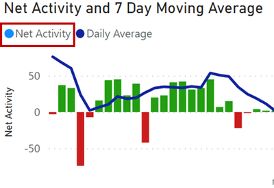
I have created a combined line and column chart, in which the column "Net Activity" have a custom color formatting to show when a value is below or above 0. However, after creating the custom formatting, the column legend shows the original color of the column. I have been unable to find a way to either hide the legend item or edit it to not show any color next to "Net Activity".
In the very least would like to maintin the legend item for "Daily Average" line.
Any suggestion for how to do this would be greatly appreciated.
- Mark as New
- Bookmark
- Subscribe
- Mute
- Subscribe to RSS Feed
- Permalink
- Report Inappropriate Content
In Power BI, achieving this type of legend customization can be challenging, as there's no direct way to remove or change the color indicator in the legend for conditional formatting. However, here are some workarounds to achieve a similar effect:
Option 1: Separate Legends with Text Boxes
1. Turn off the Legend: In the Visualizations pane, go to the "Format" section, find the "Legend" option, and toggle it off.
2. Add Custom Text Boxes for Legends: Create a text box for each legend item you want to display. For example, add a text box labeled "Net Activity" and another labeled "Daily Average."
3. Add Indicators Manually: You can use shapes (such as circles or squares) or images in Power BI to create custom color indicators next to the text boxes, if desired. Set the color for each shape to represent the corresponding measure.
Option 2: Create a Custom Legend in Power BI Desktop
1. Create a Custom Legend Table: In Power BI, you can create a separate table that contains the legend items you need, with columns for the name and color.
2. Use a Card or Multi-row Card Visual: Display this table using a Card or Multi-row Card visual and place it above or near the chart to serve as a custom legend. This lets you format colors or icons as desired without altering the chart itself.
Option 3: Use a Secondary Chart for Legend
1. Duplicate the Chart for Legend Purposes: Create a duplicate of your chart, but only display the "Daily Average" line in this duplicate.
2. Overlay or Position the Chart Legend: Turn on the legend for this secondary chart and position it to align with your main chart. This way, only the "Daily Average" legend appears on the duplicated chart while hiding the "Net Activity" legend item.
- Mark as New
- Bookmark
- Subscribe
- Mute
- Subscribe to RSS Feed
- Permalink
- Report Inappropriate Content
thank you for detailed explanation. Nice workaround, since this is not my thread, I cannot mork this is oolved, but for me this works 👍
- Mark as New
- Bookmark
- Subscribe
- Mute
- Subscribe to RSS Feed
- Permalink
- Report Inappropriate Content
you ever found a solution for this?
I'm facing the same problem
Helpful resources

Join us at the Microsoft Fabric Community Conference
March 31 - April 2, 2025, in Las Vegas, Nevada. Use code MSCUST for a $150 discount!

Power BI Monthly Update - February 2025
Check out the February 2025 Power BI update to learn about new features.

Join our Community Sticker Challenge 2025
If you love stickers, then you will definitely want to check out our Community Sticker Challenge!

| User | Count |
|---|---|
| 84 | |
| 69 | |
| 68 | |
| 39 | |
| 37 |

