Huge last-minute discounts for FabCon Vienna from September 15-18, 2025
Supplies are limited. Contact info@espc.tech right away to save your spot before the conference sells out.
Get your discount- Power BI forums
- Get Help with Power BI
- Desktop
- Service
- Report Server
- Power Query
- Mobile Apps
- Developer
- DAX Commands and Tips
- Custom Visuals Development Discussion
- Health and Life Sciences
- Power BI Spanish forums
- Translated Spanish Desktop
- Training and Consulting
- Instructor Led Training
- Dashboard in a Day for Women, by Women
- Galleries
- Data Stories Gallery
- Themes Gallery
- Contests Gallery
- Quick Measures Gallery
- Notebook Gallery
- Translytical Task Flow Gallery
- TMDL Gallery
- R Script Showcase
- Webinars and Video Gallery
- Ideas
- Custom Visuals Ideas (read-only)
- Issues
- Issues
- Events
- Upcoming Events
Score big with last-minute savings on the final tickets to FabCon Vienna. Secure your discount
- Power BI forums
- Forums
- Get Help with Power BI
- Desktop
- Re: Hide a measure in table visual using SelectedV...
- Subscribe to RSS Feed
- Mark Topic as New
- Mark Topic as Read
- Float this Topic for Current User
- Bookmark
- Subscribe
- Printer Friendly Page
- Mark as New
- Bookmark
- Subscribe
- Mute
- Subscribe to RSS Feed
- Permalink
- Report Inappropriate Content
Hide a measure in table visual using SelectedValue
Hi,
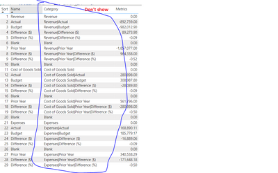
I am using the following measure - 'Metrics' to display in my table visual:

When I removed the field 'Category' the measure 'Metrics' no longer calculates correctly - this is expected behaviour as the measure used SELECTEDVALUE which is contexual (all values become 0 for the measure).
Is there a way to reference the Catgeory column without disaplying it on the visual and still have the measure calculate correctly?
Stanley
- Mark as New
- Bookmark
- Subscribe
- Mute
- Subscribe to RSS Feed
- Permalink
- Report Inappropriate Content
Just checking, can you confirm whether the name and category columns are in a single table?
- Mark as New
- Bookmark
- Subscribe
- Mute
- Subscribe to RSS Feed
- Permalink
- Report Inappropriate Content
- Mark as New
- Bookmark
- Subscribe
- Mute
- Subscribe to RSS Feed
- Permalink
- Report Inappropriate Content
Use a matrix visual and turn on the stepped layout and in the row headers turn off +/- icon this is the closest we can do I believe.
- Mark as New
- Bookmark
- Subscribe
- Mute
- Subscribe to RSS Feed
- Permalink
- Report Inappropriate Content
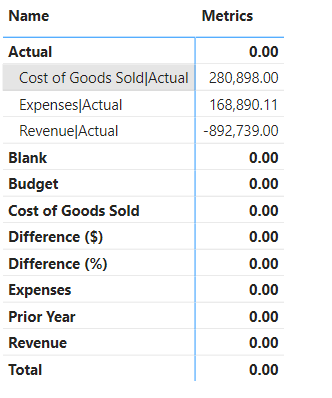
Unfortunbately this doesn't solve my issue. I get he following:
- Mark as New
- Bookmark
- Subscribe
- Mute
- Subscribe to RSS Feed
- Permalink
- Report Inappropriate Content
Hello @Stanzarectah ,
You can change the color of rows to any one color, let's say, white.
Then change the font color of both the values and the title to white.
Maybe this can be nearer to hiding the column as there is no feature present in Power BI now.
- Mark as New
- Bookmark
- Subscribe
- Mute
- Subscribe to RSS Feed
- Permalink
- Report Inappropriate Content
Yes, I have tried that a as a work around but was wondering if there is another way.
Helpful resources
| User | Count |
|---|---|
| 64 | |
| 59 | |
| 47 | |
| 33 | |
| 32 |
| User | Count |
|---|---|
| 84 | |
| 75 | |
| 56 | |
| 50 | |
| 44 |


