FabCon is coming to Atlanta
Join us at FabCon Atlanta from March 16 - 20, 2026, for the ultimate Fabric, Power BI, AI and SQL community-led event. Save $200 with code FABCOMM.
Register now!- Power BI forums
- Get Help with Power BI
- Desktop
- Service
- Report Server
- Power Query
- Mobile Apps
- Developer
- DAX Commands and Tips
- Custom Visuals Development Discussion
- Health and Life Sciences
- Power BI Spanish forums
- Translated Spanish Desktop
- Training and Consulting
- Instructor Led Training
- Dashboard in a Day for Women, by Women
- Galleries
- Data Stories Gallery
- Themes Gallery
- Contests Gallery
- Quick Measures Gallery
- Notebook Gallery
- Translytical Task Flow Gallery
- TMDL Gallery
- R Script Showcase
- Webinars and Video Gallery
- Ideas
- Custom Visuals Ideas (read-only)
- Issues
- Issues
- Events
- Upcoming Events
Join the Fabric FabCon Global Hackathon—running virtually through Nov 3. Open to all skill levels. $10,000 in prizes! Register now.
- Power BI forums
- Forums
- Get Help with Power BI
- Desktop
- Hide Time on a Continuous Date Axis
- Subscribe to RSS Feed
- Mark Topic as New
- Mark Topic as Read
- Float this Topic for Current User
- Bookmark
- Subscribe
- Printer Friendly Page
- Mark as New
- Bookmark
- Subscribe
- Mute
- Subscribe to RSS Feed
- Permalink
- Report Inappropriate Content
Hide Time on a Continuous Date Axis
TL;DR: How can I set a continuous date axis to not display times of day (12AM, 6AM, etc) when it is very zoomed in?
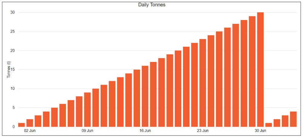
I want to create a visualisation (a column chart, and later a line chart as well) which shows the total value of a metric across many sites for many days. Currently I have about a month's worth of data, and expect it to increase. When all the data is shown together (first image, note that dummy data is used) it works perfectly.
However, I also would like to filter to a single site, and most of these sites only have values for a few days. As a result, when filtered, the graph only shows data for a short span of time, and the continuous date axis takes it upon itself to fill in all that empty space with overly precise timestamps (second image). So instead of just displaying "17 Jun", it shows "17 Jun 12AM", "17 Jun 6am", "17 Jun 12PM" and "17 Jun 6PM". I have received complaints that this behaviour is confusing readers. Does anyone know how to prevent Power BI from doing this? Tips and workarounds to get a similar effect would also be appreciated.
I have tried setting the data type to categorical, in which case every single date is printed in full and the full view is very difficult to read. I have also tried setting the x-axis to always have a min of Jun 1, which only prevents the behaviour from happening by stretching out the axis to be almost entirely empty.
Solved! Go to Solution.
- Mark as New
- Bookmark
- Subscribe
- Mute
- Subscribe to RSS Feed
- Permalink
- Report Inappropriate Content
Hi @jorio ,
As stated there isn't a proper way to format or change the values of the axis whilst in continuous mode. To make Power BI better, you can submit your request at Power BI Ideas and vote it up.
Best Regards,
Xue Ding
If this post helps, then please consider Accept it as the solution to help the other members find it more quickly.
Xue Ding
If this post helps, then please consider Accept it as the solution to help the other members find it more quickly.
- Mark as New
- Bookmark
- Subscribe
- Mute
- Subscribe to RSS Feed
- Permalink
- Report Inappropriate Content
@jorio Have you been able to come up with alternative solution? The same bug is causing problems for me too.
- Mark as New
- Bookmark
- Subscribe
- Mute
- Subscribe to RSS Feed
- Permalink
- Report Inappropriate Content
Hi @jorio ,
As stated there isn't a proper way to format or change the values of the axis whilst in continuous mode. To make Power BI better, you can submit your request at Power BI Ideas and vote it up.
Best Regards,
Xue Ding
If this post helps, then please consider Accept it as the solution to help the other members find it more quickly.
Xue Ding
If this post helps, then please consider Accept it as the solution to help the other members find it more quickly.
- Mark as New
- Bookmark
- Subscribe
- Mute
- Subscribe to RSS Feed
- Permalink
- Report Inappropriate Content
Pls can you try removing time part from column and just use date..?
May be create a new column which has only datae part and used that in your graph. I have not thried this but you can try quicly.
- Mark as New
- Bookmark
- Subscribe
- Mute
- Subscribe to RSS Feed
- Permalink
- Report Inappropriate Content
Unfortunately, the date field I used is already of type Date and not Datetime, it does not have a time associated with it. The visualisation is filling in the times because it is set as a continuous time axis.


