FabCon is coming to Atlanta
Join us at FabCon Atlanta from March 16 - 20, 2026, for the ultimate Fabric, Power BI, AI and SQL community-led event. Save $200 with code FABCOMM.
Register now!- Power BI forums
- Get Help with Power BI
- Desktop
- Service
- Report Server
- Power Query
- Mobile Apps
- Developer
- DAX Commands and Tips
- Custom Visuals Development Discussion
- Health and Life Sciences
- Power BI Spanish forums
- Translated Spanish Desktop
- Training and Consulting
- Instructor Led Training
- Dashboard in a Day for Women, by Women
- Galleries
- Data Stories Gallery
- Themes Gallery
- Contests Gallery
- QuickViz Gallery
- Quick Measures Gallery
- Visual Calculations Gallery
- Notebook Gallery
- Translytical Task Flow Gallery
- TMDL Gallery
- R Script Showcase
- Webinars and Video Gallery
- Ideas
- Custom Visuals Ideas (read-only)
- Issues
- Issues
- Events
- Upcoming Events
The Power BI Data Visualization World Championships is back! Get ahead of the game and start preparing now! Learn more
- Power BI forums
- Forums
- Get Help with Power BI
- Desktop
- Re: Help with stacked columns with different x val...
- Subscribe to RSS Feed
- Mark Topic as New
- Mark Topic as Read
- Float this Topic for Current User
- Bookmark
- Subscribe
- Printer Friendly Page
- Mark as New
- Bookmark
- Subscribe
- Mute
- Subscribe to RSS Feed
- Permalink
- Report Inappropriate Content
Help with stacked columns with different x values in same data entry
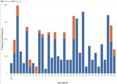
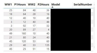
I have a datset where the entries are by model / serial number. Each entry can have phase 1 and phase 2 builds with associated hours. I'm looking to create a stacked column display for model/serial build time by work week separating colors by the phase of the build. The first image below shows the scheduled time graph I'm building.
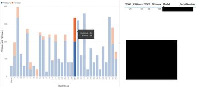
The problem I'm running into is that the graph is displaying everything summarized by the phase 1 schedule week. In other words Phase 2 hours are stacking on Phase 1 scheduled work week. How can I get phase 2 hours to show on the correct week? The second graph shows a selection where week 29 is selected, but includes also phase 2 hours for the build where phase 1 is schedule in week 29 (phase 2 is selected). How can i get the 135 hours to show in week 35?
I've tried a number of different sorts, and even separating the build hours into a separate table. I can't seem to separate phase 2 hours.
Thanks in advance!
Solved! Go to Solution.
- Mark as New
- Bookmark
- Subscribe
- Mute
- Subscribe to RSS Feed
- Permalink
- Report Inappropriate Content
I solved this by:
- Creating a calender table based on week number with this DAX: Week Num Base = VAR DateStart = MINX(tblSchedule,[P1Date].[Date]) VAR DateEnd = MAXX(tblSchedule,[ShipDate].[Date]) VAR simpledatetablesonlysunday = FILTER ( ADDCOLUMNS ( CALENDAR ( DateStart, DateEnd ), "weeknum", WEEKNUM ( [Date], 1 ) ), WEEKDAY ( [Date] ) = 1 ) RETURN simpledatetablesonlysunday
- 2. Setting up a query that pulls P1 data and relating with a date key for year/work week in its own table
- 3. setting up a separate query that pulls P2 data and relating with a date key for year/work week in its own table
- 4. relating P1, P2, and work week tables by the date key
- 5. graphing on a Line and Stacked Column Chart with calendar week number on X-axis, and P1 and P2 data on Y axis.
Helpful resources

Power BI Dataviz World Championships
The Power BI Data Visualization World Championships is back! Get ahead of the game and start preparing now!

| User | Count |
|---|---|
| 61 | |
| 44 | |
| 41 | |
| 36 | |
| 21 |
| User | Count |
|---|---|
| 176 | |
| 120 | |
| 106 | |
| 77 | |
| 52 |


