Huge last-minute discounts for FabCon Vienna from September 15-18, 2025
Supplies are limited. Contact info@espc.tech right away to save your spot before the conference sells out.
Get your discount- Power BI forums
- Get Help with Power BI
- Desktop
- Service
- Report Server
- Power Query
- Mobile Apps
- Developer
- DAX Commands and Tips
- Custom Visuals Development Discussion
- Health and Life Sciences
- Power BI Spanish forums
- Translated Spanish Desktop
- Training and Consulting
- Instructor Led Training
- Dashboard in a Day for Women, by Women
- Galleries
- Data Stories Gallery
- Themes Gallery
- Contests Gallery
- Quick Measures Gallery
- Notebook Gallery
- Translytical Task Flow Gallery
- TMDL Gallery
- R Script Showcase
- Webinars and Video Gallery
- Ideas
- Custom Visuals Ideas (read-only)
- Issues
- Issues
- Events
- Upcoming Events
Score big with last-minute savings on the final tickets to FabCon Vienna. Secure your discount
- Power BI forums
- Forums
- Get Help with Power BI
- Desktop
- Help with graphing
- Subscribe to RSS Feed
- Mark Topic as New
- Mark Topic as Read
- Float this Topic for Current User
- Bookmark
- Subscribe
- Printer Friendly Page
- Mark as New
- Bookmark
- Subscribe
- Mute
- Subscribe to RSS Feed
- Permalink
- Report Inappropriate Content
Help with graphing
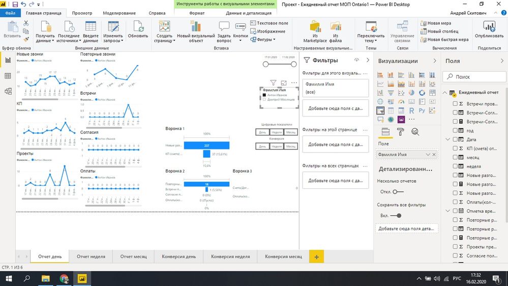
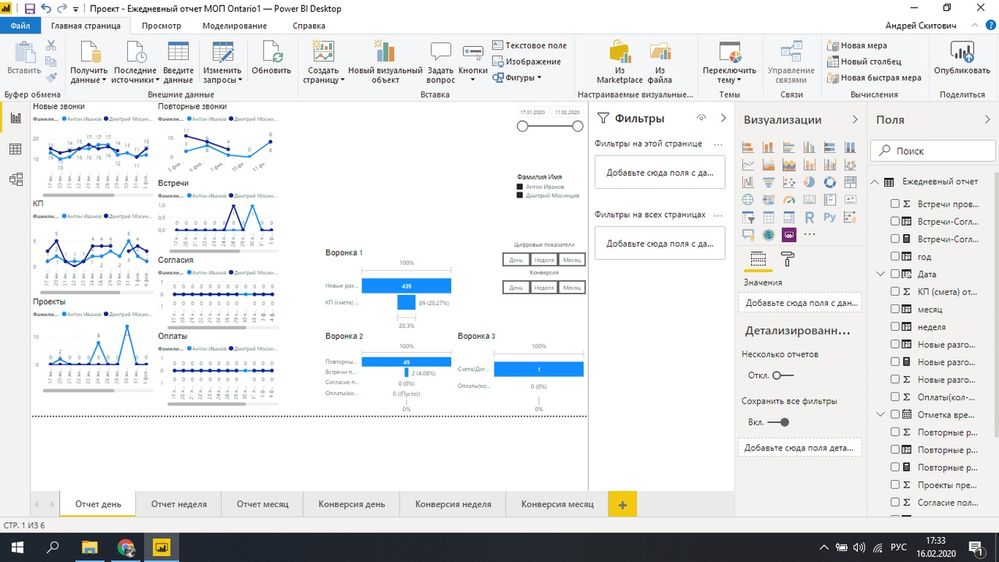
Good afternoon. I would be very grateful if you help with one question. In general, there are graphs shown in the first figure. When choosing a manager, only the selected manager is shown on the slice. When choosing two managers (Fig. 2), their comparison is shown. The question is this. How to make sure that their sum is displayed, that is, one line when no manager on the slice is selected. The slice is highlighted in the photo. I will be very grateful. I rack my brains for a long time.
Solved! Go to Solution.
- Mark as New
- Bookmark
- Subscribe
- Mute
- Subscribe to RSS Feed
- Permalink
- Report Inappropriate Content
Hi,
After trying some things i came up with a solution, I don't know if it's the best possible solution, but it seems to work for me.
First i added a new custom column to your existing table with managers, with all values being "all"
ifnotfiltered = "all"
Then I created a new table, with all the distinct managers and an extra row for "all":
filtertable = UNION(CALCULATETABLE(DISTINCT('Table'[manager])); ROW("manager"; "all"))
Then in the model window i created two relationships:
- 'filtertable'[manager] > 'Table'[Manager]
- 'filtertable'[manager] > 'Table'[ifnotfiltered]
Then create a measure that checks if the manager is filtered or not, if there is a filter we use the regular relationship, else we use the second relationship where the manager is "all"
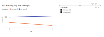
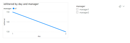
isfiltered = if(ISFILTERED('Table'[manager]); CALCULATE(SUM('Table'[value]) ; USERELATIONSHIP('Table'[manager]; filtertable[manager])) ;CALCULATE( SUM('Table'[value]); USERELATIONSHIP('Table'[ifnotfiltered]; filtertable[manager])))
Use this measure as the Values of your charts. & it should be working.
note: Due to my regional settings I use ' ; ' instead of ' , ' so maybe you need to change the semicolons to comma's in your measures
- Mark as New
- Bookmark
- Subscribe
- Mute
- Subscribe to RSS Feed
- Permalink
- Report Inappropriate Content
Thanks. I will try and be sure to give feedback
- Mark as New
- Bookmark
- Subscribe
- Mute
- Subscribe to RSS Feed
- Permalink
- Report Inappropriate Content
Doesn't work. Send you a private message


