FabCon is coming to Atlanta
Join us at FabCon Atlanta from March 16 - 20, 2026, for the ultimate Fabric, Power BI, AI and SQL community-led event. Save $200 with code FABCOMM.
Register now!- Power BI forums
- Get Help with Power BI
- Desktop
- Service
- Report Server
- Power Query
- Mobile Apps
- Developer
- DAX Commands and Tips
- Custom Visuals Development Discussion
- Health and Life Sciences
- Power BI Spanish forums
- Translated Spanish Desktop
- Training and Consulting
- Instructor Led Training
- Dashboard in a Day for Women, by Women
- Galleries
- Data Stories Gallery
- Themes Gallery
- Contests Gallery
- QuickViz Gallery
- Quick Measures Gallery
- Visual Calculations Gallery
- Notebook Gallery
- Translytical Task Flow Gallery
- TMDL Gallery
- R Script Showcase
- Webinars and Video Gallery
- Ideas
- Custom Visuals Ideas (read-only)
- Issues
- Issues
- Events
- Upcoming Events
The Power BI Data Visualization World Championships is back! Get ahead of the game and start preparing now! Learn more
- Power BI forums
- Forums
- Get Help with Power BI
- Desktop
- Help with dashboard
- Subscribe to RSS Feed
- Mark Topic as New
- Mark Topic as Read
- Float this Topic for Current User
- Bookmark
- Subscribe
- Printer Friendly Page
- Mark as New
- Bookmark
- Subscribe
- Mute
- Subscribe to RSS Feed
- Permalink
- Report Inappropriate Content
Help with dashboard
Hi everyone,
I am trying to build a dashboard with several KPIs for the company data. I am also trying to add a line and column chart on this dashboard. I have written the following measure that I am currently displaying in a card on the dashboard:
market_share = ((CALCULATE(SUM(Sales[Dollars]),
                    datesbetween('Calendar'[Date],
                        edate(MIN(calendar[Date]),-[selected_end_scale_value]),MAX('Calendar'[Date]))))
                        /
                (CALCULATE(SUM(Sales[Dollars]),
                          ALL(Brands[Brand]),
                        datesbetween('Calendar'[Date],
                            edate(MIN(calendar[Date]),-[selected_end_scale_value]),MAX('Calendar'[Date])))))
This measure shows the value of marketshare for a certain month year combo that is selected using a slicer on the dashboard and various other parameters selected from slicer on the dashboard.
I would like to make the line and column chart for this measure, the chart should display the last 12 data for this measure in this chart, however when I try to do that the chart only displays data for the month year combo that has been selected from the slicer, this behaviour is understandable, but I am trying to build a chart that takes the month year combo as the start date and shows values for the last 12 months.
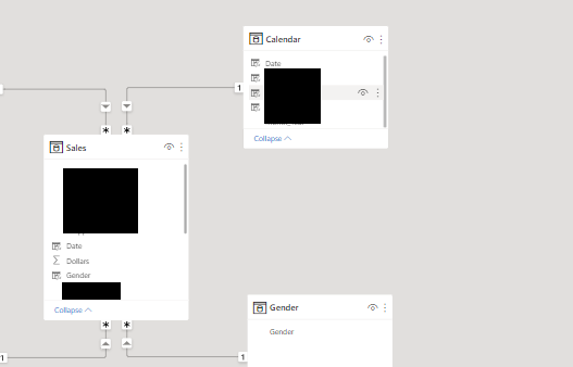
Here is a image of the table connections:
The calendar table filters the main sales table.
Any suggestions would help a lot.
Thanks.
Solved! Go to Solution.
- Mark as New
- Bookmark
- Subscribe
- Mute
- Subscribe to RSS Feed
- Permalink
- Report Inappropriate Content
Hi , @Anonymous
Based on the datasheet model you provided and your measure DAX expression, you want to implement a measure that is presented forward for twelve months based on the date column of the date table selected by your slicer and placed in a column chart, right?
I created some test data and restored your measures, and I think you can create a measure based on the measure [market_share] and put it in the column chart to achieve your needs.
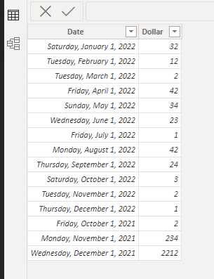
Here is my test data:
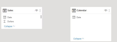
To achieve this, you can first remove the inter-table relationship between the calendar table and your fact table:
Then you can create a measure like this:
selected_end_scale_value1 =

var _date= SELECTEDVALUE(Sales[Date])

return

IF(_date>=EOMONTH([selected_end_scale_value],-12),[market_share],BLANK())
Then you can create this column chart like this and place the newly created measure:
After that, you can confirm whether it can meet your requirements, and if there are problems, you can easily provide your sample simple data and the expected output visual style simulation for us to test.
Best Regards,
Aniya Zhang
If this post helps, then please consider Accept it as the solution to help the other members find it more quickly
Helpful resources

Power BI Dataviz World Championships
The Power BI Data Visualization World Championships is back! Get ahead of the game and start preparing now!

| User | Count |
|---|---|
| 39 | |
| 37 | |
| 33 | |
| 32 | |
| 29 |
| User | Count |
|---|---|
| 133 | |
| 88 | |
| 85 | |
| 68 | |
| 64 |


